


How to Make an Interactive Infographic [+Templates]

Written by:
Chloe West

When creating a social media strategy, it’s important that you include many different types of content.
This can range from links to your blog posts to product photography and behind the scenes footage. But one very powerful form of content you can use to boost engagement and traffic is a social media infographic.
An infographic is a visual form of presenting information, such as with charts, diagrams or icons.
When 65% of the population consists of visual learners, creating content to visually represent data is a great way to resonate more with your audience.
Infographics can also increase web traffic by 12%, so including them in your content strategy is basically a no-brainer!
The best way to reach your audience with this type of visual content is through social media. But creating a social media infographic can be a little different than creating one for your website, blog or email newsletter.
Check out these 27 social media infographic tips to learn more about creating infographics for your social media strategy.
With these tips, you’ll learn more about creating infographics specifically for social media, how to share these on each platform, and how to increase followers and engagement.
We've also included tons of real examples and editable templates to help you get started with creating your own infographics for social media!
Here’s a short selection of 8 easy-to-edit social media infographic templates you can edit, share and download with Visme. View more templates below:


First things first, you need to create an infographic that’s actually relevant to your business or industry.
Think about your target audience—what do they want to know about? Furthermore, what is going to sell them on your product or service?
Take this infographic from ListHub, for example:

ListHub's infographic created with Visme
They showcase home listings and target both home sellers and home buyers, so creating a visual New Home Checklist infographic is a great way to target their audience and get them to learn more about their business.
Think about topics that are similarly relevant to your own business and industry. How can you visualize a concept in a way that entices people to learn more about your company?
Finding a relevant topic for your infographic is step one. Learn more about deciding on your infographic topic in this blog post.
It turns out an infographic isn’t all that different from a blog post or email—you still need an engaging title!
This is extra important on a social media infographic because you have a very little time to catch someone’s eye as they scroll down their feed.
Here's an example of an effective infographic title:

Create a title that is short, sweet and to the point, and ensure you’re typing it in a large, easy-to-read font that grabs attention.
You don’t want your title to be too long and overwhelming, or your audience will stop reading. If possible, try to make some big claims within your title to intrigue your readers.
An infographic is supposed to be a mixture of information and graphics that visually represent that information.
The last thing you want to do is create an infographic that’s nearly all text.
In fact, the last thing anyone wants to see when scrolling down their social media feed is an image filled completely with text!
Not only is this bad infographic practice, but if you were to try to boost your social media infographic on Facebook or Instagram, the ad’s performance would suffer significantly due to the massive amount of text.
Here's an example of an infographic with a good info-graphic balance:

Infographic created by Visme
Finding a good balance between visuals and text is key to creating an infographic that your followers will love.
White space is hugely important in design.
An infographic that’s completely full of design elements and text is cluttered and not visually appealing and it will turn your audience away. Instead, you need to embrace white space.
And this doesn’t mean you have to actually use the color white. It’s absolutely okay to use background colors, like grey, blue or pink.
White space simply means that you’re including empty sections between your graphic elements and your text, like margins around the edges and spacing between each subsection of the infographic.

Infographic created by Visme
Take the above infographic, for example. Pay attention to how flawlessly they’ve implemented margins and spacing between each of the elements. Their white space is uniform throughout the entire graphic.
Learn more about using white space and other mistakes non-designers often make in this blog post.
How do people follow along with your infographic for them to understand its point? When creating an infographic, you always need to keep the flow in mind. What element should someone look at first? Then second?
Splattering content all over the image creates a poor flow.
Whether you’re creating a two-column infographic that people read right-to-left or a one-column infographic that people read top-to-bottom, there needs to be an obvious direction for the viewer’s eyes to go.
This infographic does a great job at creating a visual flow:

Make it even easier on yourself and your audience by adding literal visual flow elements to your infographic.
Use arrows, triangles, lines, and other methods to physically guide users to the next point throughout your infographic.
Here's an example:

Infographic created by Visme
This infographic does a great job of telling the viewer where to look next.
Not only do the numbers illustrate the correct order of each point, a dotted line also creates a seamless flow between each element.
Although your infographic design really matters when it comes to resonating with your audience and generating more views, clicks, and engagement, you don’t ever want to discount the data used to create it.
There are many different places to get data, and you want to do your due diligence to find the most relevant and accurate data for your infographic.
Start by using your company data as much as possible, since you can vouch for that source. Then focus on public resources, like government findings.
A quick Google search is a great way to get started, but you want to make sure that you’re using reputable sources and the data makes sense with your infographic topic.
People on social media can be vicious. If your brand makes a mistake with its data, you can bet your audience will call you out on it.
If there are any numbers or statistics you’re not completely sure about, look around to see if you can find a better source for that information.
Even if a number looks really great, and you’d love to be able to include it within your infographic, if you can’t find any other supporting evidence for that statistic or piece of data, it’s probably too good to be true.
Learn more about fact-checking in our blog post.
There are many different ways to visually represent information, data and statistics. Based on your infographic topic and the information you’re trying to share, what would be the best way to visually convey that story?
There are 44 different types of graphs that you can choose from.
You need to figure out whether a pie chart, line graph, bar graph or other option would make the most sense for representing the data you’ve found.

Full infographic created with Visme
You can even include multiple data visualization types within a single infographic, like in the example above. You see a line graph, pie charts, bar graphs, and flow charts all in one.
As long as you’re sharing data relevant to the main topic, you can visualize each bit in a way that makes the most sense.
Get creative with your graphic elements.
Try something other than a basic bar graph or flow chart. For starters, think about how you could use pictographs to get creative.
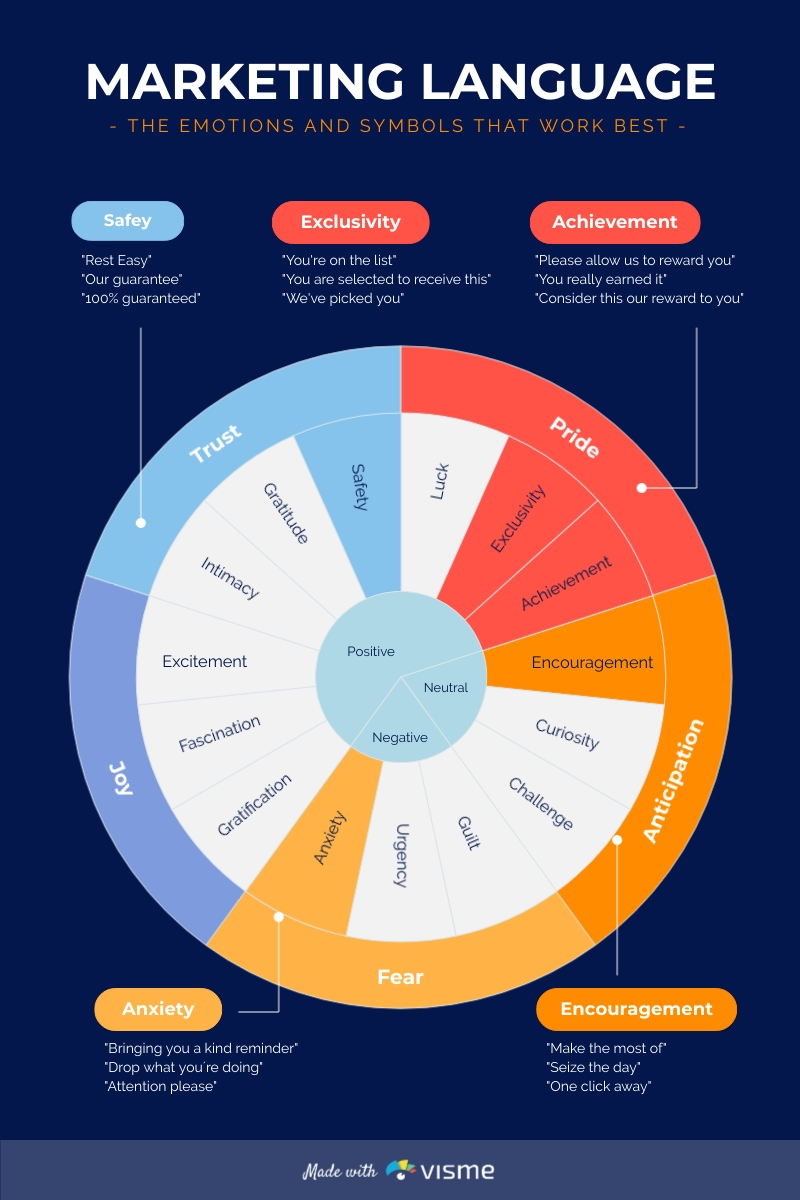
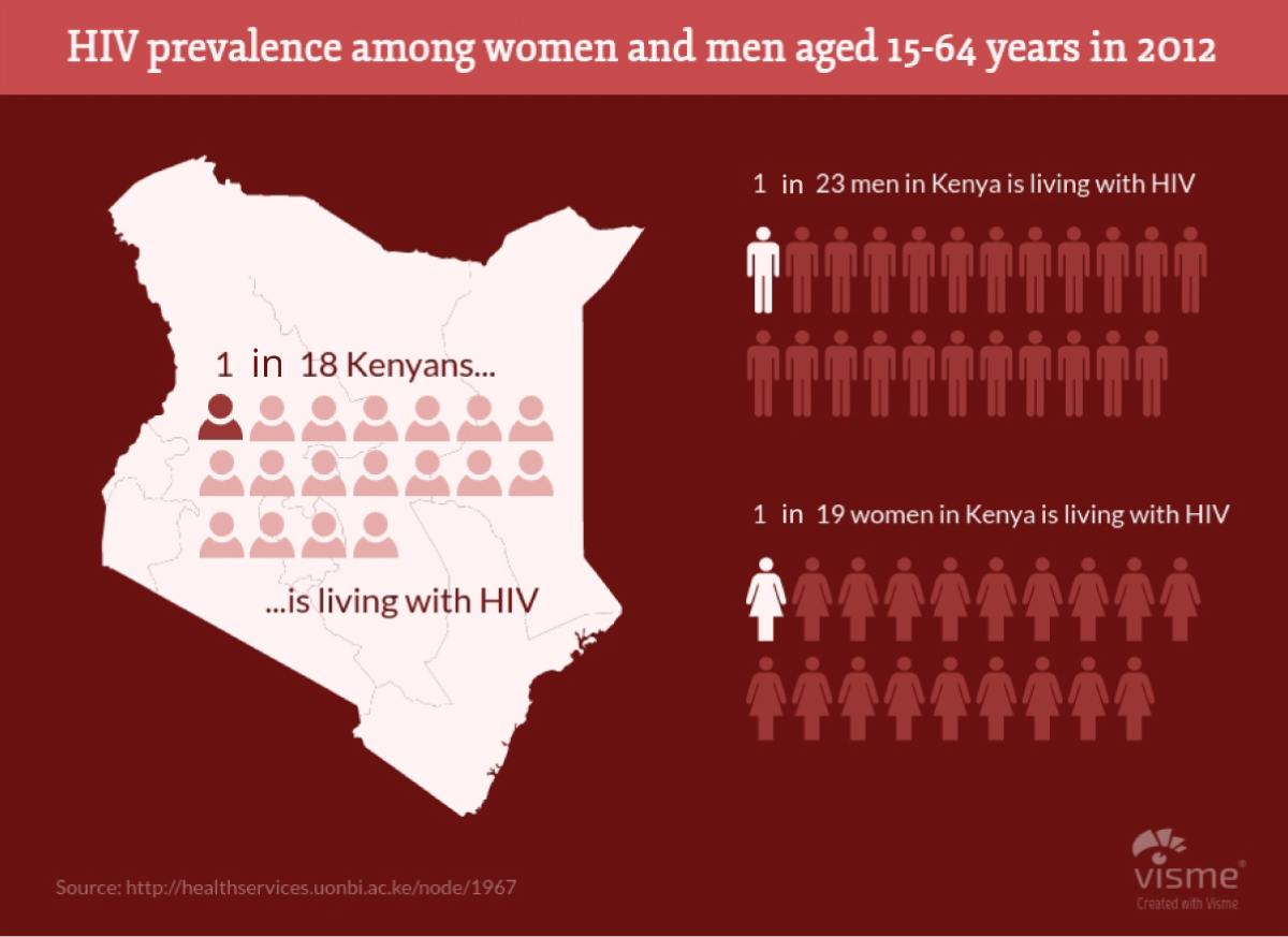
A pictograph uses an image to represent data. The infographic below shows how you can use graphics of people to represent different statistics:
Infographic created with Visme
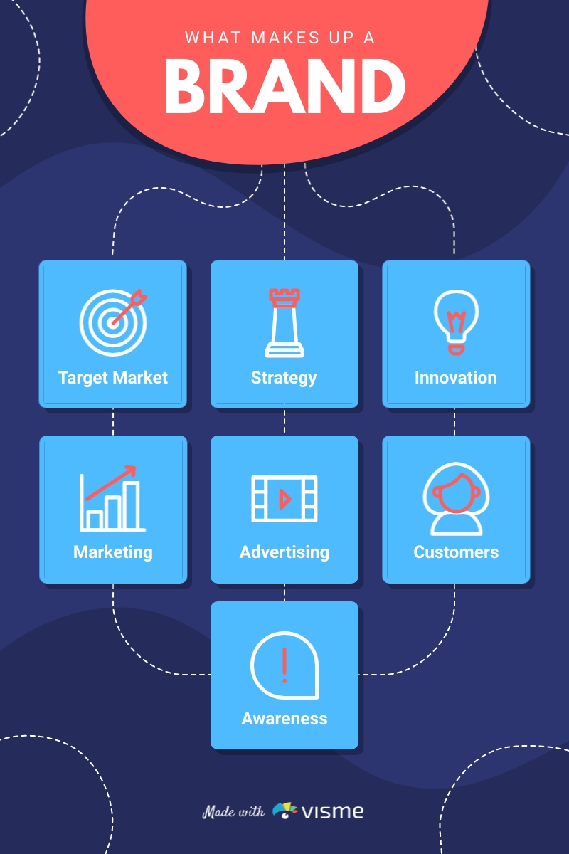
Another great way to represent your information is through an icon chart. This is when you utilize a single icon or design element to present data. Here's an example of an icon chart about video on Instagram:
Icon charts are also great to use as a social media infographic because they’re easy to read, straight to the point and don’t contain a ton of information crammed into a single post.
There are many different ways to creatively visualize your data.
This infographic timeline about internet firsts uses different types of Internet communication to share their information:
Consider the various ways you can share data visually, and don’t be afraid to test out different ideas to see if they work.
This is a good design rule in general, but especially when it comes to your social media infographic design.
Too many fonts in one graphic can look messy, and you want to create a design that is visually appealing, easy to read and shareable.
Focusing on just two different fonts (i.e., one for headings and one for copy) can make your design appear much more seamless and puts a bigger emphasis on the content and data actually included within the infographic.
Here's an example of an infographic that uses fonts wisely:

You can even take advantage of different weights of the same font.
Use a heavy weight in your headings and subheadings and a lighter weight everywhere else. This keeps the copy uniform while still differentiating between the types of text in your infographic.
If fonts just really aren’t your thing, no worries. Font pairing is one of the hardest things to do in life. This is exactly why we’ve got the perfect guide to font pairing to help get you started.
Cursives, scripts, hand-lettering and other types of fonts that are difficult to read are not ideal for use in infographics.
When creating a social media infographic, you want to stick to serif and sans serif fonts that are more uniform and easy to read at a glance.

Hard-to-read fonts tend to clutter up your design, and you should stick to a minimalist social media infographic design with plenty of white space and simple design elements.
People scroll through their feeds quickly, so your social media infographic needs to have fonts that are large enough to grab and keep attention. People will quickly keep scrolling if they struggle to read something.

While this doesn’t mean you need to need to use giant fonts throughout your entire graphic, it does mean you should be conscious of the different sizes you’re using throughout your graphic.
Although most infographics you see focus on graphic design elements, it’s a great idea to test different ways of visualizing your main topic. And sometimes photography is the best way to do this.
There are many different ways to incorporate photography into an infographic. You could use a photo as your infographic’s background and include text, numbers and other graphic elements over it. Like this:

You could also try including a photo alongside your infographic’s header. Or you could even use cut-out photo elements to visualize your data points instead of graphics and illustrations.
Because using photography within a social media infographic is still such a unique practice, you’re bound to grab attention anytime you test this out.

Just like you don’t want to use too many fonts to overcrowd your social media infographic, you also don’t want to use too many colors.
Basically, too much of anything is a bad idea when it comes to design. You need to find a happy medium, and when it comes to your color scheme, that typically taps out around 3 different colors.
Sticking to just a few different colors helps to keep the overall design very succinct and doesn’t cause the brain to feel overwhelmed.

Take a look at the infographic above. It mainly uses blue, white and a shade of turquoise for the entire visual.
We also see pops of other colors in the icons, but they're so small in comparison to the rest of the infographic that they don’t cause any disruption to the main color scheme.
Many times, using your brand color scheme is enough. But if you’re trying to branch out and play with different colors, check out our blog post on color psychology in marketing and effective color schemes.
One of the best things about design is that you just have so many options when it comes to your creation. This goes for pretty much every facet of design, but also for contrasting elements.
You only want to focus on one main contrast in your social media infographic design.
This could be a contrasting color scheme (think orange and green), contrasting fonts (a serif font paired with a sans serif font), design elements (a mixture of icons and photography) and more.
The header above shows off a couple of different contrasts seamlessly.
While you typically don’t want to include too many contrasting elements, the difference in fonts as well as the contrast of the vibrant green against the dark background really make this graphic pop.
Your infographic doesn’t have to be only data and supporting text elements. In fact, it’s a great idea to add in more design touches, whether it’s in the format of your infographic or other graphic elements added for more dimension.
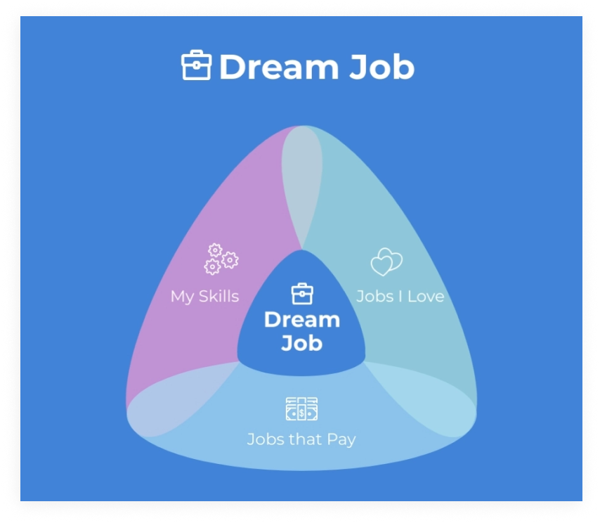
Check out this infographic resume design as an example:
Instead of simply putting together his skills and information, he formatted and designed his infographic as a resume.
This infographic is beautifully designed and all of the elements pull the message together seamlessly.
Regardless of whether this is a literal resume or an infographic about job searching or resume data, this is a beautiful and well thought out design.
If you’re creating a longer infographic, it can sometimes be weirdly tempting to switch up your design every section or so.
But it’s important to stay consistent throughout your entire infographic so that it works well as a whole. This includes your fonts, colors, photos, illustrations and even data visualization and icon design.
Infographic created by Visme
In the infographic above, each of the icons have a similar style and obviously pair well together. Take notes as this should be the case with any social media infographic that you share online.
Staying consistent is key to creating a design that seamlessly represents the data you’re trying to convey. Make sure your fonts, colors and other design elements all remain cohesive throughout a single infographic.
The important thing to know about social media marketing is: it’s not a one-size-fits-all kind of strategy.
When you’re creating a social media infographic, keep in mind that each platform has its own optimal sizing, and it’s a good idea to abide by that for each individual social network your business has a presence on. Additionally, you may need to adjust your social network scripts to ensure that the infographic displays correctly and looks visually appealing on each platform. This may involve tweaking the sizing, image compression, or other design elements to ensure that your infographic looks its best and effectively communicates your message on each social network.
Let's take a look at optimal social media infographic sizes so you can start scheduling.

The optimal sizing for any image or graphic shared on Facebook is 940 x 788 pixels (or 1,200 x 630 pixels for a link image). Although square photos can work on the platform, horizontal photos look and perform the best.
Here's an editable Facebook post template from Visme:

The platform doesn’t size well to vertical photos, except on a mobile device, so the best practice is to simply stick to 940 x 788 pixels (like the template above) for every image shared to your Facebook page.
On Twitter, your image sizing should be a minimum of 440 x 220 pixels, but really any 2:1 ratio larger than that will work as well.
This platform is similar to Facebook in that square photos can work, but vertical photos really don’t. The top and bottom of your image will be cut off, and that’s really not a good look.
Here's an editable Twitter post template by Visme:

Instagram focuses most heavily on square photos, and the optimal sizing is 1080 x 1080 pixels.
While you can upload vertical or horizontal photos that have an aspect ratio between 1.91:1 and 4:5 ratio, the image will still appear as square in your grid. It’s best to simply stick to square uploads on Instagram.
Here is an editable Instagram post template by Visme:

This platform is king of the infographic. While the optimal sizing is any size with a 2:3 ratio, the aspect ratio (i.e. for a longer infographic) can go up to 1:2.8.
So, the good thing is that any infographic you’re sharing to your website can typically be shared as is to your Pinterest account. But you’ll need to resize or crop them for all of your other platforms.
Here's an editable Pinterest graphic template by Visme:

This template has the optimal size for a Pinterest graphic, but keep in mind that infographics can be longer, as long as they don’t exceed a 1:2.8 ratio.
Create a social media infographic that teases longer ones with just a snippet of the data. Focus on just one or two of your data points or blocks, then share the link to the full infographic in the caption.
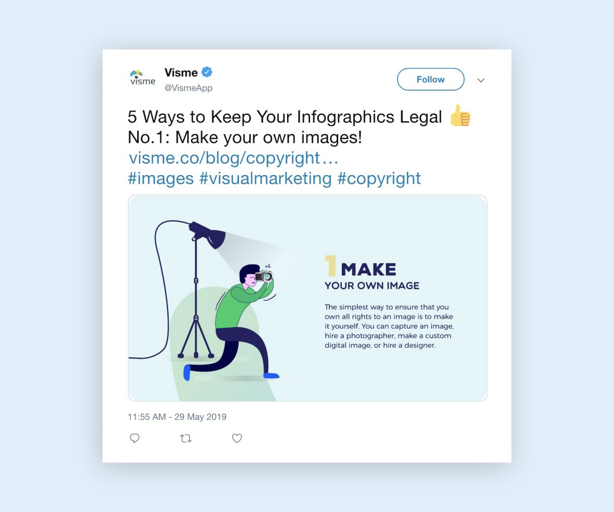
You want to choose some of the most compelling bits of information and visually appealing areas in order to increase the chances that your audience will click through to view the rest of the infographic.
Break longer infographics into smaller pieces to share within a single post.
It’s easy to add multiple images to a Facebook post. Simply click Photo/Video when creating a new post to view all of the available options.
Try a photo carousel or slideshow to share the different sections of your social media infographic all at once.
Facebook's photo sharing options
You can also upload multiple photos at a time on Instagram. Check out how @modernfinance does this social media infographic Q&A on their feed:

Instagram infographic by Modern Finance
And you can even share each piece of your infographic within a Twitter thread so they’re all linked together while still allowing your audience to focus on each bit at a time.
When creating a social media infographic, you don’t have the space (or the attention span of your viewer) to do a deep dive into a topic. Stick to one main topic rather than creating a visual novel.

Take a look at the infographic above. Although it’s a longer one, it focuses on one single topic: how to write compelling infographic copy.
It doesn’t do a brief overview of what infographic copy is and why it's important. It covers one message and leaves it at that.
In a similar vein, try focusing on just a single piece of data in your next social media infographic to make it bite-sized and shareable.
On Facebook, Twitter and Instagram, you don’t have a ton of room. Instead of cramming your full infographic into their optimal sizing, focus on just one piece of data within each graphic instead. Here's an example:

Focusing on a single data point or visualization is a great way to share infographics on your social media platforms.
When you share your social media infographic with your audience, you want them to view it, like it, engage with it and click over to your website. You also want them to share it, because then they’re introducing your brand to others.
If you’re also including your infographic within a blog post on your website, make sure it’s easy to share. Turn on social sharing buttons, add a “Pin It” option to your website and more.
On social media, include “Share this with your friends” as a call-to-action on your post. Giving people a task to do next, after looking through your infographic, is actually a great way to get them to follow through.
Ask for shares, rather than simply hoping people will share.
This is probably one of the most important tips throughout this entire article. It’s imperative that you correctly cite your data sources.
Not only does this clear your name in case of inaccurate information, it also helps people to view you as a more reputable source.

Take a look at the footer of this infographic example. It includes the source of the information included within the infographic.
The bottom of your social media infographic is the perfect place to seamlessly tuck away your source URLs.
The point of a social media infographic is to get your audience to share it on their own social media accounts. Make sure it’s easy for people to figure out who created the infographic in the first place.
Including your logo and/or company name at the top and bottom of your infographic is a great way to increase brand awareness and recognition as your content gets shared around social media.
Infographic created by Visme
See how we have Visme’s logo in the bottom right corner of the above infographic? You want to make sure you leave your company’s mark on every social media infographic you create and share.
Why not make this whole process extremely easy for yourself? Get started with a pre-made infographic or banner template to create the perfect long form or short form social media infographic.
Creating an infographic design from scratch can be difficult, and starting out with a premade template can save you hours of design work. Especially when your icons, charts and design elements are also ready made for you.
Visme’s infographic builder has hundreds of templates and thousands of charts and icons to help you create the perfect design for your business and to convey your message.
If you’re not a graphic designer by trade, Visme also has video lessons and other training tools to help you learn the basics.
But really, all you need to do is dive in and get started creating your first social media infographic. Especially since we’ve just provided you with 27 tips to help you on your way. Click here to sign up and start creating!
Design visual brand experiences for your business whether you are a seasoned designer or a total novice.
Try Visme for free


About the Author
Chloe West is the content marketing manager at Visme. Her experience in digital marketing includes everything from social media, blogging, email marketing to graphic design, strategy creation and implementation, and more. During her spare time, she enjoys exploring her home city of Charleston with her son.