


How to Make an Interactive Infographic [+Templates]

Written by:
Orana Velarde

Visual communication has always been a huge factor in human interaction. Visuals can help relay any message with very little words or none at all.
We won’t include the cliche about how much an image is worth, you know that one already. But visuals make a great addition to any type of content, be it a blog post, social media update or an email newsletter.
Infographics, in particular, are a super practical tool for visualizing data and information that can be difficult to skim.
They’re also super shareable!
But what many don’t generally consider about infographic design is that you can bring them to life with a dose of animation and interactivity.
To get your creative juices flowing, we’ve put together this rocking list of 23 animated and interactive infographics to inspire your own visual content.
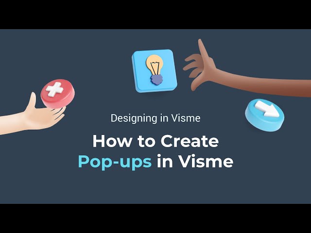
But first, check out this video from Visme’s YouTube tutorial series. It explains how to add popup graphics to your content—an important building block for interactive infographics.
The video above will walk you through creating popup graphics and hover effects in Visme to create interactive infographics that are much more engaging than static images.
Below are 23 animated and interactive infographics you can bookmark for inspiration.
The Netflix movie El Camino came out as a sequel to the Breaking Bad series years after the finale had aired. The guys at Storygraph created a timeline of the entire Breaking Bad series to watch before watching El Camino as a quick refresher.
The timeline is set with a white line for each character and they move along their line, meeting other characters and interacting with different locations.
It seems like the entire timeline was designed as one long horizontal graphic and then the characters were animated over it. The final video is fun, easy to follow, and entertaining.
This animated infographic was designed to resemble the paintings on the ceramics of the Ancient Roman Empire. It follows the life of Spartacus, and how he managed to put together an army and create Sparta.
The creative aspect of The Life of Spartacus is how everything is 2D as if to resemble the people on the ceramics of that era. Using a historical visual appeal is a great way of infusing life into your infographics.

This interactive donut chart from The Guardian is all about how each state has different laws and rights according to type. The interactivity lies in how your mouse hovers over each state and highlights the legend for what each color means.
An interactive infographic of this style is one of the easiest to make since there is no animation. The legend pop-ups are triggered on hover to create an easy experience.
Unfortunately, the last update on this chart was done in 2015—it would be nice to see this interactive infographic updated with the latest regulations.

Not all infographics, interactive or otherwise, need to be about serious information. They can also be fun and entertaining. Like this example about how men call their friends in different parts of the United States.
When you click on one of the words in the top menu, the respective area in the US is highlighted. There is a 5 color progressive code for how common the use is. This example is super simple but also super fun.

Another fun example of an interactive infographic is this one visualizing the top dog names by breed. Click on a circle with a breed name and the popup shows an illustrated example of that breed, plus the most common names used for it.
This interactive infographic was created with Visme. You could create something similar for your own content following the same popup style.

While we can't try out this interactive infographic online, it was part of an exhibit about submarine geology. It was used as a presentation tool by the professors and also as a discovery tool for students.
The interactive tsunami poster was a touch screen with visualizations about how tsunami’s form, what their impact is on the earth and how they look like from space.
Technically, this interactive infographic can be considered more as information design than anything else. It’s a great example of how teaching tools can be taken to the next level with some creativity and computer programming.

Tabletop Whale is a prominent science illustration and interactive infographics blog. Not surprisingly, we’ve included three examples of their work on this list.
This one is an animated infographic explaining the functions of a ventilator used for Covid-19 patients. The infographic has three sections to visualize how exactly ventilation works and then the two different types of ventilators that are used.
This type of animated infographic is a great example of how to easily explain the inner workings of a seemingly complicated apparatus. Offering this type of information to your followers is highly valuable.

The second interactive infographic from Tabletop Whale is one of their most notorious. How to be a human is an animated infographic about the life cycle of a human fetus. The design is a spiral visualization that progresses from the outside in.
Technically, the movement is an optical illusion—the animation is applied to each individual item but the timeline is so flawless that it looks like it’s moving.

Interactive infographics like the one above are becoming more common every day. The trick to making them stand out is to design them intuitively. In this infographic by the Chartered Institute of Ergonomics and Human Factors, the interactive triggers are easy to see.
Not only that, but there is also a label explaining how it works. Creating this style of infographic is easy with Visme, simply use the popup feature and some noticeable icons as visual triggers.

Scrolling infographics were a big thing a few years ago. These are not your run off the mill type of infographics as they take lots of time and dedication to create. Not to mention good knowledge on how to create it in a way that will load fast on the website.
The example above is one of the winners in this category. It’s a scrolling, interactive infographic the visualizes how to create the best landing pages. They named it the Landing Page Highway and the design fits the bill perfectly.
When you learn about art and design, you can’t skip the Bauhaus movement. The video above is an educational animated infographic about the history of the Bauhaus movement.
Staying true to the topic, the design is simple, minimal and very Bauhaus. This neat interactive infographic by 99designs is a great example of how a short video instead of a static graphic can make a difference.

The National Geographic online publication shared an interactive infographic visualizing all the new skyscrapers to be built in Manhattan by the end of 2020.
The infographic scrolls horizontally on a web page and is separated into sections that can be seen in 3D. The buildings are color-coded according to the year they were built and they even cast shadows on Central Park!
This example is not an easy-to-do interactive infographic. To create this type of design, you’ll need to hire a professional. But it will be worth it!

Much of the visual content we see on the Web right now emulates video games that provide users with immersive experiences, marrying top-notch storytelling with interactivity.
This animated and interactive piece, for example, reels readers in from the outset with stunning motion graphic effects and bright, vivid colors. The viewer is then allowed to direct the pace of the interactive piece by using the arrows on the right side.
One noteworthy feature of this innovative piece is the use of predominantly flat colors to create 3D designs and the use of interactive graphs, which you can access by clicking on the icon next to the name of the species.

This animated GIF infographic from Tabletop Whale educates and entertains at the same time.
The idea is to use micro-animations to catch the audience’s attention on social media channels and simulate the experience of looking at a real group of living, breathing gorgeous butterflies.

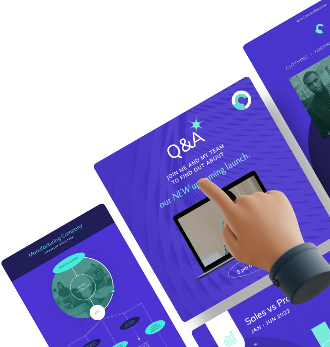
Our team at Visme created this interactive infographic to compare 7 different design tools available today. It was part of a blog post we put together that compared design tools.
This is an interactive pie chart with resized slices to represent specific aspects of the information. When you click on a slice, the legend pops up to show that design tool’s specifics.

If there’s one thing modern readers and viewers like, it’s freedom of choice.
This interactive infographic provides viewers with total freedom to explore each of the different levels of information and go as deep—or superficially—as they like.

This full-width interactive infographic attracts attention not only because of its size, but also for its expert use of vivid and bright colors, subtle but effective animation and large, bold fonts.

Warby Parker is a company known for breaking the mold.
For example, this annual report turns the tables on the reader. Instead of providing the usual numbers on the company’s performance last year, it asks audience members to create their own report.
This animated infographic uses beautiful yet haunting background music and graphics to effectively send a powerful message to its viewers.
It strikes just the right tone and leverages just the right amount of animation, graphic elements and text to create a powerful and impactful display of information.
These stunning motion infographics are both incredibly beautiful and informative at the same time. They combine sleek, professional-looking static design with other animated elements, producing a unique, eye-catching data visualization.
Using just black and white graphic elements, this simple but artfully created animated infographic dazzles viewers by using well-thought-out transitions that seamlessly connect one concept or idea to the next.
Just like with the previous animated infographics, this one stands out due to its expert use of creative transitions and harmonious combinations of text, animation and narration.
If you study each of the transitions, you’ll see that there are no abrupt stops; no unsteady shifts from one idea to the next.
This motion graphics montage combines real-life images with animated infographics, giving it a special three-dimensional quality and creative touch. This goes to show that combining seemingly disparate elements can actually make for an attractive infographic if weaved together in the right manner.
Inspired yet?
After seeing 23 stunning animated and interactive infographics, you’re probably wanting to make your own now. With Visme, you can create interactive content with popups and animations by using templates or designing from scratch.
Once your animated or interactive infographic is finished, you can embed it into your site for your users to interact with. To share on social media, download a JPG and direct them to a live link.
You’ll be surprised at the positive reactions you’ll get from readers and followers.
Don’t forget to show us what you create!
Design visual brand experiences for your business whether you are a seasoned designer or a total novice.
Try Visme for free


About the Author
Orana is a multi-faceted creative. She is a content writer, artist, and designer. She travels the world with her family and is currently in Istanbul. Find out more about her work at oranavelarde.com