


How to Add Text to a Photo on iPhone Using Markup & Visme
Written by:
John Cole

Color may well be the most powerful tool in the graphic designer’s toolkit.
Of course, elements such as concept, line, texture, and space are just as important in their own way. But nothing quite slaps the viewer around the chops like the striking use of color.
Do you prefer a sparse, stylish two-color palette to seduce your audience, or are you of the school that likes to spatter everything you’ve got at the digital canvas? Either way, you’ll know the importance of always having a chromatic theme to unify your choices.
Here are ten natural color palettes from beautiful landscapes to get you on your way to finding the perfect color scheme.. Who knew nature had such disciplined design principles?

Sundown over Bolivia’s famous dried lake land deals with a tricky chromatic conundrum: how to balance warm colors with cold?
The shimmering surface of that alien and beautiful landscape suggests a solution through the reflection of warm pastel shades over the briny blues of the reflected sky in the water.
The precise balance of warm and cold you use in a design will depend on your brief. It’s possible you may want to create something that uses either entirely warm or cold colors. It can help to think about concentrating on either warm or cold colors – and then finding a ‘cause and effect’ justification for using a bit of the other for relief.

They know a thing or two about the damp in the Okavango Grassland. The swampy delta is saturated from seasonal flooding, and so its shades are full and saturated: vivid, healthy greens, blues, and mustard shades to make you thirsty.
Saturation in particular defines the way a design pops. Using your HSB (Hue-Saturation-Brightness) tools is a great way to experiment with the impact and meaning of your design.
If it seems too loud and aggressive, try desaturating your colors; if your image seems kind of reverent and lifeless, upping the saturation can be a great way to get an overview of the dynamics at play.

It gets a bit fresh around chilly Lake Louise, which may be why the color palette recalls the design of toothpaste packaging! Minty greens and ice-cold blues are given added zing with the contrasting yellow of sun on rocks.
There’s a good reason that so much advertising design eschews cold colors and shouts at you with warmer hues. Psychologically, warm colors feel like they’re closer, while cold colors create a sense of distance.
Advertisers want their product to reach out into your world and grab you. Integrating colder colors into your design can help create a sense of depth and set you apart from the competition.

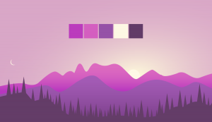
Provence is the first of the pack to go all-out with a bold leading color identity. The rude purples of the French farming region’s lavender fields force its supporting colors to step into line!
Thankfully, the skies complement the fields by completing a classic claret-and-blue twofer; the dry straw yellows of the land beneath the flowers drain a little color out, making the whole thing bearable.
A strong leading color is a powerful branding tool. There’s a certain shade of Facebook blue we all wish we could see without immediately thinking of Zuck! Many businesses capitalize on this effect by naming their brand after a striking color: Orange, Purplebricks, etc.
If you’re creating a campaign or your own series of works, think about how using a signature color can get your audience thinking about your brand before they even start to digest the content.

Ok, so there’s something of a theme here of nature using ‘magic hour’ to coat its beautiful landscapes in gold and thus add a little unity. But no place does it quite like this UNESCO World Heritage site in northeast Vietnam.
Halong Bay is a living lesson in how minimalism is sometimes maximalism, and vice versa. Note the way that the limited palette is given extra reach with the use of varying textures and level of contrast – and the green adds stealthy relief, hidden as it is in the shadows.
Of course, light effects play an enormous part in most of the images we see – not just in photography and figurative art.
There are very few abstract works that can truly claim to disavow themselves of the way we see the world around us – we always see a map (Rothko) or movement (Pollock) or something else. Playing with lighting effects can be a sophisticated way to guide the beholder through your abstract artwork.
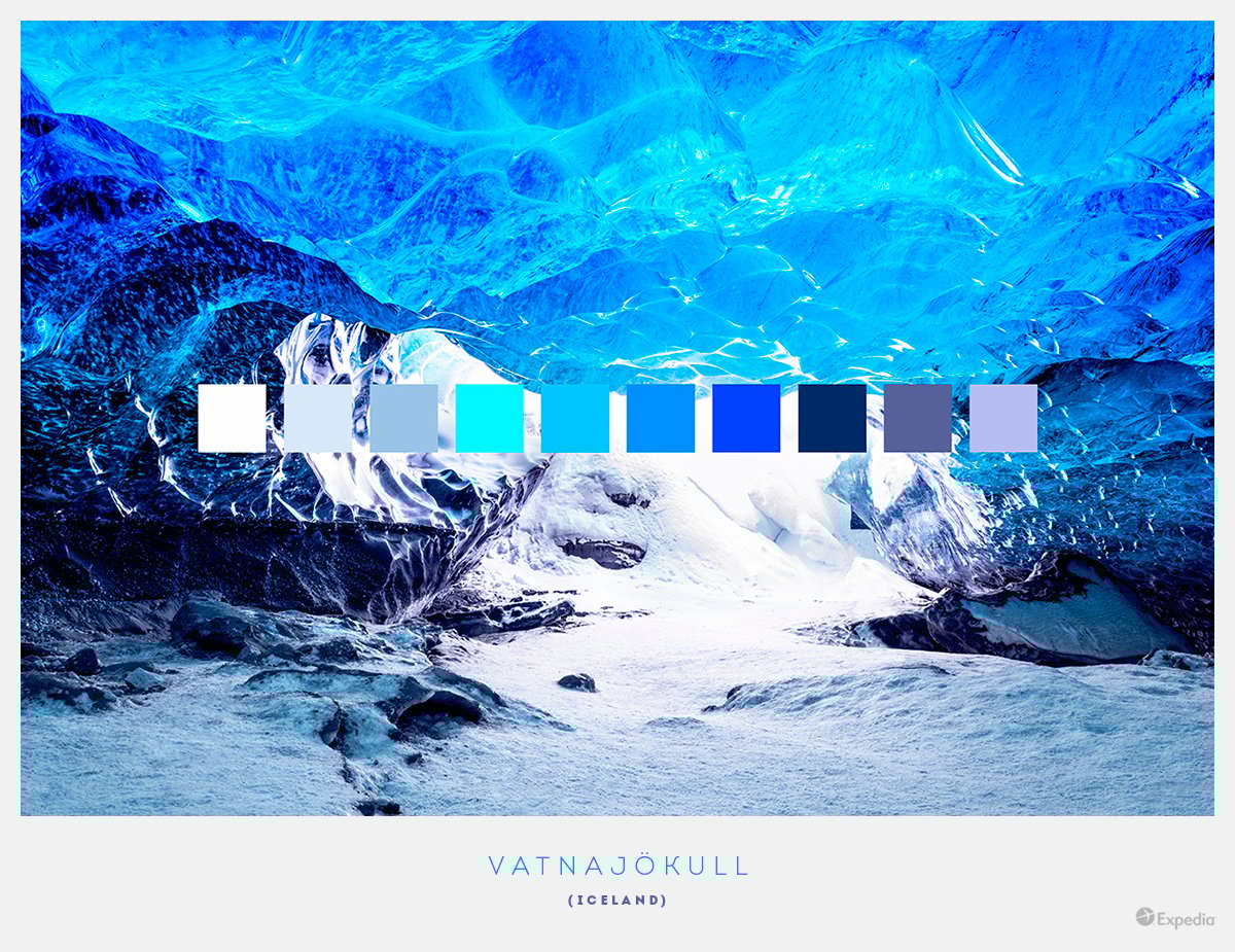
If Halong Bay was bold, Vatnajökul in Iceland goes even further, fully restricting its palette to a thin slice of the color wheel pizza.
The play of light upon the icy rocks and the texture of the snow in the foreground use a form of natural pointillism to add interest and variety to an otherwise pale, monochromatic image.
When you’re working with a limited palette, it can help to start by creating your outlines and then tinting the whole thing to your color of choice.
Experimenting with the HSB of each graphic element one by one will highlight which areas of your design require more dynamic contrast, and where you can get away with – and benefit from – using line or subtle changes in tone to express a visual idea.

Tall reeds and bamboo poles always stir thoughts of Japan. Perhaps it is the cramped nature of the island, coupled with its reverent gaze up to Mount Fuji, that make it a land of verticals.
The Japanese are known for formal simplicity and philosophical reflection, too; and that’s certainly what these calm, creative greens and modest bronzes inspire.
Pale tones and pastels are a great way of creating calming design. But think outside the box – literally: even a pale frame can help to quieten your image.

New Zealand’s tallest mountain has borrowed a dab or two from Vatnajökull’s palette. But following the pointillism of that uninhabitable glacier, Mount Cook delivers an advanced lesson in texture and stroke, since the colors of its epic centerpiece are reflected and developed in the lake at the mountain’s foot.
Repetition is a simple, powerful tool to strengthen the identity of your design. Each time you add a new color, ask yourself: is there a color I’ve already used that could work instead? And: where else can I use this color?
Your audience will interpret your design by tracing the narrative of the colors across your image.

The southern coast of Portugal is a designer’s delight. There are few places in Europe where the color, pattern, and patina of the man-made environment are so rich and varied.
And nature scores a point or two too, with its warm sandy beaches, frothy salt mines, and the gold and blues of the Benagil caves where the land and the sea intertwine.
There are many interesting ways to add patina to the elements of your image. It’s easy to get carried away with your digital tools, but look at the world around you. You're surrounded by different surface textures that you can steal for your design!

What was that about verticals? Bryce Canyon has them to spare! One of the most eclectic palettes among this collection, the national park’s secret is to create the epic by deepening this beautiful landscape with new color after new color the further back you look.
Remember the tip about using cold colors at the back of your image to add depth? Here’s a tip to go with that: using an aerial perspective gives you license to add the haze of altitude to your landscape and other figurative designs, and gives you more background to soften.
Epic idea, no?
Design visual brand experiences for your business whether you are a seasoned designer or a total novice.
Try Visme for free

About the Author
John is a digital nomad and freelance writer specializing in leadership, digital media and personal growth. His passions include world cinema and biscuits. A native Englishman, he is always on the move, but can most commonly be spotted in the UK, Norway, and the Balkans.