


How to Make an Interactive Infographic [+Templates]


Written by:
Lucia Wang

Data is often considered as boring and impersonal, but does it have to be? More and more we're seeing the most technical and complex data being transformed into compelling visuals. Data visualization or information design is becoming the norm rather than the exception when it comes to telling stories both accurately and creatively.
As effortless as beautiful information design may seem, the creation process is still not common knowledge. First, one needs to organize the information, and then present it in graphical form. A newbie to information design, I find myself experiencing analysis paralysis every step of the way: What information should I prioritize in a limited amount of space? How can I arrange data in a way that’s easy to read? What graph type fits a certain story best? What colors represent the emotions I want to convey?
To address these burning questions, we asked several best-selling infographic book authors a simple question: How do you do it? Below, we've provided some examples of their most noteworthy work and a few tips that may help you on your path to mastering storytelling with data. And to follow them on social media, simply click on the quote image to tweet their expert tip and view their Twitter handle.
RELATED: 5 Data Storytelling Tips for Creating More Persuasive Charts and Graphs

Gareth Cook is a Pulitzer Prize-winning journalist and contributing writer to the New York Times. He edited the bestselling book "The Best American Infographics," a series of annual compendiums of the best infographics of the year.
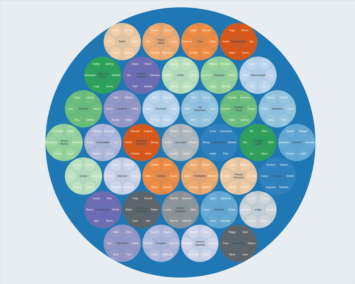
From intriguing interactive visualizations to simple but revealing infographics, Cook's selection of infographics makes even the driest subjects palatable. Take, for example, this visualization of the most common names found in certain professions:
Gareth and his collaborators' invested interest in data stories marks the rising popularity of these graphics across newsrooms striving to explore complex issues in politics, environment, science and public health in an unbiased manner.
And it's easy to see why: These graphic data stories allow journalists to present factual information in a way that reduces cognitive load. It’s a perfect storytelling tool for informing the public on big issues without boring them. Also, it allows audiences to perceive and understand reality through an entirely different lens.
Gareth talks about how infographics act as a “cognitive prosthetic” that helps us process information. After all, our brain is naturally attracted to patterns and images, so it makes sense that infographics help us absorb information with speed. Besides looking beautiful, they have a functional purpose: To simplify complex information.
RELATED: The Best Infographics of 2016 (and What You Can Learn From Them)
His advice for turning boring data into compelling visuals? “Never lose sight of the most important question: What is the story you are trying to tell?”

Alberto Cairo authored the best-selling infographic book "The Functional Art." He also teaches visual journalism at the University of Miami's School of Communication. A journalist and designer by trade, Alberto not only produces beautiful data visualization work but also writes well about the subject.
Infographic design can be complex. It sits at the intersection of statistical science, graphic design, cognitive theory and journalistic investigation. It invites lively public conversations and hot debates. But one thing is undeniable: Words alone are not powerful enough--we need visuals to communicate complex ideas.
Alberto also notes that the tools for producing complex dataviz work is becoming cheaper and more accessible. In an interview with National Geographic, Alberto said: “I am amazed that I can code a complex data visualization in R, for example, with just three lines of code.” We can foresee a future in which data visualization continues to rise in popularity, and more and more people will be able to produce dataviz work.
Although some of the skills required for creating dataviz are still quite technical, the statistical knowledge discussed in his books are relevant to anyone in science or business. Alberto is currently teaching a MOOC course on data exploration and storytelling if you're interested in learning more about the subject.
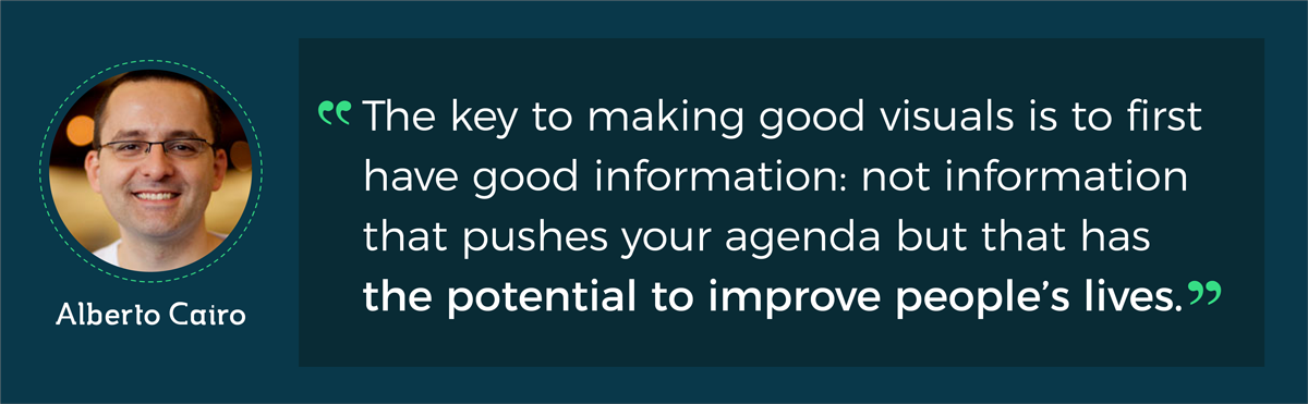
His advice for us was: “The key to making good visuals is to first have good information: not information that pushes your agenda but that has the potential to improve people's lives.”

For over 30 years, Steven Heller was the art director at the New York Times. A prolific writer, Steve has published and edited over 100 books on design and popular culture. He also teaches at the School of Visual Arts in NYC and has curated many shows.
An iconic figure in the design community, Steven is attuned to the rising trends in visualizing complex data with infographics. Steven thinks of infographics as a “groundswell,” a means of “helping people understand or at least navigate through the swell of information.”
He’s mostly interested in the conception process behind large, complex data visualizations. He co-authored the book “Infographic Designers' Sketchbooks” to take a peek at the creative process behind the transformation of raw data into visuals. Doodles, drawings and digital mockups reveal the many techniques designers employ to turn complex information into easy-to-read, hard-to-forget infographics.

Heller’s book reveals the design process behind a visualization of the daily life of a Guantanamo Bay prison inmate. Via Slate
But Steven also says that there are no set rules in infographic design--every designer has a unique process. In general, however, the process of visualizing data does require an ambidextrous brain: the ability to not only think visually but also crunch data.
In this age of information overload, Steven believes that deliberately designed infographics are a necessity. School education is falling short in the field of information presentation, and that’s where infographic design comes into play.
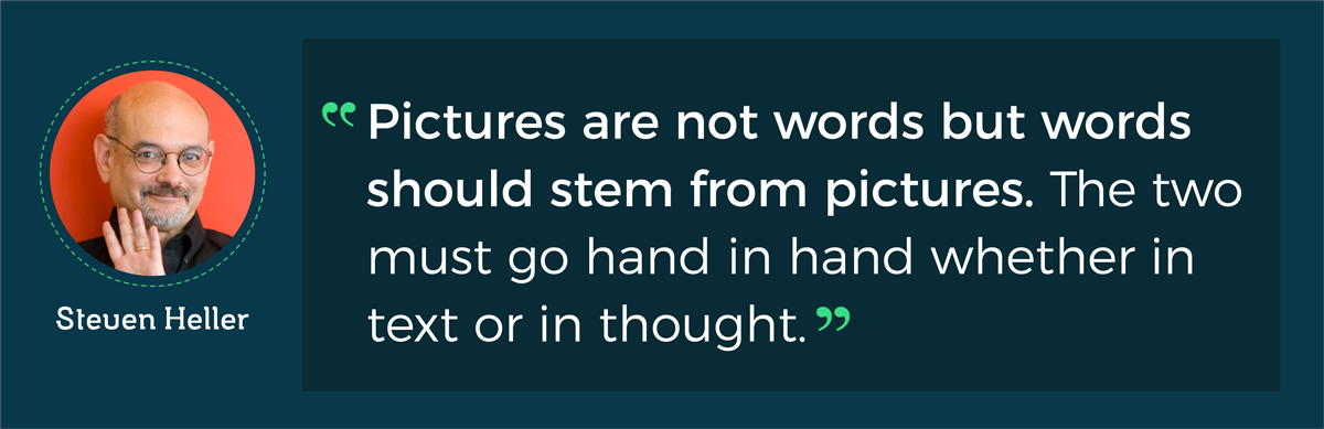
When asked to give his best advice on visualizing data, Steven says: “Pictures are not words but words should stem from pictures. The two must go hand in hand whether in text or in thought.”

A mathematician at heart, Cole Nussbaumer combines the magic of storytelling with rigorous data analysis. Before her popular dataviz blog Storytelling with Data took off, she had a corporate career in data analysis, including a People Analytics role at Google. Cole now travels around the world, training companies and individuals on the fundamentals of data storytelling.
Cole authored the best-selling infographic book “Storytelling with Data: A Data Visualization Guide for Business Professionals,” a handy manual packed with practical lessons on how to make data the pivotal point in storytelling.
At first glance, her framework for visualizing data might seem counter-intuitive: She focuses first on understanding the context and the audience before choosing the appropriate graph for a dataset. After that, it’s a matter of eliminating clutter and making the central message more salient.

A page from Cole's book. Via PolicyViz
Compared to design-centric peers, Cole’s data visualization work is more accessible. She’s more concerned with effectively communicating the key message than with creating artistic visualizations. Business professionals will especially benefit from her pragmatic approach to data storytelling as their primary goal is to drive decision making. For example, Cole goes over the process of how to use visual cues to draw attention to specific details in your chart.
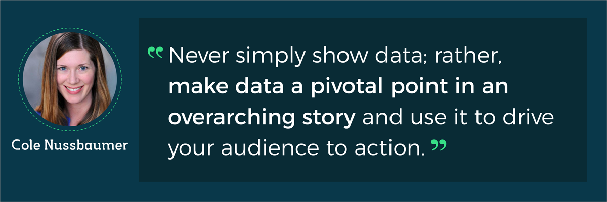
We asked Cole about her secret for turning data into compelling visuals, and her response was: "Never simply show data; rather, make data a pivotal point in an overarching story and use it to drive your audience to action."
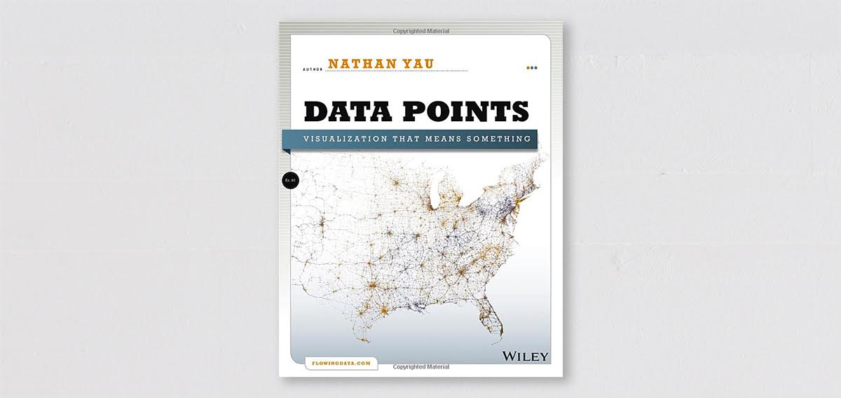
Nathan Yau is behind the highly popular dataviz blog Flowingdata, a must-read for anyone interested in data visualization. Trained as a statistician at UCLA, Nathan is especially interested in social and personal data. His visualizations explore less-trodden waters in the business-oriented dataviz world, such as how we will die and how we spend our time.
Relying heavily on programming in his visualization work, Nathan advocates a flexible approach to data, rather than adhering to the conventional principles followed in the creation of charts and graphs. The name of his blog, “flowing data,” represents this view of data: It is fluid and intertwined with everything. His visualization invites interaction and is open to interpretation. In fact, Nathan’s work demonstrates that statistics and science are more influenced by personal experience and bias than we may think.

Nathan’s visualization on social data explores topics relevant to the average person.
And unlike many dataviz experts out there, Nathan doesn’t believe infographics - even the low-quality ones - overshadow quality work in the field of data visualization. The rise in infographics is proof that the public is ready to engage with data, and as Nathan has said in his blog post about “low quality infographics,” when bad infographics stop being popular, we should be concerned: That’s when people lose interest. He even charted the evolution of the infographic, from 2008 onwards, in this post.
A champion for breaking the rules, Nathan wrote the book “Data Points: Visualization That Means Something,” which showcases the ways one can look beyond conventions to experiment with data. His one-sentence insight on how to make data meaningful and beautiful: “We can make it human, and all of sudden people listen and understand that this data is about them.”

Best known for his popular infographic inspiration blog Cool Infographics, Randy Krum wears many hats: He is a designer, author, speaker and entrepreneur who passionately advocates for the use of infographics to visualize real-world business information.
Speaking from his experience running his own Dallas-based design agency, InfoNewt, Randy believes visual communication is the solution to the problem of information overload in today’s business world. Visualizations not only make information easier to understand both for the communicator and the audience, they are also more likely to be remembered than textual information.

An infographic InfoNewt created for Quicksilver on the legendary surfer Kelly Slater.
His book “Cool Infographics: Effective Communication with Data Visualization and Design,” explains the science and process behind effective infographic design. It's a good read for those who have a pressing need to visualize business data but are at a loss when it comes to turning raw data into infographics.
Packed with practical tips and tools, Randy’s book is a handy how-to guide that covers not just the design process behind the creation of a great infographic, but also how to make sure it reaches the target audience via the right marketing channels.
When we asked Randy about his secret for transforming data into compelling visuals, Randy said: “Use color to highlight the insight from the data and draw the reader's attention to the key message of the design.”
Hungry for more practical advice on how to transform boring data into compelling visuals? Take a look at these 25 expert tips on how to make information beautiful.
And if you want to learn all our secrets on how to create an effective infographic (from how to write content for your visual to the design process), grab our free e-book below.
Design visual brand experiences for your business whether you are a seasoned designer or a total novice.
Try Visme for free


About the Author
Lucia is fascinated by the intersection of communication and behavioral psychology. She studied Arts Journalism at School of the Art Institute of Chicago and History of Art at Yale before taking the plunge to pursue a career in technology marketing. When not working, she can be found advocating for remote working, digital currency and circular economy.