


15 Interactive Map Templates to Create National, Regional & Global Maps

Written by:
Tamara Scott
The human brain is a powerful tool that can create and process a vast amount of information. If you want to take the shortest route from page or screen to brain, try an image. A 2014 study by MIT neuroscientists found that it takes as little as 13 milliseconds for the brain to process a single image.
Our brain recognizes visuals much faster than text. In the past several years, this realization has contributed to the rise of reporting and data visualization tools. For the sake of saving time and brainpower, it’s increasingly popular to use charts, graphs, and simple KPI reporting for all parts of business, and execs are breathing a collective sigh of relief at the reduction in reading material.
Between meetings, conference calls, and the general pace of business, B2B executives have little time left over to read long-winded reports or to parse important data from confusing sources. Thankfully, C-levels can catch a break by using data visualization tools that replace the time-consuming task of making business graphs and charts while also telling clear, compelling stories.
RELATED: 4 Ways Data Visualization Can Improve Sales and Marketing Alignment

Pie chart created with Visme
What’s more important to the bottom line than revenue? When execs want that 10,000-foot view, revenue reports are useful visuals that provide a quick overview of the fruits of a team’s efforts.
Important stats and charts:
Monthly and quarterly reports should directly reflect the company’s goals and departmental goals. If your goal is to increase revenue per customer, be sure to use this as an individual KPI (key performance indicator) rather than just picking and choosing the stats that make you look good, like increased visitors to the website.

Task burndown chart created with Visme
Capacity: How much work each of your employees can handle without going bonkers
Resources: The material investments necessary to carry out any project
Capacity and resource planning modules can be found in most business intelligence and enterprise resource planning (ERP) solutions, giving managers and executives visual and accurate representations of the employee, time, and material requirements of each product or process. Implementing project burndown charts, tracking budget requirements and material outputs, and scheduling the right number of employees to efficiently take care of a project can be overwhelming. The right data visualization tools can place all of this pertinent information in a single report.
Building resource plans that include time and materials is also useful for analysis. When a product or order is complete, compare projections against actual usage stats to discover bottlenecks and where your expectations did not align with reality. What process changes can the team implement to bring about more efficient products in the future?
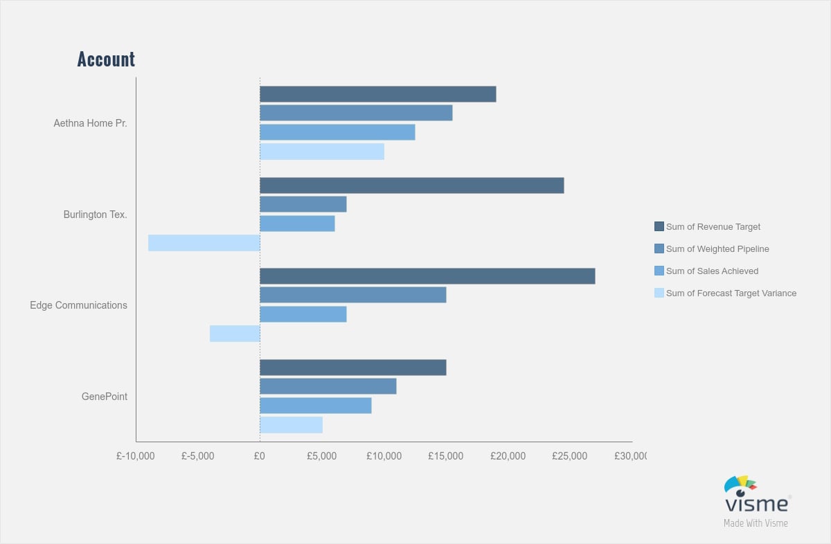
Identify and analyze your best and worst performers by account, and use that data to inform your customer success decisions.
Finding your highest attributed revenue accounts can pay off in several ways. These can help your team build an ideal customer profile based on usage rates, engagement levels, and statistics on most-used tools or products. What sets your biggest spenders apart, and how does this fit into your current customer profile? Use this data to update (or build) the ideal customer profile to direct your targeting.
The same is true for your low performers: They can present opportunities for growth and opportunities to slow your churn rate. What can your team do to increase product engagement for those accounts? Compare the low performers against your new ideal customer profile to understand where engagement, support, or customer type isn’t working as expected. Perhaps the team missed something in onboarding that you can fix, or maybe they weren’t a good fit from the beginning and your teams need to update targeting criteria.

Sales and customer service teams spend all day growing and maintaining the business on the front lines, so they deserve as much motivation as they can get. Leaderboards inject a little bit of friendly competition into an otherwise bleak landscape while reinforcing good overall behaviors. Don’t be afraid to use motion and color here to increase the impact of the information and drive employee engagement.
Sales leaderboards add a pinch of gamification to run-of-the-mill sales goals and keep stats updated in real time. Connect your sales data sheets to your data visualization tools, and display the results on a TV or monitor in a centrally located position. Use pie charts or other graphics next to your overall revenue leaderboard to track good customer engagement behaviors that build toward that closed deal.
Service leaderboards tap into a similar sense of competition, but with customer satisfaction and engagement at its core. Leaderboards can show KPIs that include the number of completed customer requests, total average rating per representative, and total incomplete customer tickets.
Once your teams start tracking these data points, don’t forget to use these stats to improve overall team processes. Study the types of behaviors your high performers engage in, and pinpoint what they can do to mentor the other members of the team to increase overall growth.
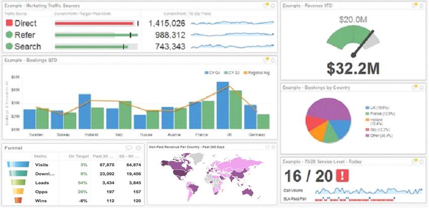
Do you know, off the top of your head, what the current customer churn rate is? Average deal size? Do your employees? A company-wide dashboard can bring your team together around a central purpose.
Similar to the sales and service leaderboards, place company-wide dashboards in a central location (next to the coffee machine?) where employees can watch progress toward company-wide goals. Start broad with total revenue, deals, or trial vs. premium subscriptions.
Adding animation, trend charts, and traditional traffic-light color coding makes these visualizations easy to follow. This sort of transparency in company goals and progress boosts employee morale, teamwork, and alignment.
Whatever the output, start with team or company goals when planning your visualizations. Data visualizations that don’t tie directly to larger goals and objectives are doomed to fail, especially at the executive level. They may look pretty, but the desired outcome of increased engagement will be lost.
If you're looking for a an easy-to-use, online tool for creating business graphs and charts, you can take Visme for a test drive free of cost!
You can also view various business KPI examples to get some inspiration on how to visualize data and make it easier to understand and analyze.
Let us know what you think in the comments section below!
Design visual brand experiences for your business whether you are a seasoned designer or a total novice.
Try Visme for free

About the Author
Tamara Scott is an analyst at TechnologyAdvice, a B2B research firm that connects buyers and sellers of business technology. She writes about technology, business, and SEO in Nashville.