


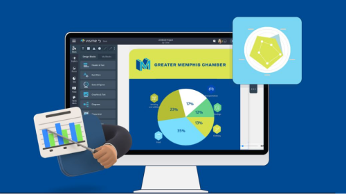
How Greater Memphis Chamber Creates Award-Winning Content While Saving Costs Using Visme


Written by:
Nayomi Chibana

If you believe the stat that only 13% of people worldwide actually like their job, then you’ll consider graphic designer Jackie Litchfield a very fortunate person.
A self-professed perfectionist, Jackie has been designing for the web for over 16 years, which has allowed her to create functional experiences and still be able to indulge in her first love: design.

She is currently the creative lead at the Office of the Children’s eSafety Commissioner, Australia’s leading organization in online safety.
At eSafety, she is the creative driving force behind the conceptualization of different online educational materials and resources, such as videos, games, lesson plans and quizzes.

eSafety provides online safety resources for parents and educators.
One day, after spending many weeks working with the organization’s front-end developer to create an interactive infographic, she decided to search for an online tool that would allow her to easily and quickly create one without any coding.
She stumbled upon Visme, an online DIY infographic and visual content creation tool, and was pleased with the way it allowed her to create interactive infographics within a few hours, without any coding knowledge, and then seamlessly embed it on any web page.

We had the opportunity to interview Jackie, and here is what she had to say about the process she followed to create these beautiful interactive projects.
RELATED: How America’s Leading Arts Nonprofit Is Using Infographics to Promote Its Cause
As the creative lead of a department tasked with providing online safety training to children and their parents, Jackie works with a team of educators, researchers, marketers and designers to create web and print materials.

Static infographics created with Illustrator.
For example, their research team has conducted investigations on how parents regulate the time their children spend online and how they keep them from coming into contact with inappropriate content.
The findings are then turned into engaging educational material, such as the infographics below created with Illustrator, and then posted on their news section called iParent.

Static infographics created with Illustrator.
Over the years, the department has created many of these flat, static infographics. Eventually, they were ready to move on to something a bit more engaging and interactive, but they didn’t have the time or resources to enlist a front-end coder for every new interactive project, so Jackie got to work, researching the best interactive infographic tools.
After comparing several of these online tools, she found that Visme offered more of what her department was looking for:

“We actually tested out another competitor, and you guys won the battle. It was a few things: Being able to upload with ease and store all your previously used images and icons in the media manager.
You also have more options of ways we could style things up, because we have our brand guidelines so there are things we can do and things we can’t do, so we found that you had the most flexibility, and the graphs and animation effects were a drawing point as well.”
Here are some of the projects Jackie created with Visme. The first was an online interactive infographic on how parents can manage web-connected devices in the home, with clickable buttons that lead to other pages on their site and colorful stats visualized in an engaging manner:

View original infographic here
She also created this infographic report on how parents view their children's online time and their information needs, based on a survey conducted with 2,360 parents in Australia.

View original infographic here
Finally, there's also this infographic, created with Visme, on the types of strategies parents use to keep their children safe online, including defining fixed rules for Internet usage, monitoring their child's use and talking about what the child read or saw online.

View original infographic here
Many of the online tools Jackie found allowed her to create static infographics, but not animated or interactive ones.

With Visme, however, she was able to produce an infographic that looks “nice and sharp” on all screens, as projects are completely mobile responsive, and also make them accessible to all types of site visitors, such as the visually impaired:
“As a government department, we need to make our content accessible to all types of viewers. So using tools that pick up live text to read, for example, an infographic to someone who is visually impaired is always a positive thing. This is something you can’t do with static infographics.”
Also, she enjoyed being able to add animation to element, and found it extremely simple to use:

Add animation to any element within Visme.
And being able to add links and create interactive buttons that take visitors to other web pages was a big plus as well:

Stylize text boxes and turn them into interactive buttons.
In a few words, she finds Visme to be a “highly useful and versatile tool,” as it allows her to customize the look of any element. For example, she can change the color scheme of any icon or choose from a variety of styles, such as outline, glyph or flat icons.

Modify the color scheme of icons.
Would she recommend it to other nonprofits? “Definitely,” she says. “The most positive point about using Visme is being able to create interactive graphics online without having to enlist a front-end coder. So any project can be easily implemented by myself or someone else without having to get a programmer to style it up for us.”
If your organization is looking to create interactive and animated content but under strict time and budget limitations, you can take Visme for a test drive here and use it for free for as long as you want.
And since Visme supports nonprofit causes, those looking for immediate access to all Premium infographic templates and features can also apply for a 25% discount here.
If you have any other questions on how infographics can empower you to communicate visually, don't hesitate to drop us a line below!
Design visual brand experiences for your business whether you are a seasoned designer or a total novice.
Connect with Sales

About the Author
Nayomi Chibana is a journalist and writer for Visme’s Visual Learning Center. Besides researching trends in visual communication and next-generation storytelling, she’s passionate about data-driven content.