


15 Interactive Map Templates to Create National, Regional & Global Maps


Written by:
Nayomi Chibana

Working with numbers isn’t usually thought of as a sexy job. After all, occupations like accounting and data entry aren’t exactly the most exciting vocations in this digital era.
But just like the once-unglamorous computer geek now rules the world, data analysts are currently perceived as “unicorns of the job market.”
The ability to make sense of large volumes of messy data and find unique insights in them is one of the hottest skills in the job market, according to LinkedIn.
And it’s easy to see why: More data has been created since 2013 than in all of human history before that date.
As a result, there’s not only a high demand for data scientists but also those who know how to visualize and present data in an effective and persuasive manner.
This is where data storytelling comes into the picture.
A combination of data, visuals and narrative, data storytelling is the hot, new data science skill everyone will need in the future.

Information source: Forbes
For those who are uncomfortable with numbers, this may be really bad news.
But before you start panicking, let’s start with some simple facts that will help you understand how our brains process visuals and how you can use these principles to improve your charts and graphs.
RELATED: Bad Infographics: 11 Mistakes You Never Want to Make
If you prefer watching to reading, be sure to check out the video version of this blog post:

Contrary to what you may have learned in high school, human vision is much more complex than just processing the light that is reflected by an object.
Although we can apparently see everything within a 180-degree angle, we can actually only view with full accuracy those things that are in the very center of our field of vision, within a very narrow field of two degrees.
How is it then that we don’t see a blurry mass of things?
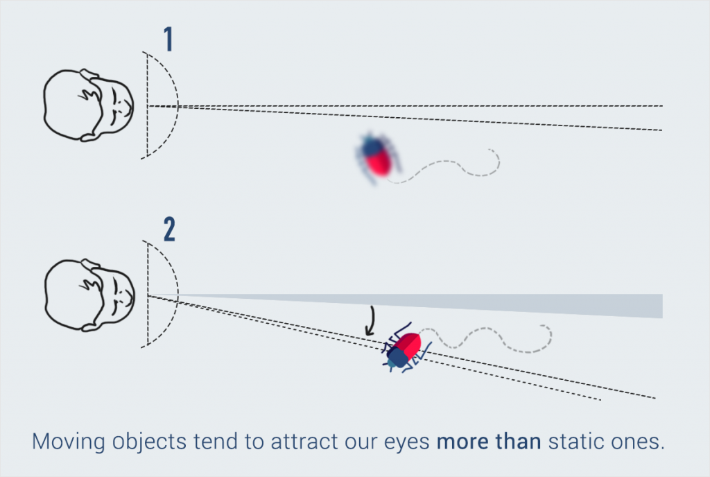
Thanks to rapid ocular movements called saccades, we are able to perceive the objects that lie in the remaining 178-degree angle. Without noticing it, our eyes jerk rapidly and fixate on different points of a scene to create an accurate visual map from this aggregate information.
Although these movements are unconscious, our eyes prioritize what they fixate on. For example, bright colors, uncommon shapes and moving objects immediately draw our attention, even if they are not right in front of us. (Source: The Functional Art by Alberto Cairo)
Information source: The Functional Art
Once light has been encoded into electrical signals, the brain then extracts the main features, beginning with a gross shape and patches of color, and only then starts to really process and identify what is in front of the person, using a lot of information from long-term memory.
To get a more visual explanation, you can also watch Payman Taei describe the science behind how we perceive objects here:
So, instead of capturing an entire scene like a camera, our eyes actually focus first on key points that stand out. That’s why our visual brains immediately notice difference and contrast.
Just take a look at the image below. How long did it take you to see the bear in the first two illustrations? And the last one?

This simple exercise reveals that our brains are much better at identifying differences in color rather than shapes.
Did you know that your senses are constantly processing all kinds of information from the environment before you’re even consciously aware of it?
This is called pre-attentive processing and without it, we would waste a whole lot of time trying to make sense of the world around us.
Thankfully, our visual brains make things easy for us by automatically detecting differences and similarities between objects.
For example, take a look at this image below.

Did you immediately focus on the one large rectangle in the middle? In the second section, you probably noticed right away how one rectangle has a vertical orientation, unlike the rest.
This is the visual brain for you: It is designed to notice patterns and immediately detect disruptions of those patterns.

Now that we’ve had a peek at the science behind the way we perceive objects, let’s look at how this knowledge translates into practical tips for creating effective and persuasive data visualizations, from the guide Good Charts by Harvard Business Review.
The first difference between reading a page with text and reading a chart or graph is that with the first, you read in order: from left to right, from top to bottom, in Western culture. With the second, there is no predetermined order--you simply go where your eyes take you.

The pace is also different. Instead of steadily reading line by line, you jump from one thing to the next and spend longer amounts of time on some parts than others.
This means that it’s especially challenging to create effective visualizations that deliberately take viewers on a predefined visual journey.
When we look at a chart or graph, like the one below, we don’t see everything at once but instead focus on one salient point.

Information source: Prison Policy Initiative
The first thing that stands out in this graph is the peak at the far right. The central message of this visual is crystal clear: the U.S. incarceration rate has increased exponentially since the 1970s.
The best data storytellers take advantage of this principle by creating charts and graphs with one clear message that can be effortlessly understood.
Whenever you have a graph or chart with more than 5 to 10 variables, the individual units start to lose their individuality and are perceived by our eyes as a single whole.
With this in mind, you should simplify your charts so that they highlight one main point you want to make.
Take, for example, this chart. The first things you notice are the peak in the middle, the green line and the word “outage.”

If the objective is to convey a clear message through a declarative chart (rather than an exploratory one), then you’ll see that there’s no clear message here.
Let's say, for example, that you want to reveal that performance ratings continued to decline even after the outage, then the viewer has to work hard to find this trend, as the peak in the background distracts from the green line.
The best solution, in this case, is to eliminate the number of customer service calls data and focus on customer service ratings before and after the outage.
Another important fact is that our brains are designed to immediately look for connections and try to find meaning in the data.
If you look at this chart, you’ll find that your brain unconsciously makes the connection between the orange in the title and the orange-colored dots.

“This must mean that the orange dots represent the top performers,” our visual brain concludes.
Wrong. Actually, the top performers are those plotted to the top right of the chart and have nothing to do with the selection of colors.
Knowing this, we must make smart design decisions and assign colors deliberately to improve the functionality of your visual.
There are certain conventions that we take for granted. For example, in Western culture, we all intuitively know that when visualizing time, it moves from left to right, not right to left; or that blue means cold and red means hot.
The same goes for visual metaphors: We all associate a pyramid with hierarchy or a scale with a comparison of two things.
If you ignore these conventions, then it goes without saying that your visuals will be hard to decipher.
Just take a look at this chart and how hard it is to extract meaning from it when time is placed on the Y-axis rather than the X.

Here are some examples of how to improve charts and graphs so that they don’t simply display data but tell a story, from the book Storytelling with Data by Cole Nussbaumer Knaflic.
This bar chart displays the number of tickets received and processed in a year.

If your purpose is to convey a message and move someone to a specific action (in this case, the hire of two new employees), then this is much better.

By choosing a line graph over a bar chart, the growing difference between the number of tickets received and those processed is made completely apparent.
This is another example of data displayed without a narrative or clear message.

Now look at this same data set presented in a completely different manner. Big difference, right? The central message is immediately clear: More children were excited about science after the program.

Create charts like this with Visme.
The use of single chart rather than two separate ones allows viewers to quickly understand the results of the survey. Also, the use of a few colors, not five or six, and an effective title helps the reader to quickly grasp the differences between pre- and post-program results.
Another example of an ineffective chart that is accurate but does not communicate or persuade an audience to take a specific action.

In this chart, our eyes are immediately drawn to the blue strip, the gray lines and the blue dot representing the average price point.

The central message is immediately clear: To be competitive, the ideal price is within the $150 to $200 range.
At first glance, this pie chart seems clear enough, but upon deeper analysis, you’ll find that it doesn’t abide by several conventions that allow viewers to quickly grasp the information.

Normally, we would expect values on an artificial scale to be arranged in order, from “not at all interested” to “extremely interested.” But in this case, the values are arranged in accordance with the percentages of each response.
We would also expect the changes in color to correspond to the artificial scale, with one color on one end of the scale and the second on the opposite end, and intermediate tones in between.
This is much easier to decipher at first glance. Arranged according to the values on a scale, we quickly understand that a majority of people are not interested in this particular product.

Now that you’ve learned a few simple principles for more persuasive and effective data storytelling, you can try your hand at creating your own visual data stories with this free chart and infographic tool.
And if you have any data storytelling tips of your own you’d like to share, please drop us a line below in the comments section!
Design visual brand experiences for your business whether you are a seasoned designer or a total novice.
Try Visme for free

About the Author
Nayomi Chibana is a journalist and writer for Visme’s Visual Learning Center. Besides researching trends in visual communication and next-generation storytelling, she’s passionate about data-driven content.