


How to Add Text to a Photo on iPhone Using Markup & Visme

Written by:
Nayomi Chibana

When was the last time you looked at a stunning graphic design and just thought, "Wow. I wish I could do that."
The great news is that you can! You just need to avoid these common graphic design mistakes so that you, too, can create stunning graphics, even if you're not a designer.
To help you learn even more about basic graphic design rules, we've put together a whole list, filled with examples, to showcase exactly what you should be doing next time you open up your Visme account to start a new design project.
Let's dive in.

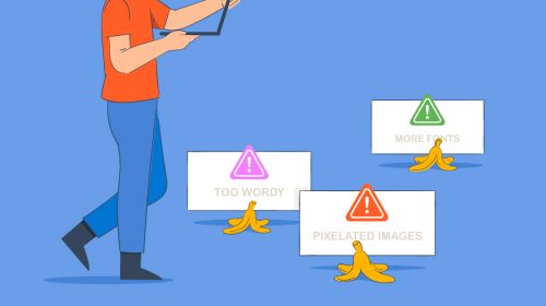
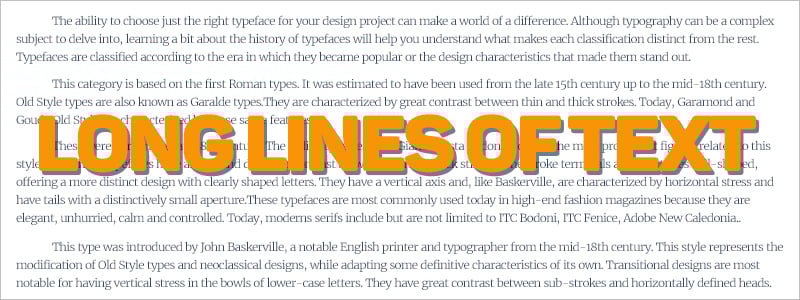
One of the fastest ways to turn your audience off is to include too much text in a piece of communication that is supposed to be primarily visual. This is especially true in the case of infographic and presentation design.
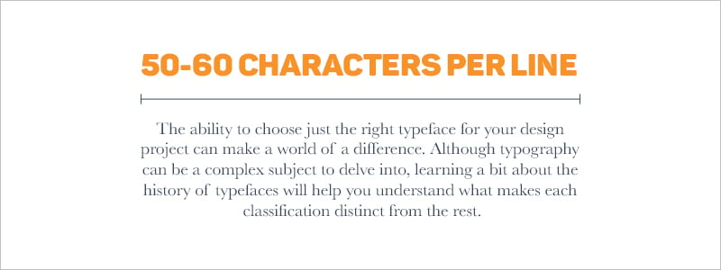
Another common mistake is to attempt to fit too many words into one line of text. For readability purposes, 50 to 60 characters per line is the ideal length.

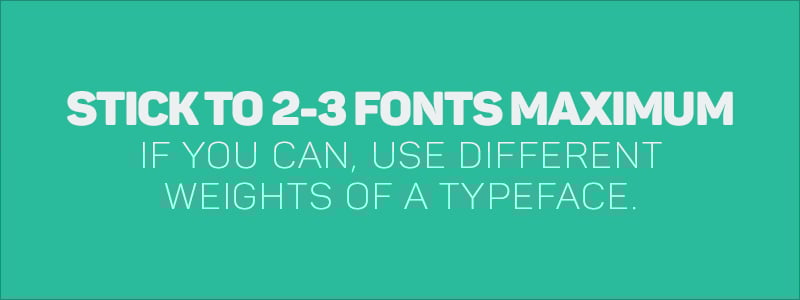
Non-designers also have a tendency to overdo it by combining too many fonts. This tends to give the design a disorganized and unprofessional look.

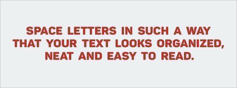
Most non-designers won’t give a second thought to the spacing between letters--called kerning--but it can make a big difference in how your project looks.
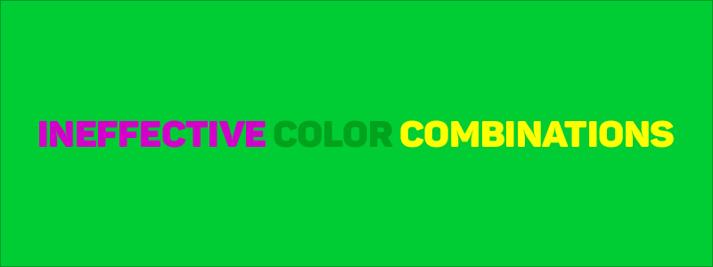
One of the single most important design decisions you will make in the creation of your project is your choice of color combinations. Many times, a project with good communicative potential can go awry if the right colors are not chosen. For inspiration, you can consult this tool.

A sure sign of an amateur designer is the lack of white space (or negative space) in a visual design. But instead of looking at white space as empty space, consider it like any other important element of design. A good example is the Google website. You're never roaming around, wondering where the search bar is.


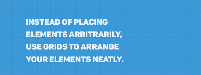
One way to create order and symmetry in your design is to properly align elements. A lack of alignment can lead to a product that looks messy and disorganized.

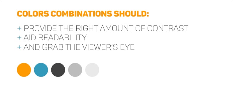
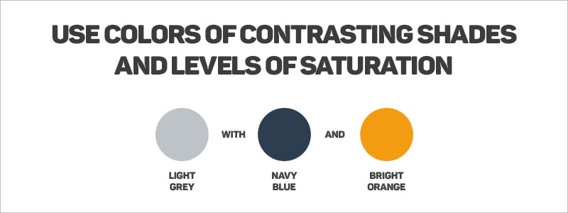
Another common problem is not using contrast effectively within a design. Not knowing how to use contrast effectively can mean the difference between an effective design and an ineffective one. The example below uses a light color, a dark color, and a bright color.

Non-designers are also at times reluctant to use large and small scale. But they shouldn’t be. When this is done, it is important to make sure that the elements are not stretched in ways that were not intended so that they do not become distorted.
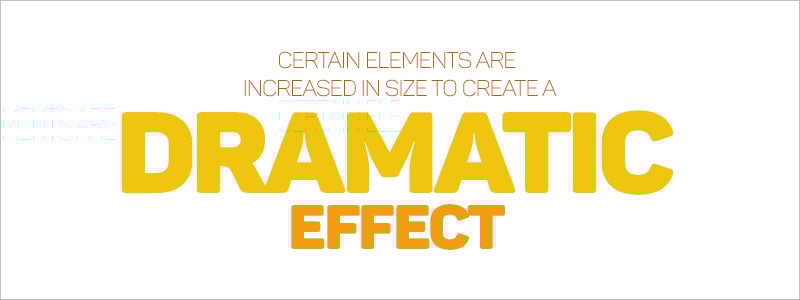

An important principle of graphic design is visual hierarchy. It communicates to the viewer the importance of each element in relation to the rest.
For example, in the design below, the largest text is the most important message, followed by the subtitle and then the body text.


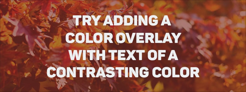
The goal of good design is not just to be aesthetically pleasing, but to effectively communicate a message. In line with this, text should not only fulfill design goals, but also be easy to read. Placement of text as well as contrast between text and background is important

Knowing how to pair fonts is another crucial skill a non-designer should strive to learn. Like all other design elements, correctly paired fonts communicate a message all on their own.
For example, there are fonts that communicate elegance and formality, while others have more of an approachable and lighthearted look.

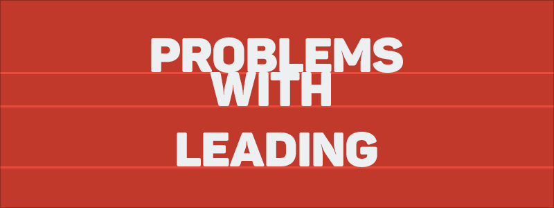
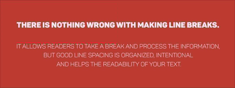
Leading is the spacing between lines of text. As seen in the examples below, having too much space between lines can cause your text to appear disjointed, while having too little space can make the blocks appear too tight and crowded.
Non-designers often make the mistake of using raster images instead of vectors. While the former is made up of pixels and become blurry when enlarged, the latter is made up of geometric lines and curves, so they can be scaled to any size and still appear crisp. If you are worried about your design getting pixelated, a good rule of thumb is to make your design bigger than it needs to be. If you start at a high resolution and scale down, the images will still be crisp. You can always reduce resolution, but you can never increase it.


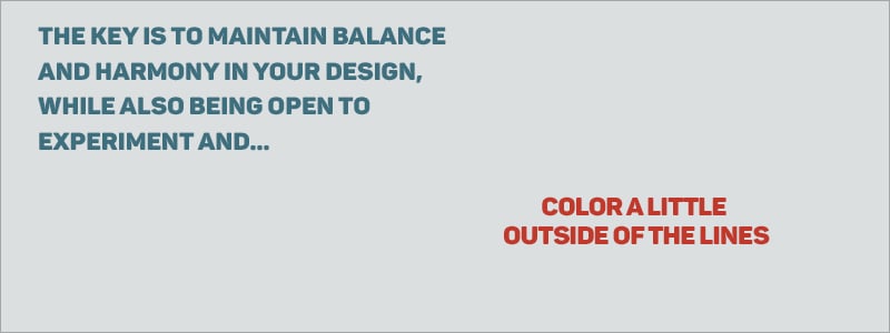
Another common misstep is to try and make a design look too perfect and symmetric. The use of absolute symmetry can make a design appear boring, while trying something not so symmetrical can produce a more eye-catching design.

Designers and non-designers are both guilty of this. Many times, we can get so caught up in creating a design that appeals to our own tastes and aesthetic preferences that we forget about the client’s needs and, worst of all, about the content and how it should serve its audience.


Although it is advisable to look for inspiration in others’ creations, it is definitely not okay to copy someone else’s work and pass it off as your own.
This will not only hurt your credibility in the end, it will also limit the reach and impact of your message.
Also, steer clear of cliches and overused design elements like the ones found here.


Another important factor which is often overlooked is the medium in which your design will appear. Whether it will it be published online, in a book or a magazine can make a big difference in the way you go about creating your design.
For example, if your artwork will appear in a bound book, you must account for the space between the two pages, which is called a gutter. Before you lay out your ideas, make sure to avoid placing any important design elements over this space since they will get lost in the binding process.
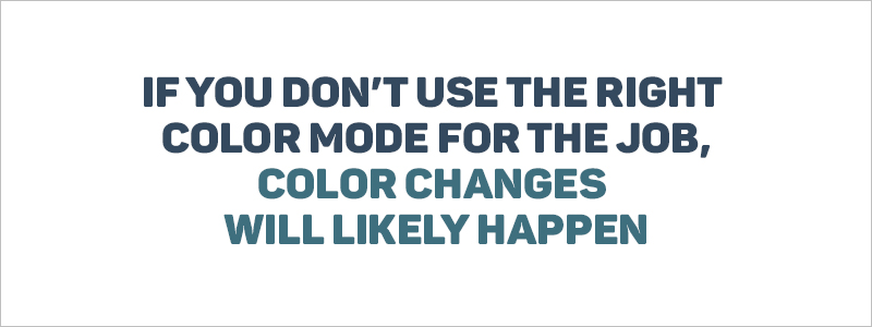
Also, if you need to print your design be sure to change to CMYK color mode, not RGB, which is the color mode for projects displayed on mobile devices and computer screens.

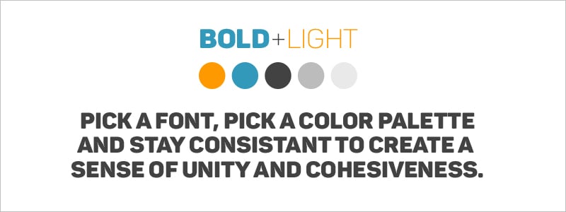
Another mistake you should steer clear of is the lack of consistency and repetition in your designs. For example, you should use some of the same visual elements (such as image filters or types of buttons) and layouts throughout your project.
But remember not to overdo it. You also don’t want each page to look too similar to the rest.

Now that you’ve read about some of the most common mistakes made by non-designers, you can watch Payman Taei explain them in the video above.
And if you want to receive additional tips on becoming a better visual communicator, don’t forget to sign up for our weekly newsletter below.
Design visual brand experiences for your business whether you are a seasoned designer or a total novice.
Try Visme for free

About the Author
Nayomi Chibana is a journalist and writer for Visme’s Visual Learning Center. Besides researching trends in visual communication and next-generation storytelling, she’s passionate about data-driven content.