


How to Make an Interactive Infographic [+Templates]

Written by:
Nayomi Chibana

Whether you're a marketer, entrepreneur, writer or educator, odds are that you're itching to create some awesome visual content--something that will really impress your audience--but just don't know where to begin.
You're not alone.
Like you, many non-designers nowadays find themselves in the same predicament: full of ideas worth listening to but lacking the know-how to visualize them in a way that will really captivate readers, even in the midst of a crowded web.
To help you properly translate your ideas into visuals so that you can extend their reach and lifespan on the web, we've created a short tutorial for beginners on how to create a simple infographic with Visme.
All you have to do is follow these simple step-by-step instructions, and you'll be on your way to creating visual messages that will impact your audience more than text-based content alone.
If you don't already have a Visme account, create one simply by entering your name, email address and password. Next, click on the "Create New Visme" button on the top left corner of your screen and name your new project. Then, choose the Infographics option to view all the available templates:

One of the most convenient and time-saving features Visme offers is the ability to choose from a variety of professionally designed templates. Whether you're looking to visualize a financial report or breathe life into a useful but simple text-based article, there are many options to choose from, each with a different style and purpose.
For this tutorial, we've chosen a simple template to start with:

As you can see, this is a list-based infographic, which is mostly comprised of text and a few icons. If you're looking for something a bit more eye-catching in terms of visuals, don't worry. We'll show you how to add a few more visual elements to this basic template, if needed.
Depending on your situation, this second step may come before or after the first. Some start by creating an outline of their infographic before they choose a template; others prefer to pick a template they like and then work from there. It's up to you.
This step ensures that you don't veer off track in the middle of creating your infographic.
In order to create an outline of your topic, ask yourself a few questions:
Your outline should address each of these questions and help you reach your goals.
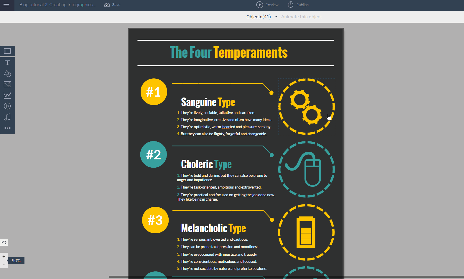
In this case, we decided to make a infographic on a light-hearted topic that would be of interest to most people: the four personality temperaments. We decided that its purpose would be to help people in a general audience get to know themselves better:

Next, you want to start modifying the most basic level of your infographic message: your textual content. All you have to do is click on the headline and start typing in your infographic title.

Since your headline is the first thing that your audience will read, make sure that it grabs the reader's attention and that it accurately summarizes what's in your infographic.
(An important note: If you want to use the template color scheme, be careful to click at the start of each word with a different color and replace each individually, instead of inserting the entire headline at once. This will ensure that you don't inadvertently make your headline a single color.)
Then, you can insert each of the subheaders and add your own content to each of the numbered lists. Since your goal is to visualize text-heavy information, do your best to stick only to the most essential points.
The next step in building your infographic (starting from the most basic elements and moving outward to the external elements) is choosing the right icons to communicate your message.
As we've said many times before, an image or icon can say as much as a sentence or even a paragraph of words, if chosen correctly. One of the most common mistakes beginners make when creating their first infographic is keeping all or most of their textual content.
In this case, we want to summarize the concept of the four personality temperaments in such a way that people get a general idea in just a single glance. So, we decided to use outline versions of emoticons to represent each of the four temperaments.
To insert icons, simply click on the existing ones and delete them. Next, click on the Shapes & Icons button on the left and type in a keyword to search for the right icon. Click on the desired one and resize or change its color scheme if needed.
Make sure to choose icons that complement the tone and overall style of your infographic. They should pair nicely with fonts and the color scheme, which we will cover in the next steps.
Now, we can move on to modifying the external appearance of our infographic. One way to do this is by modifying the header and body fonts. These must be carefully chosen as they will define the mood of the entire piece. Are you going for a humorous infographic? Or are you going for a serious and professional tone? Choose a font that reflects these choices. Also, you want to pick a second body font that is simple and easy to read.

If you're pressed for time and the original template's color scheme conveys your message well, then you can leave it as is. If, however, you wish to change the color scheme, there are a few things you need to keep in mind.
Colors affect not only our mood, but the way we perceive a message by providing a nonverbal context to the written information. With this in mind, it's important to define your message (see step 2) and the emotions you want to trigger in your audience. (Consult our post on color psychology to determine the most appropriate color.)
Once you've determined the mood you want to create with your color scheme, you can choose a harmonious and eye-catching color scheme by consulting one of many online tools for generating color schemes, such as Adobe Color CC and Coolors. Just remember to not overdo it: Stick to two--max four--colors.
Next, you can modify the background and font colors by simply inserting the hex color codes generated by these tools into Visme's option for customizing color, as seen below:

Once you're satisfied with the overall look of your infographic, you're all set to publish your creation. You can either share a link to your infographic, embed it into your blog or site or download it as an image file or PDF. And voila! You've now created your first infographic.
Now, for those of you who want to go a bit further with their visual creation, there's also the option of adding more visual elements to this primarily text-based infographic.
In the case of our infographic on the four temperaments, you could keep the template's list-based format, but spice things up a bit by adding a few more visual elements, such as images and short videos, and making it interactive by adding a call to action in the form of a link to a quiz at the end.
To do this, you would have to first compartmentalize each section--which now includes a few more elements--so that the information is organized in bite-sized sections that are easy to digest.
Here, we show you how to add shapes that serve as section dividers (and even add a drop shadow to each):

Next, you can upload your own images and crop them as needed. Also, you can easily insert a relevant and informative video in each of the sections:

Finally, you can lead your viewers to a specific action by creating a call to action button at the bottom and linking it to an online quiz:

And here you have an interactive infographic that provides users with enough insightful information to fill a book in a limited amount of space:
So, how did it go with your first infographic? We would love to hear about your experiences, or if you have any questions or comments, just drop us a line in the comments section below!
Design visual brand experiences for your business whether you are a seasoned designer or a total novice.
Try Visme for free


About the Author
Nayomi Chibana is a journalist and writer for Visme’s Visual Learning Center. Besides researching trends in visual communication and next-generation storytelling, she’s passionate about data-driven content.