


How to Make an Interactive Infographic [+Templates]


Written by:
Masooma Memon

Do you know what can prevent your infographic from becoming a success other than poor design? Wordy infographic copy.
In such a case, design might do a stellar first job of catching your reader’s attention. But long copy that clutters your design is going to do the exact opposite: repel readers.
Why? Because it threatens the infographic’s readability.
So, it makes sense to ask how to write an infographic that not only grips readers, but also gets your message across easily and effectively.
And to answer that for you, we have put together this guide that shares six simple steps to writing infographic copy that’s easy to understand and helps you create a winning infographic design.
Let's dig in.
Want to create an infographic for free? Use our infographic maker to create one in minutes. Use stunning infographic templates, drag-and-drop editing tools, branding features, built-in graphic assets and more.
Here’s a short selection of 8 easy-to-edit infographic templates you can edit, share and download with Visme. View more templates below:


Before you dive into writing an infographic, it’s essential you understand the purpose of the copy. This helps you inform your writing, refining it to its best.
Mainly, infographic copy is responsible for:
Since the infographic copy’s job is chiefly a supplementary one, it’s crucial to bear in mind that you don’t need long, wordy sentences.
You’ll also want to make sure your copy is easy to understand. Simple words and short sentences will help with that.
With that, let’s walk you through the steps you need to take:
The objectives of your infographic copy depend on two things:
Let's look at each one in more detail.
Essentially, there are several types of infographics — each with a different objective.
For example, a how-to infographic tends to dive into explaining steps on the topic it covers. Similarly, a timeline infographic highlights the different timestamps in a process or subject history.
Since these infographic types serve different objectives, their designs also tend to be different. By extension, each infographic’s copy requirements are also different.
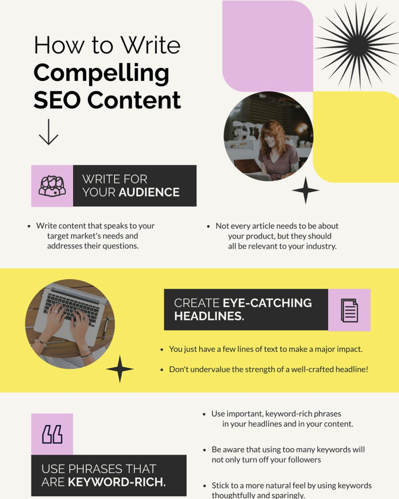
Take this template from Visme’s pool of infographic templates, for instance. It’s focused on very little copy.

On the other hand, this infographic template contains a little more copy than the other example:

This infographic, however, packs in a lot of written content:

So, you need to be aware of your infographic type and what you’re trying to achieve with your infographic before you work on its copy.
You also need to consider the infographic’s design.
Remember: The answer to whether the infographic design comes first or the copy depends on your workflow and preference. Whatever the case may be, it’s always helpful to have a rough design sketch ready so you can write copy to complement the design.
The design plays a critical role in informing your infographic copy. For example, the copy you need for a flowchart infographic is always going to be different than one for a comparison infographic.
Several infographic designs also have enough space to share content in bullet points such as this one:

So, keep all of this in mind before starting to pen your infographic copy.

Another thing to do before you sit to draft your infographic copy: get your brand voice guidelines.
This is essential so that your writing is consistent with your brand voice. After all, you don’t want to be humorous in your infographic if your brand voice is a friendly professional one.
You’ll also want to figure out the infographic content’s font size. This will help you understand if you need to cut your copy short and where you need to plan line breaks.
Ideally, you can do this best by adding your copy to the infographic when it’s ready. Then, edit it on the spot if needed to accommodate for line breaks and whitespace.
Every infographic starts with a headline so that’s where you should start when addressing how to write an infographic.
The best infographic headlines are:
The goal? To entice readers to read by answering the classic question they have in mind: what’s in it for me.
Use your headline to throw light on what the infographic content is going to cover and what’s unique about it.
For example, you could be sharing remote work tips (the subject) that can boost productivity in minutes (the unique value proposition). Together, the subject and value proposition, tell the reader why they should read.
So how do you write an attention-grabbing infographic headline? You write a handful of them so you can pick the best option.
As you do so, keep the following tips in mind:
Still unsure how to write your infographic’s headline? Use this template:
Number + Adjective + Noun + Keyword + Promise.
Example: 10 Ways You Can Save Money On Your Bills.
Most headlines in infographics are accompanied by a subheading or subtext.
This subheading is responsible for hooking readers further in. How? By setting their expectations and sharing a bit on the topic.
You can do this by asking a relevant question that exploits the reader’s pain point before giving them the solution. Or you can get creative and share an expert’s quote on the topic.
This infographic template, for example, does this best:
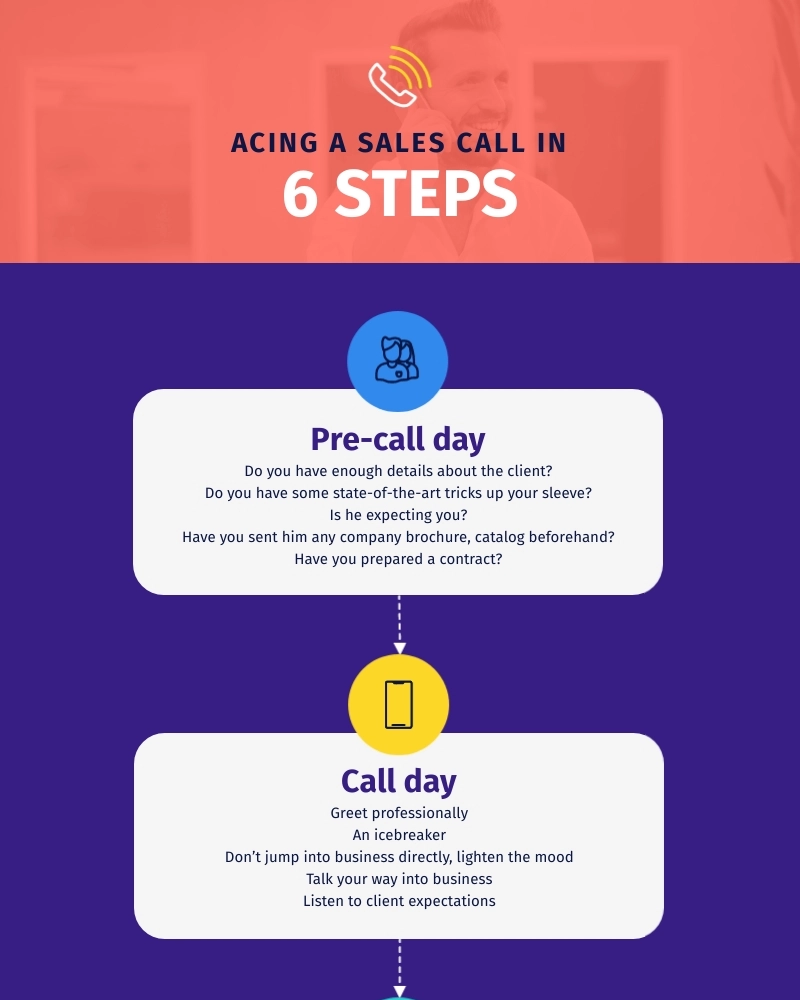
Some infographics don’t have a subheading at all. Case in point: this template that dives straight into the steps.

If you’re using this template or creating a similar infographic, you’ll need to work on descriptive, to-the-point subheadings for each step included in the process.
In short, go back to your infographic design to see whether you need one leading subheading or multiple, steps-introducing subheadings or both.
Exact copy requirements depend on the type of infographic you’re creating.
Here’s a brief rundown of each type and how to write infographic copy for it:
Finally, it’s important you gather all sources you’ve sourced your content from.
For example, if it’s a number-based, statistical infographic, you should share all the original sources for the stats in the infographic’s footer.
Ideally, it’s best you save these sources with yourself as you use them. This way, you can save your time and wouldn’t need to go hunting for the sources again.
Now before we wrap this guide on how to write an infographic, let’s leave you with some expert copywriting tips to take your infographics to the next level:

These are emotion-triggering words that encourage people to read, download or whatever action you want them to take. Use them in your headlines to push people to read.
Example: ‘5 ridiculously simple tips to write better blog posts’ where ‘ridiculously simple’ are power words that make readers want to read the tips.
These are words you rely on so nobody can tell you what words these are but yourself.
So how do you identify them? As you edit your infographic copy, look for words that repeat a lot in the text. These could be anything from ‘because’ to ‘literally.’
Your crutch words show up in all content you write. Infographics are no exception so make sure you sweep them clean of these words.
Two things help here.
One: Get rid of anything that’s repetitive. If you can’t identify redundancy yourself, run your copy through Grammarly and let the tool highlight repetition for you.
Two: Review each sentence individually. See if there’s a word or two that you can remove from it without changing the sentence’s overall meaning.
This is easier said than done. But there’s one surefire way to do this: rewrite your infographic copy.
You might not need to rewrite the entire copy. Fixing some particularly long sentences by rewriting them can work wonders for your overall copy.
Keep in mind: rewriting helps you frame your ideas/content in fewer words. Aim to prune sentences down to their absolute must — no extra words or adverbs.
Weak words don’t convey meaning as powerfully (and succinctly) as strong verbs do. They also don’t trigger readers’ imagination as best as strong verbs can.
By choosing strong verbs, you can also get rid of adverbs or words that end with ‘-ly’ such as ‘quickly.’
Example: Instead of ‘looking forward’ write ‘anticipated’ — see how the latter uses one word.
Removing these words would make no difference to a sentence’s meaning. You can either completely get rid of them or shorten them.
For example, get rid of filler words like ‘really,’ and ‘a lot.’ Similarly, replace words such as ‘in order to’ with ‘to’ for a tighter infographic copy.
Since infographics feature short-form copy, typos and grammar mistakes can stand out easily.
So, it’s best to proofread at least twice — once when you’ve completed your infographic and again when you’ve pasted the copy in your infographic.
Now that you have the answer to how to write an infographic, we’re sure you’re feeling pumped up to write your copy and create an engaging infographic that your audience loves.
Remember: be clear about your infographic’s objectives and the design you’ve chosen to meet those objectives before you draft your copy.
Stuck with creating your infographic design? Sign up for Visme's infographic maker for free and create visually engaging infographics in minutes using ready-made templates, drag-and-drop tools, built-in icons and graphics, branding features and more.
Design visual brand experiences for your business whether you are a seasoned designer or a total novice.
Try Visme for free


About the Author
Masooma Memon is a pizza-loving freelance writer by day and a novel nerd by night. She crafts research-backed, actionable blog posts for SaaS and marketing brands who aim to employ quality content to educate and engage with their audience.