


Ecommerce Email Marketing Guide: Best Strategies, Tools & Emails to Use

Written by:
Nayomi Chibana

It's 2016 and most of us are hoping for the best year of our lives. Perhaps that means moving into a whole new phase in life, being a better person, finding your true passion or building meaningful relationships.
Whatever the case, there's always a need for a little extra inspiration and motivation, either from friends and family or some of the greatest leaders and thinkers of our time.
To help you start the new year off on the right foot, we've compiled a list of 15 inspirational quotes that are sure to blow some wind into your sails and lead you in the right direction.
And for those who would like to create their own memes and share them with their social networks, we've also included some useful font pairing and color scheme tips for creating eye-catching designs.
Tip #1: Choose the Right Image
Tip #2: Choose the Right Fonts
Tip #4: Evoke Past Experiences
Tip #9: Evoke the Right Emotions
Tip #10: Send the Right Message
Tip #11: Add Text to the Background
Tip #13: Avoid Overused Stock Images
Tip #14: Use Contrasting Colors
Tip #15: Experiment With Text Placement

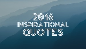
Well-chosen images speak volumes all on their own. The one above, for example, perfectly conveys the notions of repetitiveness and tunnel vision--two things we could do without in 2016.
We also chose an elegant serif font, Jacques Francois, to properly convey the wisdom of this inspirational quote and paired it with a stylish and clean font, Hattori Hanzo.

One of the keys to creating a branded image with an inspirational quote is to pair the right fonts. In the example above, we decided to use Oswald, a timeless but modern-looking and bold font, with a more traditional, serif typeface, Old Standard TT.
The boldness of the first font, along with the background image, sends a message of determination and resolution--just what we all need to reach our goals in this new year. The second font is often associated with tradition and authority, so it aptly conveys the notions associated with a prominent figure like Margaret Thatcher.

Here, we chose an image that gives viewers a unique perspective on life and empowers them to create their own future. We used Yellowtail, an old-school script typeface that is also very legible, with the contrasting serif font, Rokkit.

Another key to evoking the right emotions with your branded memes is to use images that bring to mind relatable experiences. Like the person in the image above, we are all headed somewhere, trying out new things and meeting new people. In this example, we used a common font combination: Helvetica with Georgia.

An important rule to follow when creating shareable memes is to ensure that the text is readable. One way to do this is to place text inside shapes and frames to make it stand out against the background image.
In the example above, we've used rectangles--although you can use any shape, depending on your design needs--with a degree of transparency, to let the image show through for a softer feel, and colors that provide contrast in relation to the text.
To provide a sense of casual liveliness and friendliness, we used the font combination Dancing Script with Lato.

To increase brand awareness, you can place your logo in one of the corners of your branded image so that it doesn't compete with the central message of your meme. For this meme, we paired Source Sans Pro with Fjord, both found in Visme.

Another way to make your inspirational quote stand out in your audience's feeds is to use original, eye-catching images with a unique element. The meme above, for example, is primarily black and white with a dash of color. Here, we paired Vollkorn with Montserrat.

As any good communicator will tell you, the key to crafting a message that resonates with your audience is to trigger memories that are common to a wide audience.
Most readers will see this inspirational image and relate it to good times with good friends. This enhances the truth behind these famous words and motivates viewers to not only commit to memory, but share it with their peers.
We used a fun-loving font, Pacifico, with the clean and sleek Josefin Sans.

Besides triggering memories, you also want to evoke the right emotions in your audience.
In this meme, the unique perspective offered by the photo makes viewers literally feel the sinking sensation of being confronted with a daunting task or tough challenge ahead. Its central message, however, also motivates the reader to conquer their fears in this new year.
To give this inspirational quote a playful yet elegant touch, we used Black Jack with Montserrat.

Another good rule of thumb to follow is to make sure that the combined effect of your visual elements and their relative placement on the page send the right message.
In this branded quote, the image reinforces the text and, in this case, plays a crucial part in the interpretation of the final message. You could have just as easily interpreted it differently and chosen an image of a motivational speaker or a scientist at work in a lab.
For those who want to replicate this font combination, we used Trocchi with Dancing Script.

Another way to place text over images is to position the lettering in portions of the photograph that are less busy, such as the background. Also, you should follow the visual flow of the image. For example, if the person in the image is looking toward the center of the image, then the text should be positioned there.
In this branded image, Grand Hotel was combined with Caviar Dreams.

A technique which can be used in any type of communication is the use symbolism to drive a message home.
Here, for example, the iconic image of the lion--often associated with dominance and confidence--is aptly used to convey the thought that whatever we believe about ourselves is what we eventually become.
This boldness is also conveyed with the selection of Oswald, combined with Montserrat.

If you want to catch your audience's attention, stay away from overused stock photos.
In this branded meme, for example, the common image of the light bulb--used to represent ideas--is here depicted with a slightly different hue and tone than is frequently seen, giving it a softer look that evokes a specific mood.
In this case, Desyrel was combined with Oswald.

This is a simple rule of combining text with images, but you should always try to use a text color that creates high contrast with the colors of the background image. Here, for example, the vibrant green in the background contrasts with the white text.
To give this a playful mood, we combined Pacifico with Montserrat.

Lastly, it is important to remember that your inspirational quotes don't always have to appear in the same place: at the center of the image. You can play around with text placement and position the lettering to the left, right, top or the bottom, depending on the image you use.
For this image, we went with a bookish font to reinforce the image: Trocchi, combined with Josefin Sans.
Have an inspirational quote that you love? Take advantage of Visme's quote maker to create a stunning graphic to share with your audience, or to print and post in your home or office.
Design visual brand experiences for your business whether you are a seasoned designer or a total novice.
Try Visme for free
![Top Social Selling Tools You Should Use [+ Examples]](https://visme.co/blog/wp-content/uploads/2023/09/Social-Selling-Tools-and-Examples-Thumbnail-500x280.jpg)

About the Author
Nayomi Chibana is a journalist and writer for Visme’s Visual Learning Center. Besides researching trends in visual communication and next-generation storytelling, she’s passionate about data-driven content.