


How to Make an Interactive Infographic [+Templates]

Written by:
Samantha Lile

Infographics have been around since the first humans started scratching symbols in the dirt, and they’re just as influential today. The continuity makes sense. We are, after all, visually wired. An astonishing half of the human brain is involved with visual processing, and 70 percent of its sensory receptors are in the eyes.
With each passing day, we’re exposed to increased amounts of information. The average person is exposed to five times as much information today compared to 1986. As our brains adapt to process more information, the infographic's efficiency at quickly and clearly conveying a message becomes more vital to communication.
It's no wonder the use of infographics in literature has increased by more than 400 percent since 1990. Likewise, the use of infographics on the Internet -- where users are barraged with a constant stream of changing information -- has grown by nearly 1000 percent since 2007.
Infographics may be prevalent, but they aren’t all created equal. Some infographics reflect passing trends, while others hold a lasting influence over our world. Following are 12 of the all-time most influential and interesting infographics that changed the world:
RELATED: The Best Infographics of 2016 (And What You Can Learn From Them)
Not only is it one of the world’s all-time most influential infographics, but Dmitri Mendeleev’s Periodic Table of the Elements is without a doubt one of the most recognized. The table is much more than a simple chart. Mendeleev designed it so that its format alone provides plenty of information.
The classic “castle with turrets” periodic table illustrates properties of the elements, as well as how they interact with one another. Elements included in each column share characteristics such as metals and inert gases. Placement also indicates an element’s electron configuration, size, weight and electronegativity.
The table’s format even helped scientists predict the existence of new elements not yet discovered when the table was initially created. And despite a host of element discoveries since 1869, Mendeleev’s design remained accurate.

It’s hard for us in the 21st century to truly grasp the desperation of escaping communicable disease. But even doctors of the past failed to understand how disease spread and how to prevent contagions. In the 19th century, even scientists commonly believed diseases such as cholera and typhoid were caused by “bad air.”
British physician John Snow helped improve global health conditions with a simple infographic. When Snow mapped cholera deaths throughout London in 1854, it finally became apparent that at least one deadly disease was linked to contaminated water. According to Snow’s infographic, the vast majority of cholera deaths could be linked back to a single water pump.
It was later discovered that the water had become contaminated by a baby’s diaper. The map ultimately helped shape how disease was viewed and treated worldwide.

Snow wasn’t the only innovator whose interesting infographic advanced medicine in the 19th century. British nurse Florence Nightingale’s excellent record keeping helped her chart disease in Crimean War military hospitals.
Nightingale even published an 1859 paper, A Contribution to the Sanitary History of the British Army during the Late War with Russia, which included an assortment of data and charts based on her records. The most influential of those infographics illustrated the impact of three causes of death: preventable diseases, battle wounds and all other causes.
Nightingale’s charts not only illustrated that many military deaths could be prevented by providing more sanitary conditions, but precisely how much those deaths could be reduced by more acceptable conditions.

Maps are one of the earliest types of infographics, and cartographer Henricus Martellus changed the entire course of world history with his influential map. Hailing from Germany but living in Italy when he drafted his world map, Martellus couldn’t have known the impact his work would have on global events.
It was Martellus’ map that Christopher Columbus used to persuade Spain’s King Ferdinand and Queen Isabella to support his journey across the Atlantic. Martellus’ map may not have been very accurate by today’s standards, but those inaccuracies actually helped Columbus in his argument that Europe was fairly close to China when travelling west across the ocean. It was also the first map to illustrate the Cape of Good Hope and the absence of a southern land link to China.
One of America’s most historical infographics depicts one of its greatest social issues. In 1860, the U.S. Coast Survey department drafted a map that heavily influenced the course of the Civil War. Based on data from the 1860 census, the map illustrated the distribution of slavery. Each county was shaded to reflect its slave population. The darker the county was shaded on the map, the more slaves held there.
By examining the map, Union military leaders could see the range of slavery’s prevalence across the south. While some areas’ populations consisted of as little as 2 percent enslaved, others could hold more than 90 percent of their dwellers in bondage. They correctly deduced that residents of areas with smaller slave populations would fight less ferociously for the Confederacy, and they used that knowledge in forming their military strategy.
Even President Lincoln often consulted the map, studying it to understand the impact emancipation might have on Union troops.
Much of the world first heard of the global warming phenomena in 1990 with the publication of the Intergovernmental Panel on Climate Change’s first assessment report. Formed in 1988 by a United Nations resolution, the IPCC was tasked with providing the world with an objective, scientific view of climate change, as well as its political and economic impacts.
In its landmark 1990 report, the IPCC determined that emissions from human activities were enhancing the greenhouse effect and causing an unnatural warming of the Earth’s surface. A concept we all now know all too well, the panel’s findings were ideas most had never given much consideration.
The report may have made much less an impact without some pretty convincing infographics. The 400-plus pages were full of data and formulas that might mean something to the scientists who wrote the report, but may as well be written in Greek to the average reader. A graph illustrating skyrocketing temperatures over the coming century, however, is something that grabs hold of anyone’s attention. Suddenly, global warming was a topic of concern worldwide.
The IPCC has published four additional assessment reports over the past 27 years, as well as a number of special reports, each reflecting new research and understanding of climate change. With each publication comes additional infographics, furthering our understanding of global warming and its impact on society.
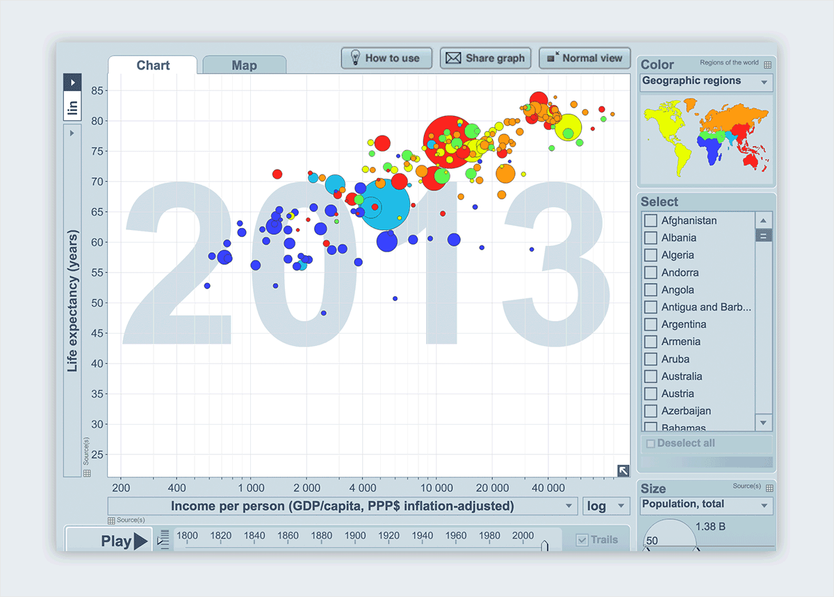
Landmark infographics aren’t merely a part of our past. Swedish statistician Hans Rosling made history in 2007 in a TED talk in which he shared his own data visualizations. His Gapminder design illustrates the relationship between life expectancy and income, based on Rosling’s more-than-30 years of research.
What set Rosling’s infographic apart? He presented global health and poverty trends through animated statistics that truly took the world by storm. What would normally be a set of blasé figures transformed into a stunning combination of animated data-based graphs and theatrical presentations.
Millions viewed Rosling’s talk, which not only helped change the public’s perception of health and poverty, but took data presentation to new heights. Rosling didn’t stop with animated graphics, he also presented statistics with boxes, blocks, toys and even washing machines. Trendalyzer, the data visualization software Rosling developed and used to create the interesting infographics in his TED talk, was soon purchased by Google.
Transit cartographers of the early 20th century faced several challenges when drafting maps of underground transit routes. Designers needed to represent an assortment of lines owned by multiple companies that criss-crossed an entire city from downtown to the outskirts – and it all needed to fit on a map that could be folded up for individual distribution.
It took a technical draughtsman accustomed to diagramming circuits to create the perfect transit infographic, one that has set the standard since its initial 1931 publication. Harry Beck mapped the London Underground with a tube diagram that is used in a modified version to the present day.
Instead of a map emphasizing distance and geographical accuracy, Beck’s design consisted entirely of colored, criss-crossing lines marked by labeled stops. The London Underground’s publicity department initially rejected Beck’s design, which he based on the circuit diagrams he drew at his day job, but a trial-run soon revealed the infographic was exactly what the public wanted.
Protesters flooded Hong Kong’s Civic Square in 2014, challenging China’s electorate system, hoping to cause economic interruptions, pushing the government to coalesce and grant universal suffrage. The Occupy Central movement lasted about three months, but ultimately the Chinese government made no concessions.
The movement may have failed for a variety of reasons, but a series of powerful infographics were certainly a contributor. Broadcast by Chinese state television, the series of infographics, Hong Kong “Occupy Central” Ten Questions, featured unflattering cartoon images of protestors and plenty of criticism of the movement. The infographics criticized the Occupy Central movement for its Western influences, which the creator labeled “foreign forces” amid accusations of espionage.
While the protests began in September with riots, tear gas and arrests, after the interesting infographics were released and support of the movement lagged, it quieted before ending entirely in December without resistance.
Tension between the United States and the Soviet Union escalated in the early days of the Cold War. American hysteria reached a peak in the late 1940s and early 1950s, in an era now known as the Red Scare. Infographics, such as Fortune’s “Red Star Rising,” published in 1946, played a role in fostering a climate of fear.
Colorful maps and timelines illustrated the fears of many Americans – that communism would continue to spread across the globe, swallowing up once proud nations along the way.
For almost 20 years, Microsoft founder and world-renowned philanthropist Bill Gates has helped fight malaria, a disease that kills a million children a year. Gates began donating millions to the cause through his foundation. But in 2014 he made a different type of contribution.
Gates helped progress public understanding of the issue by publishing an influential infographic to his blog. The design clearly illustrated the world’s deadliest animals, and the list filled with predators such as sharks, lions and crocodiles is topped by none other than the mighty mosquito.
“Despite their innocuous-sounding name—Spanish for “little fly”—they carry devastating diseases,” Gates wrote of mosquitos. “The worst is malaria, which kills more than 600,000 people every year; another 200 million cases incapacitate people for days at a time. It threatens half of the world’s population and causes billions of dollars in lost productivity.”
The surprising conclusion of Gate’s infographic made plenty of headlines, which enhanced the illustration’s impact, further spreading the message among the populace.
The Centers for Disease Control and Prevention are constantly publishing data in support of vaccinations. And no matter what the numbers say, there is still a group who believe vaccines cause more harm than good. But infographics such as this one by New York graphic designer Leon Farrant are helping to cut through the rhetoric and drive the message home.
Farrant’s infographic compares past morbidity of once common infectious diseases with current rates. The design clearly illustrates the eradication of smallpox, polio and diphtheria in the United States and near-elimination of maladies such as measles, mumps and rubella.
Which of these is your favorite infographic? Did I miss an influential or interesting infographic you'd like to see featured here? Let me know in the comments section below!
And if you want to learn all our secrets on how to create an effective infographic (from how to write content for your visual to the design process), grab our free e-book below.

Design visual brand experiences for your business whether you are a seasoned designer or a total novice.
Try Visme for free


About the Author
Samantha Lile is a web content creator with a journalism and mass media degree from Missouri State University. She contributes news and feature articles to various web publications, such as the Huffington Post. Currently, she resides in the beautiful Ozarks with her husband, four dogs and two cats.