


How to Add Text to a Photo on iPhone Using Markup & Visme
Written by:
Samantha Lile
What makes one brand succeed while another fails? Obviously, the quality of the product, customer service and availability are all important factors in any company’s success. But if all of the above are equal, what sets a business apart in the vast sea of competition?
An effective logo can sometimes make the difference between a brand’s wild success or abysmal failure. Consider some of the world’s most lasting brands. They employ logos that are not only distinctive and eye-catching, but also meaningful and memorable.
“A logo is a flag, a signature, an escutcheon, a street sign. A logo does not sell (directly), it identifies,” world-renowned designer Paul Rand wrote. “A logo is rarely a description of a business. A logo derives meaning from the quality of the thing it symbolizes, not the other way around.”
So how can you know if your logo design is a keeper? Ask yourself if it reflects the qualities described in these logo design tips, summarized in this infographic we created with Visme.
Embed on your site:
<script src="//my.visme.co/visme.js"></script><div class="visme_d" data-url="4doo47p9-15-surefire-ways-to-know-if-your-logo-is-a-keeper" data-w="800" data-h="4599"></div><p style="font-family: Arial; font-size: 10px; color: #333333" >Created using <a href="http://www.visme.co/make-infographics" target="_blank" style="color: #30a0ea"><strong>Visme</strong></a>. An easy-to-use Infographic Maker.</p>
When designing a logo, ask yourself what meaning or message it should communicate.
A logo is more than a mere image. It’s the public face of a brand. Before even beginning a design, it’s vital to consider what the brand offers and to whom. Should it be represented by a particular emotion or specific utility?
An effective logo doesn’t have to portray a company’s product, and most don’t. Nowhere in McDonald’s famous golden arches is there a hamburger. And Nike doesn’t sell “swooshes.” But each represents the brand through a combination of shape, color and symbolism.
When it comes to effectively conveying a brand’s message, simple logos are more recognizable and memorable. Sometimes designers try to communicate too much, creating a design too complex for audiences to decipher.
Consider a billboard that audiences might drive past at 70 miles per hour, or a magazine ad that is only seen while flipping through pages. A complicated design will be nothing but a barely-noticeable blur. Some of the world’s most famous logos consist of one simple shape.
Think again of Nike’s famous “swoosh,” or Apple’s bitten-into apple. The basic shapes are immediately associated with the brands they represent. Would a complex design featuring running shoes or computer circuits be nearly as recognizable?
Brands are often distinguished from their competitors by their logos. A glass of Pepsi looks pretty much the same as a glass of Coke. Some people can’t tell the colas apart in a taste test, even. But each has a distinctive logo that could never be confused with the other.
When designing a logo that stands apart from the competition, it’s important to think outside the box. Neither Coke nor Pepsi feature the actual beverage in their logos. If every airline used an airplane in their logo designs, would anyone recognize one from the next?
Also, keep in mind that the shape of your logo is one of the most fundamental ways you can make your brand stand out from the crowd. If all your competitors have rectangular logos, then you might consider a shape other than rectangles to differentiate your logo design.
When designing a logo, it’s more important to consider what will speak to the target audience, rather than personal tastes. A conservative designer may prefer muted colors and block letters, but if the brand caters to a youthful, urban audience, bright colors and vivid fonts might be more appropriate.
Market research is vital for designers not already familiar with the brand and its primary customer base. What does the target customer care about, and in what ways does the brand hope to reach them?
Design trends come and go, but an effective logo stands the test of time. While the best designers keep abreast of the latest fads, they also realize the importance of not jumping on every bandwagon. After all, you don’t want your brand to be a passing trend.
Will your logo convey the same message in 10, 20 or 50 years? And will it still stand apart from the competition? If you find yourself borrowing heavily from the latest design trends, the answer is probably no.
If a logo is to universally represent a brand, it must be compatible with a variety of media. Effective logos don’t simply look good on a package or a store front. The same design must also be recognizable online, in print advertisements, on road signs and in video. While many logos are designed in full color, they should also be compatible with a black-and-white printing process.
Designers should think big when designing logos. Just because the design represents a small-scale brand now doesn’t mean that the company won’t explode in months or years down the road. Effective logos should be scalable so that they easily can be transformed between sizes and formats. Many designers accomplish this by designing their logos in a vector format.
Unless you’ve designed an ingenious vector with a one-of-a-kind and instantly-recognizable shape, your logo needs some sort of typography to describe your brand. But it’s vital to differentiate between logo type and a tagline, which is text featured under the design that describes a company’s mission. Too many words in a tagline requires small text that can be illegible in many sizes.
Instead, the most effective logos employ typography, whether it’s the business name, initials or some other descriptor. While popular logo designs often feature a customized typeface, designers can also choose a pre-set font, provided it’s simple and classic.
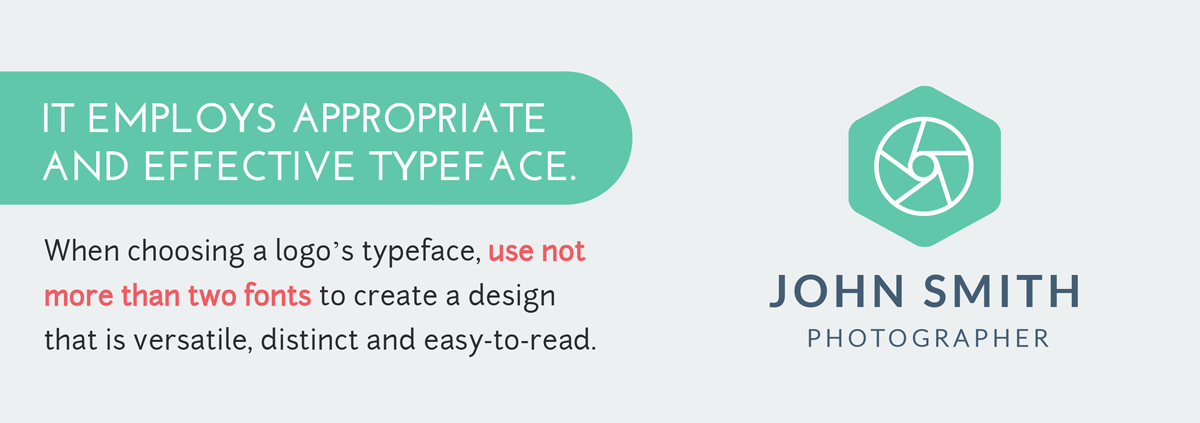
When choosing a logo’s typeface, don't use more than two fonts to create a design that is versatile, distinct and easy-to-read. Helvetica is one of the most commonly-used fonts in logo designs, as seen in popular brands such as Target, JC Penny and Crate & Barrel.
Some logos are completely font-based, such as Coca-Cola’s universally-recognized script. The style is popular a among Fortune 500 companies because of its simplicity and ease of reproduction, but it can also be difficult to achieve originality. Designers often tweak an existing font if they aren’t comfortable with creating their own typeface.
"If your company has a unique name, then you could get away with a logotype. But if you have a generic name, then you're going to need something to identify the company by, which can be achieved by using a logo mark," logo-design blogger Jacob Cass told Mashable.
Sometimes the most effective element of a logo is nothing at all. Designers use negative space to communicate aspects of their brand, such as FedEx. The logo is made up solely of the company’s name, but positioned in a way that the empty space subtly creates a hidden arrow.
Even if the space left in a logo isn’t sending a subliminal message, it’s still an important element of the design. Effective logos usually include an exclusion zone, the area surrounding the logo that isn’t filled with another element. Without the empty space, the logo could blend into whatever background in which it appears.
Movement is an important element of any design, including logos. In the case of illustrations, however, movement has nothing to do with animation or video. Instead, the use of varying sizes, placements and rotation within the design causes viewers’ eyes to move across the design.
One of the simplest ways to create movement, obviously, is through the use of arrows and other angles, or even lines. But clever designers know better than to rely on such cliches. Simply slanting text can create movement, as can the positioning of images. Twitter created movement in its logo by slanting the bird towards the sky, as if it were taking flight.
RELATED: 11 Rules of Composition for Non-Designers
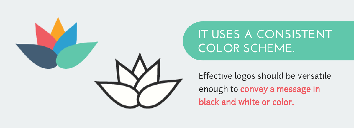
Effective logos should be versatile enough to convey a message in black and white or color. Therefore, if the design conveys its message through the use of color, try altering the contrast of various elements to retain the same meaning if presented in monotones.
While it’s important to consider the design’s impact in grayscale, color is a great way to express a brand’s personality or to target specific emotions within a target audience. In fact, entire books have been written on the science and psychology of colors. For example:
Still, even if multiple colors are chosen, it’s important to stick with a scheme that is consistent with color theory and the classic color wheel. Effective color combinations take into account each hue’s position on the color wheel, as well as warmth and contrast. Check out Visme’s tutorial on choosing impactful color schemes.
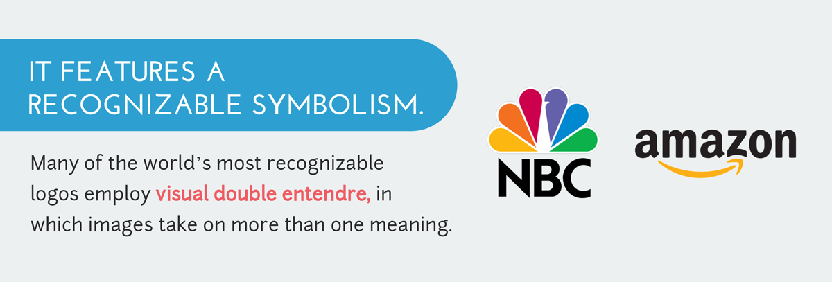
Many of the world’s most recognizable logos employ visual double entendre, in which images take on more than one meaning to convey a more powerful message.
Amazon, for example, uses a simple logo that consists of the company’s name. Pretty straightforward, right? But upon a closer look, the name is underlined with an arrow, that just happens to point from “a” to “z,” expressing that the retailer offers anything a buyer could want, from A to Z.

Just as colors can arouse specific emotions within audiences, shapes also carry powerful psychological forces. Whether a designer chooses straight lines, circles, curves or jagged edges, each conveys a different meaning.
For example, while round shapes – such as circles, ovals and curved lines – project positive emotional messages, femininity and endurance, angular shapes – including squares, triangles and other polygons – suggest power, stability and masculinity.
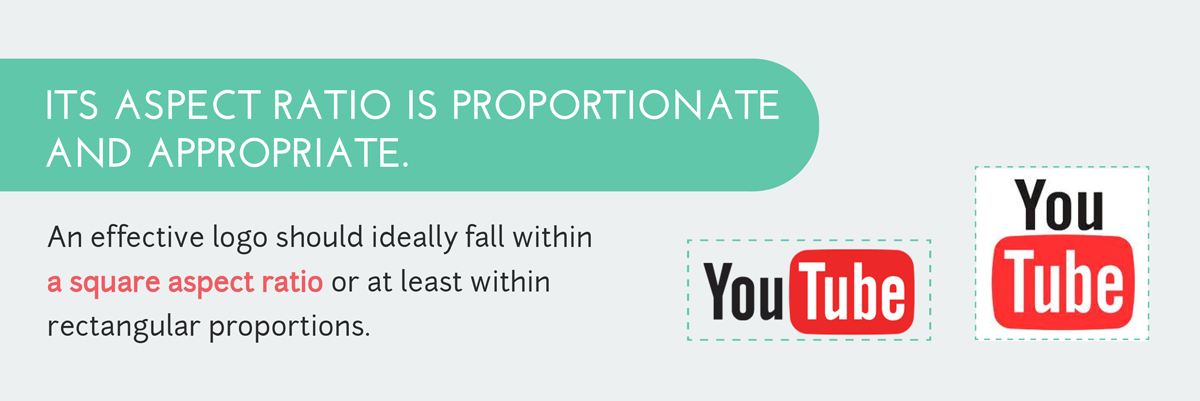
In any logo design, aspect ratio is key. Logos that are too tall and skinny are generally not visually pleasing, nor are those too wide and short. Plus, if the design’s width and height aren’t proportionate to each other, the logo can be difficult to use in many layouts and other illustrations. An effective logo should ideally fall within a square aspect ratio (including circles) or at least within rectangular proportions similar to a standard sheet of paper or a business card.
For a logo to be fully effective, it must be recognizable. Studies show that even toddlers can recognize many brands by their iconic logos. And all of the above elements are key in creating a recognizable design. But it’s also important to realize that many of the world’s most recognizable logos stand apart because their designers bucked tradition and thought outside the box.
One element that can definitely hinder recognition is change. Just as with any learning, repetition is key. The more audiences see a consistent logo, the more they recognize the brand. If it’s changed, the brand recognition can disappear with the original design, so once an effective design is determined, companies should think twice before changing it.
RELATED: How to Create Catchy Slogans and Taglines
Just as an effective logo must be recognizable, it should also be memorable. What makes it stand apart so that audiences will remember the design and associate it with a brand?
Oftentimes, a single unique element can make an image remain in viewers’ memories. Consider the Apple logo once again. There’s nothing memorable about the silhouette of a fruit. But by removing a bite from the shape, the brand created a logo that is associated with it and it alone.
What are some of your favorite logos? Do they employ the elements we’ve discussed? Tell us in the comments below!
Design visual brand experiences for your business whether you are a seasoned designer or a total novice.
Try Visme for free

About the Author
Samantha Lile is a web content creator with a journalism and mass media degree from Missouri State University. She contributes news and feature articles to various web publications, such as the Huffington Post. Currently, she resides in the beautiful Ozarks with her husband, four dogs and two cats.