


Ecommerce Email Marketing Guide: Best Strategies, Tools & Emails to Use

Written by:
Dave Carder

The emergence and continued growth of social media marketing has caused many organizations to put all their energies into these emerging platforms and, for some, email marketing has become an afterthought.
But did you know that 72% of people prefer to receive promotional information through email, compared to only 17% who prefer social media, according to MarketingSherpa.
If you have moved on from email marketing to strictly utilizing social media outlets, you might want to rethink this strategy. Not everyone is on Facebook, Twitter, and Instagram, but EVERYONE has an email address.
Since so many businesses and organizations are focused on social media marketing channels, you might also find that there is less competition for your message in your audience’s inbox then there is on their Facebook news feed.
This does not mean that you can just mail it in and expect solid results. Seth Godin coined the term “permission marketing” in 1999 in his book of the same title. He defined it this way:

To make the most of this unique privilege, here are 12 newsletter design tips you can keep in mind to create visually engaging messages your audience will look forward to reading and will keep you off the email blacklist.
RELATED: 3 Steps to Finding Your Unique Brand Voice
If you prefer watching to reading, be sure to check out the video version of this blog post as well:

The Pew Research Center reports that for the first time, more people own smartphones than a desktop or laptop and that people spend significantly more time on their mobile devices.
Most email design platforms now come with a wide array of mobile-optimized newsletter templates. It makes sense to consider how the layout will appear on the smallest screen your subscriber may be utilizing and begin with a mobile-first approach.
Single column designs and slightly larger fonts are a safe bet to make sure that people will be able to easily view the entire width of your message on any smartphone.
Tip: Make sure your template will send the email in both HTML and plain text in case the user’s device will only allow text.
Keep things clean and simple to avoid unnecessary distractions and hold your readers' attention from beginning to the end.
It can be helpful to begin by making a simple sketch of the general layout of the newsletter by using a newsletter template and then begin plugging in the necessary content elements as you refine your design.
You can find templates for entire newsletters or for single components, like your email header, call-to-action area and even email signature templates.
Here is a perfect example of how single-column design can facilitate easy scrolling on mobile devices. Try using HTML email templates as well to really perfect your newsletter design.
Tip: Evaluate and compare a number of different email marketing platforms. There are a wide variety of choices that allow non-technical users to easily populate and customize visually engaging templates.
With declining attention spans, it is essential that you carefully strategize not only the right content, but also how many different topics you want to introduce.
Many people receive various email newsletters almost every day of the week now. Think about your own inbox and the newsletters that you no longer read or have unsubscribed from.
What was the reason? Most likely it was because you did not find the information to be valuable on a consistent basis, the email was too difficult to quickly scan and read, or that it was sent too often.
RELATED: How to Build a Better Company Blog in 2017 [Research Report]
This promotional email from J. Crew uses a simple but creative layout to build suspense and entice the user to click on the call-to-action button for the promoted sale.
Tip: Use a theme to weave content together and include a “Read More” button when promoting blog content.
This design principle requires creating a sense of what is important to the reader through the use of position, size, color, contrast and shapes.
At a glance, it should be very obvious what elements are the most important and what you want the reader to focus on.
An effective use of font sizes and color are the easiest and most common ways designers can create a sense of importance within the body of an email.
Tip: Utilize the Squint Test to get a high-level view of the visual hierarchy of your design.
Effectively utilizing white space allows the brain to scan, interpret and break down elements into easily digestible pieces.
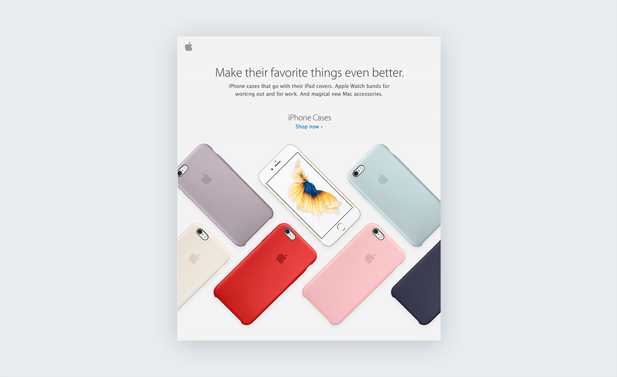
Apple has set the standard that so many brands have tried to reach when it comes to effective use of white space and a clean layout.
Less is more. Give your content room to breathe and make an impact on the reader. All beautiful design makes strategic use of negative space to emphasize certain parts of your content.
The first 2 to 3 inches on an email are the most critical real estate you have to gain the attention of the reader. The header, in particular, is your first opportunity to make a great impression.
Footers may not be the first thing a reader sees, but they should provide a solid visual bookend to the header of a newsletter and help frame the look and feel of the entire email. You can use an email template builder to achieve the right frame.
Be sure to include social media icons as well as an unsubscribe button and other elements that will make your message CAN-SPAM compliant.
Stat: According to a study by the Nielsen Group, readers can quickly scan and process newsletter content in an average of 51 seconds.

Plenty of research has been conducted on how different colors elicit certain feelings and emotions. Be very intentional with your choice of color schemes to create a message that resonates with your readers.
So, what do different colors mean in marketing? And what colors attract customers to buy?
In the west, there are certain cultural conventions that dictate which colors should be used for certain messages. For example, black has been traditionally associated with luxury and sophistication, while blue is often connected with the notions of integrity and tranquility.
Obviously, you want to utilize a color scheme that complements and reinforces your brand identity.
Tip: Establish a style guide to ensure the continuity of your message across all mediums.

So many fonts, so little time. It's easy to become paralyzed by indecision when searching for the perfect font among the thousands that are available online.
Designer-turned-author David Kadavy does a fantastic job of simplifying this topic in the quick reference sheet above.
Tip: Use 22 pixels for headlines and 14 pixels for body text to create sufficient contrast.
When you have limited space to get a message across, a carefully chosen image can make a big statement.
The example above puts the product on center stage, accompanied by a background image that creates an outdoorsy, adventurous feel that is likely to resonate with the target audience.
Just be careful to not overuse images or choose pictures that are too large, as they can make your email more likely to be labeled as spam. Give images no more than 30% of the available real estate. In certain cases, a simple text email can be the most direct way to get an important message across.
Tip: Don’t forget to add ALT text to images in case an email provider does not display images by default. Or provide a plain text version as well.
GIFs and video in email are being used more and more and can make a significant impact if done properly.
In this example from ModCloth, they creatively feature the different pieces of clothing that are are part of a complete outfit.
But be careful not to overdo it: Use GIFs that are relevant to your product or service and make sure to not come across as too “in your face.”
This newsletter from PlateJoy is a beautiful example of email marketing that is well crafted on all levels, while also making use of a timeline infographic.
With one key highlight for each month of the year, this infographic gives the reader quite a bit of information in a very clean and palatable manner, ultimately leading them to a call to action button at the end.

keting can create and reinforce brand awareness, but at the end of the day, you want the reader to take some kind of action.
If you've implemented a fundamentally solid design utilizing the techniques we've already covered, then chances are your reader will easily identify your call to action.
This example demonstrates how using the Inverted Pyramid Model can create a funnel-shaped journey that is easy for the eyes to follow, leading them directly to the prominent CTA button.
Also, you can use a professional email signature in your newsletters to increase customer engagement. An email signature is a very logical way to end a newsletter with your company and personal details. It makes your email more personal and gives you the opportunity to add more CTAs like banners and social buttons.
You can also use a tool like Rebrandly URL Shortener in order to track how your CTA's perform.
Tip: 70% of business marketing emails do not have a call-to-action button. Make sure yours has a CTA that stands out.
What's the best part about email marketing for your organization? You and your team are 100% in control of every element of the messages you craft for your audience members.
Remember: They gave you permission to send them useful and inspiring content. Don’t let them down! Get started with the newsletter maker today.
Design visual brand experiences for your business whether you are a seasoned designer or a total novice.
Try Visme for free
![Top Social Selling Tools You Should Use [+ Examples]](https://visme.co/blog/wp-content/uploads/2023/09/Social-Selling-Tools-and-Examples-Thumbnail-500x280.jpg)

About the Author
David Carder is a writer living in Auburn, California. After graduating from Texas A&M University he spent time as a Project Manager before eventually transitioning to a full-time writing career. His interests involve spending time in the mountains whenever he is not researching and writing about ever-evolving digital marketing trends.