


![15 Best AI Presentation Makers in 2024 [Free & Paid]](https://visme.co/blog/wp-content/uploads/2023/11/Best-AI-Presentation-Makers-in-2024-Thumbnail-500x280.jpg)
15 Best AI Presentation Makers in 2024 [Free & Paid]

Written by:
Chloe West

Looking for the top presentation tips to help you deliver an unforgettable slideshow?
When you’re preparing to give a presentation, you have one thing on your mind. You want your audience to really love what you’re saying.
There’s no worse feeling when you’re up on stage or at the front of the board meeting presenting your information than when you can visibly watch your viewers’ eyes glaze over, see them start to get bored and antsy, and notice they’re not all that invested in what you have to say.
Here's a short selection of 8 easy-to-edit preseentation templates you can edit, share and download with Visme. View more below:


Making sure your presentation wows your audience starts at the very beginning, right after you’ve been assigned or chosen your topic.
We want to help you make sure your audience is talking about your presentation for days (and even weeks or months) to come. So we’ve put together a list of presentation tips that cover the design, performance and overall reach of your slideshow.
To really knock the socks off your audience, be sure to check off each one of the tips below.
You don’t want to crowd too much information into one slide. If your slide design is cluttered and ugly, your audience is immediately going to zone out of your presentation and look elsewhere.
Instead, use one slide for each thought or idea.
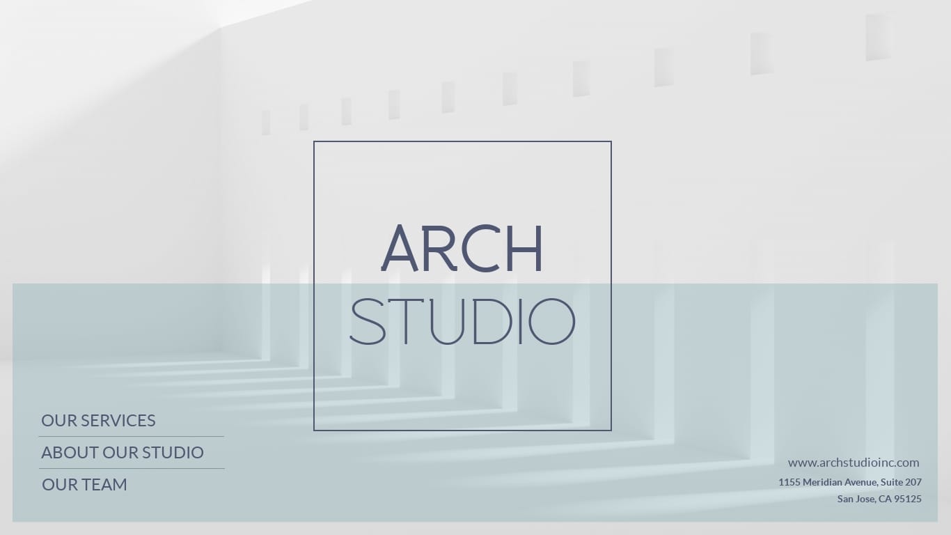
Check out the way this slide from one of our presentation templates was designed.
It’s a testimonial slide that includes nothing but a couple of quotes from past customers.
Whether it’s a new section heading, an about slide, a team slide, etc., you want to keep the information you include on a single slide to a minimum.
There’s no need to try to cram your entire presentation or even a whole section of it onto one slide. Your slideshow will be much more visually appealing if you break your content up into multiple slides.
Nothing clutters up a design like too many fonts. We recommend sticking to just two fonts throughout your entire presentation, and three at the most.
It's a good idea to find one larger, bold font for your headers and a separate sans serif font for the rest of your copy. But presentations often utilize an accent font like an italicized or serif font.
Take a look at the presentation slides below. There are two different fonts being used on these slides—a thin sans serif for the quotes and a serif for the names and locations.
Choose two or three fonts and use them throughout your presentation. Consistency is key, and you want to make sure your slides look cohesive and like they belong together.
Visual hierarchy is a design strategy for organizing elements depending on importance. This goes for font sizes, icon size, contrast and any other visual element in your presentation.
This is an important presentation tip because you want your viewers to know exactly which part of the slide they should be looking at first, second, third and so on.
It’s all about focusing on what can grab the user’s attention first, whether it’s larger font, more space between elements or creating deliberate alignment.
You can learn more about visual hierarchy and how to use it in your next presentation by watching this video.
Your slide shouldn’t be a huge wall of text. That’s what your speaking is for. Instead, be sure to keep it to less than six lines of text at a maximum. Ideally, you’ll have even less.
The content included on your slide should be limited to your main talking points (or a single point, if you really want to keep your slides minimalistic), and your voice should do the rest.
And if you’re not giving this presentation live?
You can always record your audio over your slides. Visme’s presentation maker allows users to record their own audio right in the design dashboard to create stand alone presentations and webinars.
The presentation slides below are a great example of limiting text. There’s a quick snippet of text, and the rest of the content as well as the speaker’s voice will add any context the viewer needs.

Like we mentioned in point one, don’t try to fit your entire presentation on a single slide. Let your voice do the talking and your slide include the most pertinent information.
Don’t bore your audience with a slide filled with words. Visuals are just as important.
Here's another one of our “don’t use too much text” presentation tips. Bullet points have plagued presentations for years. But if you want yours to stand out, it’s best to stay away from them.
There are so many other more engaging and visually appealing ways to design your presentation slides. Bullets just aren’t one of them.
Consider this slide template layout below. The icon blocks help to differentiate the different points in a unique way so that you don’t have to revert to overused bullet points.
Edit and DownloadCustomize this presentation template and make it your own!
And to help you get even more creative with your slide layouts, Visme’s presentation themes offer hundreds of different options to choose from.
In your audience, you might have people sitting in the back of the room, relatively far away from your screen. To make sure they can still see your presentation slides, you need to create strong contrast.
This means your text should easily stand out against your background. If you have a dark background, all of your text and design elements should be light in contrast, and vice versa.
Check out this slide from one of our presentation templates. The white and yellow easily pop against the dark background, giving this slide great contrast.
When putting this presentation tip to practice, make sure that your text and other elements are easy to see and don’t blend into your background, even from the back of the room.
Just like you should use no more than two or three fonts throughout your presentation, the same goes for colors. Don't forget, there's such a thing as too much of a good thing.
We love color, but trying to fit too many colors in a single presentation can easily backfire.
When you start to get four, five, six colors into a presentation, it can start to look messy and like the slides don’t actually match or go together in the same slideshow.
A good presentation tip is to choose a color scheme with up to three different colors, or consider a monochromatic scheme of a single hue, similar to this presentation slide.

The use of different shades of blue/grey help tie the slide together and give it a cohesive color scheme.
Finding a color scheme for your presentation doesn’t have to be the hardest part of your entire design. Choose from a basic scheme like cool or warm colors, match your colors to your topic or incorporate your company colors into your presentation to communicate your brand values and identity.
One great way to create an interactive presentation is by adding audio and video elements to your slides. This helps you take a break from talking and can give your presentation another dimension.
Using Visme, you can easily embed videos into your presentation slides, upload audio files, choose audio clips from our free library and even record your own audio over your slides.
You’re probably finding a theme here. When it comes to fonts, colors, images and other design elements, you don’t want to go crazy. Simple is almost always better.
And when it comes to images and photographs, it’s best to incorporate just one in each slide. There are several different ways to use these images, like as a background, an accent photo or with a color overlay.
This presentation slide is a great example of how to use a single photo to add a little something to your slide so it’s not just text, graphics or charts.
While there are reasons and ways to use multiple images tastefully, a good rule of thumb is to stick to just one main image as a background or accent.
You don’t want any of the photos, graphics or icons in your presentation to be low-resolution or blurry. Always use high-quality vector graphics that look great no matter how big or small they are.
Icons and graphics can be an effective way to visually represent your words and context and further help your audience understand what you’re saying.
Here’s a sample presentation slide from one of our templates. Each of these graphics are high-quality, represent different words and help to tell more of a story.

Visme’s library includes thousands of free vector icons, shapes and graphics in different styles for users to incorporate into their presentation slides.
Data visualization can include anything from charts and graphs to radials and icon charts.
It’s essentially taking numbers and statistics and showcasing them in a visual form so that it's easier for your audience to understand at a glance.
This presentation slide template below includes an attractive vertical bar graph illustrating the company’s revenue and funding over the years.
The presentation themes in your Visme dashboard come with hundreds of data visualization slide layouts to help you display your data in a digestible format for your audience.
We talked briefly about how adding audio and video to your presentation slides can help make it interactive, but there are many more ways to do just that.
In fact, we’ve written a blog post with 17 different ways to make your presentation interactive. Some of these have to do with your performance, but we’re talking about design right now.
Adding in links to your presentation, whether it’s between slides or even between elements in a single slide, is a great way to create a unique slideshow that your audience will love.
Watch this quick video to learn more about linking your slides together to create a non-linear presentation.
You can also put together an interactive quiz by linking elements in a single slide to appear on your click and so much more.
When adding transitions and animations to your slides and design elements, it can be easy to get excited about all of your options and go overboard.
But it’s important to keep all transitions and animations consistent within your presentation or it can easily overwhelm your audience. In fact, we recommend sticking to a single transition and animation type throughout your entire slideshow.
You also don’t have to animate every single one of your elements. Let some of them stay static while other, more important elements are animated on the screen.
Your audience can feel your energy, and if you’re standing up at the front of the room and speaking through each slide with an unenthusiastic and monotone voice, they’re going to quickly lose interest.
You’re on the stage, and you need to command their attention. Practice this presentation tip by being energetic. Move around the front of the room or use hand motions.
It's also a good idea to drink water or fresh juice before your presentation to energize yourself. Don't forget to keep a water bottle with you during your presentation!
Learn how to use your voice to entertain your audience through your presentation. Vocal delivery matters, so practice beforehand and get comfortable changing intonation based on your content.
When you’re able to tell a story that resonates with your audience and grabs their attention, you’ve got them wrapped around your finger for the rest of your talk.
There are many different storytelling techniques that can make your presentation stand out. Think about how you can incorporate one or two of these while putting together your content.
The structure of your presentation is important. It helps give your story and your presentation depth.
There are many different ways to structure your presentation based on its messaging, and you want to make sure that the one you choose makes sense for your topic.
Learn about seven potential methods for structuring your next presentation in the video below.
Understand who is going to be in your audience—how many people, what their backgrounds are, who else will be speaking at the event that they’d be interested to see and more.
If you’re giving a presentation at a conference or networking event, you should be able to speak with the organizers to get answers to all of these questions. Once you really know your audience, you’ll be able to determine what they want to learn and how you should present the information.
Another presentation tip to remember while in front of your audience is to make eye contact. It exudes confidence when you’re able to look directly at the people you’re speaking with.
It can also help to persuade them to your point of view and keep your audience focused on you and what you’re saying to them.
Maintaining good eye contact with your presentation audience can even help you to speak more slowly and clearly so they can follow along more easily.
Making eye contact can be nerve-wracking for some presenters, so make sure you keep some tips in your back pocket, like holding eye contact for just four to five seconds, looking at people’s heads or making eye contact during your most critical lines.
Want to keep your audience engaged and help them fall in love with your presentation?
Make them laugh!
Incorporating humor into a presentation is always a great way to pass the time and make your information that much more interesting.
You don’t want to force it, because that can make things awkward for all parties involved, so make sure you plan some lighthearted humor that you can easily pull off.
Also ensure the jokes you tell are actually relevant to your content. You don’t want to start off by making your audience laugh and immediately jump into, “Now let’s talk about [entirely different topic]!” That will turn them off faster than if you didn’t use any humor at all.
Avoid controversial topics and sarcasm, and try testing out a few jokes before delivering them during your presentation.
Standing still and straight as a board throughout the duration of your presentation will seem pretty off-putting to your audience.
Even if you don’t necessarily feel confident, you want to create the illusion of confidence, and moving around the stage and using your hands to emphasize your words is a great way to fake it until you make it.
Taking time throughout your presentation to summarize what you’ve said so far is a great way to help your audience fully understand the material and remember it for the future.
Create a summary slide after every main point and/or at the end of your presentation to conclude.
You can use a slide like the example below to share your summary or key takeaways for each section.

Edit and DownloadCustomize this presentation template and make it your own!
While you don’t want to sound like you’ve just memorized your lines and are badly reading off a script, you do want to be completely comfortable with your material and the way you want to deliver your message.
And you get to that point by continuously rehearsing, re-reading your note cards and scrolling through your presentation slides to ensure you know what to say when and more.
You want your presentation to be a success, and you do that by being fully prepared and rehearsing plenty.
Not only is rehearsing good for knowing your material, but it can also help make sure you don’t start rambling and lose track of time.
If you’re worried about going over on your time, there are apps that can help notify you of how much time you have left and help guide you through your presentation.
When you’re presenting at an event with lots of speakers, you want to make sure you’re being respectful to both the attendees and the presenters by not commandeering the show. Stick to your allotted time, and make sure you’re staying under each time you rehearse.
After you’ve designed and given your presentation, what next? It’s over?
You’ve invested all of this time into creating an awesome piece of content, and you should continue to use it to your advantage. There are ways to still reach a broader audience after you’ve given your speech.
When you create a presentation in Visme, you can publish it online and easily embed it on your website.
This way, you can create a webpage or a blog surrounding your recent presentation and let people who weren’t able to see you present live still learn about your content.
Visme provides an embed code that makes it easy to share presentations online and seamlessly include all of your transitions, animations and interactivity.
Check out this example of an embedded Visme presentation below.
While there are many different ways to embed a presentation on a website, Visme’s embed is one of the most seamless and visually appealing, with no ugly outlines and slide changer messing with the design on your page. It’s also responsive and able to adapt to different screens.
Visme also allows you to publish your presentation online so that you can get a public link to share with your audience. You can grab that link and share your content on social media, in email newsletters or even as a link in your email signature.
Plus, if you publish a presentation—or any design you create with Visme—publicly, you have access to analytics so you can view how each of your creations perform with your audience.
You’ll be able to look at how many total views your presentation received, how many people viewed the complete presentation and more.
SlideShare is an online platform owned by LinkedIn that allows users to upload presentations.
The platform has millions of presentations, as well as powerful search features and categories, which makes it a great way to get your content found.
Create an account with SlideShare and link it to your LinkedIn account so you can easily share your presentation with your connections.
Even if your presentation was created on an evergreen topic, information is always changing or being discovered. To keep your presentation relevant, make sure you regularly update and adapt your content to be current and accurate.
You can also include an area in the footer of your first or last slide with the creation date alongside the last date of update so your audience knows it’s being revisited often with updated information.
Visme allows users to record audio directly in the app to add another dimension to a presentation, or even to turn it into a webinar.
Converting your presentation into a webinar can give you a way to connect with your audience on another level, and you can even have people sign up on your website to view it as a way to gather email addresses.
While your webinar can also be considered a lead magnet, we’re covering something slightly different here. You don’t even have to worry about recording audio over your slides or making any changes.
Instead, you can require people to enter an email address directly in Visme before being able to view your content and generate new leads through there without setting up any other processes.
All you have to do is click Share in the top bar of your presentation maker, go to Advanced Settings, click the Social/Engagement tab and toggle Requires registration to On.
This will require your viewers to input their name and email address before they’re able to access the content. You can go into your Visme dashboard to download your form results and import them into your email software or CRM.
Ready to create a presentation that will wow your audience? Take all of these tips and use them to create a beautiful and memorable slideshow.
Try out one of our premade presentation templates and sign up for a free Visme account to create, present and promote your next presentation.
Did you find these presentation tips helpful? We'd love to know. Let us know your questions, thoughts and suggestions in the comments section below.
Design visual brand experiences for your business whether you are a seasoned designer or a total novice.
Try Visme for free


About the Author
Chloe West is the content marketing manager at Visme. Her experience in digital marketing includes everything from social media, blogging, email marketing to graphic design, strategy creation and implementation, and more. During her spare time, she enjoys exploring her home city of Charleston with her son.