


How to Make an Interactive Infographic [+Templates]

Written by:
Orana Velarde

Stop stressing over the idea of creating an infographic — it’s not as difficult as it seems.
Believe it or not, you can make an infographic in 5 steps. All you need are the right tools plus an easy-to-follow guide. As long as you have these down, your infographic strategy is on the right track.
Here’s a short selection of 8 easy-to-edit infographic templates you can edit, share and download with Visme. View more templates below:


Before we start, here’s a quick overview of the sections.
Below is an infographic with the five steps, just to show you that you can pretty much create one from any type of information. It’s just a matter of visualizing engaging content for the reader.

Before you do anything towards designing an infographic, you need to know why you’re doing it in the first place. Adding infographics to your content marketing strategy isn’t just about aesthetics; it’s about the communication you’re creating with your readers.
What would you like them to gain from seeing your infographic? How would you want them to react to it? What value will your infographic add to their lives?
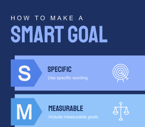
Start by setting attainable goals for your infographic design. If you don’t know what you want the results to be, you’ll have difficulty putting it all together into a cohesive infographic design.
Use a SMART goals approach to pinpoint what you wish to achieve:
Use this SMART goals template to draft these ideas out with your team.

A big part of setting goals is to define a purpose.
For example, will it be part of a blog post, or are you planning on distributing only on social media? Is the purpose of the infographic to be informational or purely entertaining? If informative, is it an academic infographic, or a corporate or casual one?
Maybe your infographic is part of an annual report or training manual. If so, it’ll need to match the rest of the design, both in visual composition and tone. Not to mention, branding qualities like color and font must be the same as the other pages.
Is the purpose of your infographic to print, laminate and put up on the wall of the employee restroom? Or maybe it’s meant for an event booth where you’ll hang up posters. Are you creating the infographic fully immersive as a scrolling web page?
Now is the time to make these decisions.

According to the purpose of your infographic, you’ll need to select an aspect ratio and final output. As you might already know, vertical infographics are not the only option. Their square, horizontal and multipage counterparts are quickly growing in favor, mostly on social media.
Not to mention all the other places where infographics make appearances like proposals, onboarding documents, school bathrooms and more.
The first decision is the aspect ratio. Here are your options and where their use is most suited.

The final output is all about the file type of your finished infographic. Select the option that makes the most sense with your goal and purpose. Here are your options and use cases.
Here’s an example of an interactive infographic embedded into the page. This technique is easy, and it’s the best solution when sharing live data or if you might need to make a change in the near future. You could say it’s the most agile way of making infographics.
Next up, it’s time to decide on exactly what type of infographic you’ll be making.
This choice is all about the content; assess accordingly to pick the perfect one. Combine with the selected aspect ratio and final output, and you’ve got a winning infographic.
In this section, we'll take a look at some of the most common infographic content types you can create with Visme.
If you prefer to watch rather than read, here's a video where Mike from Visme sums up the different types and shows examples of each.
The informational infographic is the most common and versatile for blogs and social media purposes. There are various ways to compose an informational infographic, depending on the content.
It could be a list, a collection of information blocks that repeat visually or a highly interactive composition of bite-sized content.
Here's an informational infographic template you can use:

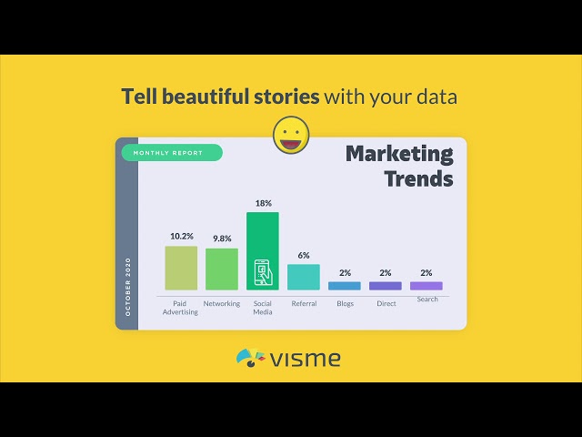
The second most common type of infographic is statistical or multi-chart. These are infographics with layouts that include information made up of numerical data. The combination is usually any mix of pie charts, arrays and data widgets.
Here's an example of a statistical infographic template:

Use a mind map style infographic to share how you came up with an idea or teach others how to do it. This infographic content type is excellent for client proposals, academic research posters, and anything involving thought processes.
Here's a mind map template as an example:

The list infographic is easily one of the most common infographics out there, which is not surprising since it’s so easy to make quickly. You know the listicle blog post and the listicle video? The list infographic is of the same family.
Below is an example of a list infographic template:

If our Google Analytics is any inspiration, timelines are super popular!
They’re also relatively easy to make. The trick to timeline infographics is to make sure each content piece is the same size in terms of word and character count; this way, it stays balanced.
Here's a timeline infographic template you can customize:

Every ‘How To’ blog post or guide deserves its own infographic. Select the perfect combination of icons to help visualize the steps in a fun and interesting way. How-to infographics are an excellent option for interactivity as well.
Here's an example of a how-to infographic template:

There are so many uses for a process infographic, from training guides to explainer videos. Adding animation and interactivity can take a process infographic to the next level. Use icons and lines or the Visme flowchart tool.
Below is an example of a process infographic template:

Are you looking for an infographic to help you visually compare data sets? Great comparison infographics are the ones that have apparent differences and an organized layout — an exceptional option for review sites that publish comparisons between products.
Here's a comparison infographic template as an example:

The geographical infographic isn’t as common as others but is still quite practical for visualizing choropleth maps with all sorts of data. You can also use a map infographic to show location concepts from large regions to smaller country areas.
Here's an example of a geographical infographic template:

Visme Flowchart infographics use our flowchart maker, an intuitive tool that grows with your content. The different shapes are customizable, and the lines are mobile even once connected to a shape.
Here's a flowchart infographic template you can use right away:

Hierarchical infographics are ideal for visualizing information with a size or importance decrease or increase. For example, food and nutrition charts or sales funnel explanations.
Use this type of infographic with a pyramid or cone chart to optimize hierarchy. Here's an example of a hierarchical infographic template.

Single chart infographics are smaller than regular infographics and include only one chart. These are ideal for visualizing a simple data set with a bar graph, pie chart, line chart, map or radar chart.
Include a legend for easy visualizing. Single chart infographics are also great for sharing bite-sized data on social media. You can also create them from longer infographics.

An anatomical infographic is all about describing the essential features of a person, object or idea.
The central element is surrounded by shapes and lines, including the content for each feature. This style of infographic is more creative than others.
Here's an anatomy infographic template you can use:

Organizational charts are essential in business building and planning.
A branded organizational chart can be included in the About Us page of your website, an annual report or a pitch deck to get funding. Use attractive images of your team to make it personal.

With step 1 complete, it’s time to plan and create the content for your infographic. According to your strategic planning and goal setting, you selected a type of infographic to make. Align your content with the purpose and overall layout of the infographic.
For example, if you chose a timeline infographic, set up the content in chronological order. If you’re creating a statistical infographic, it’s essential to outline the data and content in their proper order and sections. Let’s look a bit deeper.
The best way to start writing the content is an overview outline. Create this outline following the infographic style you chose. Take a look at the example infographics to analyze how the visuals work and set up the content to match.

When writing infographic copy, use strategies to make the message easy to grasp with the least words possible. Infographics are not the place to get wordy or overzealous with vocabulary.
Use the KISS method and “Keep It Simple, Stupid!”
Infographics have sections; that’s why they’re easier to read. Most people will skim an infographic rather than read it. In general, infographics are not detailed data visualizations with deep data sets that you need a legend to understand. Keep it simple! (remember, KISS).
Use the outline as a guide to separate the content into clusters. Try to keep the word and character count even; that way, you won't end up with a huge text box next to a tiny one, throwing the infographic design off balance.
As you create your content clusters, look for opportunities to use data visualization.
A spreadsheet with data is a clear indicator that you could turn that into some type of chart. But what about percentages, comparisons, and statistical snippets? Those can all be visual.
Take note of your content where you can take advantage of this tool.
Content and data are different, yet you can visualize both. For example, a list can be content blocks with icons and colored numbers. Similarly, statistical snippets make for great data widgets.
Let’s take a look at all your options below.
Bonus: Watch this video to understand how data visualizations work and help tell stories visually.
Choosing between a line graph or a pie chart — or many others — depends on the kind of data you have on hand.
You have various data visualization options when you create an infographic with Visme. Here's an infographic summarizing all the charts and graphs available in our editor.

Let's take a closer look at each one and when to use it:
A dual chart combines a line chart and a bar graph.
This combination chart enables you to visualize two data sets that change over time and compare their differences. Color the dual chart with contrasting colors.

The radar chart is a circular grid where you can plot one or more data series.
For example, the aspects of a group of restaurants, service, food flavor, ambiance and location — each plotted on a point in the radials.

The main reason to use a cone chart is to visualize hierarchical data or a hierarchical flow.
For example, you can visualize numerical data from largest to smallest or a process that diminishes in size or importance as it progresses.

Pie charts are perfect for comparing parts of a whole, most commonly percentages. The thing about pie charts, though, is that the data should differ enough, so it’s easy to understand.
For example, if the data includes three values, 28%, 32%, and 40%, the wedges will look too similar to each other.

A line chart is ideal for comparing changes over time, even with minor variations.
They’re also helpful in comparing differences between groups with lines in different colors. This is a perfect opportunity to KISS (keep it simple, stupid).

Use bar graphs to show changes over time, but it will make more sense when the variations are large and more evident (use a line chart for smaller variations).
Bar graphs also help compare statistics between different groups.

A data widget is a small visualization for data that stands alone, for example, percentages and parts of a whole unit. These are perfect for statistical, informational, multi-chart, single chart and minimal data visualization infographics.

A data array is a visualization using icons of two different denominations.
The comparison is between two or three groups. Each group is color-coded, and each icon represents a full amount. Include a legend for better understanding.

Maps are a great addition to an infographic when any information has to do with location or geographic data.
Choose from continents to countries to regions and color code the map to match the rest of your design. A map data visualization can be part of an informational infographic or used on its own.

Use a Venn diagram to compare groups and visualize what they have in common and what they don’t.
Generally, Venn diagrams are created with circles but can also have ovals, triangles or elaborate designs. The data has two groups but can have as many as 6 or 8. A simple diagram fits well in a large infographic or on its own.

Including tables in an infographic isn’t very common, but they can help if you’re comparing a list of features or maybe a short pricing table.

Use the integrated Visme tables with formatting and layout options or create your own using shapes, lines and formatted text. Make sure to complete the table in a way that matches the rest of the infographic.
Mind maps make for great infographics inside blog posts because they help readers understand the content better. These visualizations are the best for conceptual content with no numerical data or blog posts about how to do things, create processes or brainstorm ideas.

Visualizing your content as a mind map can take many forms, from bubble maps to brace charts. These are also called graphic organizers, and their best use is as their own infographic or as part of a creative, informational infographic.
This video walks you through all the types available.
Now that you know what type of infographic you want to create, it’s time to figure out the technicalities. Browse the template gallery for the style you need.
Additionally, here are some things you can do to make sure you choose the right infographic template to start with:
When you’re not sure what you’ll like your infographic to look like, looking at inspiration is a great help.
The templates in this article are a great place to start, but you can also look on Pinterest, infographic curation sites and Behance. The video below also has tons of inspiration to give you some ideas.
The most straightforward way to create infographics is to use a template. Sometimes it’s the templates themselves that give you the idea for an infographic in the first place.
Other times you have the idea, and you just need a template to start. The most important thing to remember is that you can either stick to the layout a template offers or customize it.
Visme templates are 100% customizable and include a draggable bar at the bottom that helps you make the infographic longer or shorter according to your content.

Aside from the ease of using templates, you also can use content blocks. Imagine a content gallery of pre-designed blocks that you can mix and match however you want on a blank infographic canvas.
The magic of Visme content blocks is that they’re all in grayscale with basic fonts, so it’s easy to apply your branding to all content blocks at once.
Here’s a rundown of the Visme content blocks.
These are the essential headline designs for the topmost part of your infographic. There are different visual options.

Icons & Text content blocks are perfect for visualizing small content clusters like on a list or informational infographic.
Try the images and text content blocks with creative image crops if you’d like to use images in your infographic.

The statistics and figures content blocks are a variety of data widgets and small data visualizations, including percentages and gauges.

This gallery section is all about data, including bar graphs and pie charts in different layouts and compositions.

Comparison content blocks are perfect for informational infographics that need to visualize content side by side.

The content blocks with diagrams include pyramids, Venn diagrams and other visualizations to help you build an infographic.

Timelines are great content blocks for small infographics in any aspect ratio, from vertical to multi-slide documents.

This content block category is about processes and the flow of information from one step to the next.

Anatomical infographic content blocks are a bit different from the others. These are all about describing the features of a person or object.

Geographical content blocks are next in a collection of ready-to-use layouts and compositions for your infographic.

The last section of the content block collection is the footer. It’s here that you add your logo and information sources.

When your infographic has all the content it needs and is edited to the point of including only what’s essential for relaying the message, it’s time to make sure it’s also visually appealing.
Adding design elements is important but requires a degree of consciousness that can be difficult for non-designers.
Here is a video with some tips that can help you understand the essential aspects of infographic design. These will help you make your infographic interesting and easy to understand.
A great way to get things right is to know what will make things go wrong and avoid them. As you can see below, errors like mistakenly chosen color palettes make text difficult to read.

Shapes are your best design tool when creating infographics. They help separate content and improve the flow from top to bottom.

There’s also a more profound use to shapes, as they can impart feelings and thoughts to the viewer. Viewer perception is important, and shapes play a big part in that.
Check out this article detailing types of shapes and how they’re used in graphic design.
Choosing the colors for your infographic is all about contrast and legibility. The color palette must have one primary color and another to complement it.
Use two or three other colors to finish the color scheme. Contrast is indispensable for text over a background color or texture; the text must be easy to read and not hurt the eye to look at it.
You can use Visme's color palette generator to instantly create a color palette from an image that defines the mood or tone of your infographic. Here's a quick GIF showing how that works.

When creating infographics, the fonts you choose should support the content and data without distracting or taking away from the flow. Use no more than two fonts or variations of the same font.
Stay away from novelty fonts that are difficult to read, unless the content truly needs it. Don’t use too many colors on the text and keep it balanced.
Here's an infographic showing some examples of great font pairs.

Icons are the magic potion when it comes to infographics. They help visualize the story in the content, separate it into sections, create visual flow and help balance the design as a whole.
Use the same icon style throughout to maintain an ideal composition. For added visual depth, use 3D icons color-coded to match the design.
Have you considered creating an interactive infographic?
You can add all sorts of animated and interactive elements to your infographics in Visme, including links and popups, animated icons, characters and illustrations, videos, quizzes and GIFs.
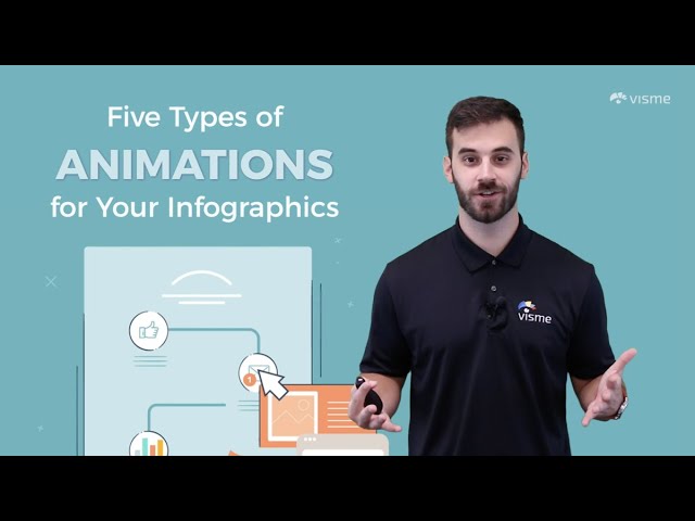
Here’s Mike showing you the best options for adding animation to your infographics.
Making an infographic is as easy as the five steps outlined in this guide. But you also need to have good design. That’s why we offer you so many templates in different styles to get you started.
If you still feel like you don't know about design enough to create an infographic, don’t worry. With the design tips in the video and the list below, you’ll be right on track to create a great infographic.
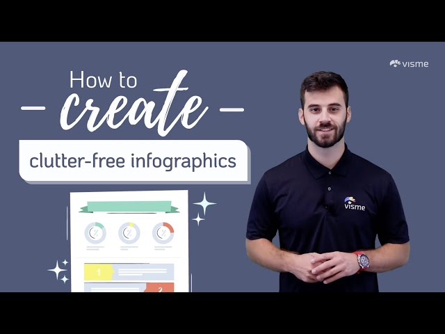
There’s nothing worse than a cluttered infographic — too much text mushed together, visuals without air to breathe and no space between titles and body text.
Yes, indeed, space on an infographic is usually limited, but part of that space needs to be empty areas, margins, spaces and what designers like to call “white space.”
Again, here’s Mike with lots of practical tips to help you figure it out.
Make sure that your infographic has a good visual hierarchy. The main title must have the largest text of the entire design, then the subtitle a bit smaller.
Here are some additional visual hierarchy principles to keep in mind:

Every section must follow a set of rules that you repeat throughout the design. These rules include the size of the section title, the size of the body text and the size of any icons or visuals.
Keep it balanced and ensure a flow to how the infographic reads.
If you're a business creating an infographic for marketing or internal communication purposes, it’s critical to make sure your infographic is on-brand. If you’re making the infographic for a client, then it’s their brand that must be front and center.
Brand elements include the color palette, font pairing, brand icons, tone and voice. Don’t forget to add your logo and website URL in the footer of your infographic.
Additionally, for SEO and readability purposes, when you add the infographic to your site, make sure to include your brand name in the file title and descriptive alt tags.
Try It For Free
That's it — you're ready to create an infographic with engaging content that will attain the goal you set for it. Sign up for a free Visme account today and create beautiful infographics online easily.
Take advantage of 1000's of ready-made templates, drag-and-drop design tools, free images and icons, animation and interactivity, and much more.
Don't forget to brush up on all the different ways you can promote your infographic and how to use infographics as part of your marketing strategy so you can get maximum results out of your efforts!
Design visual brand experiences for your business whether you are a seasoned designer or a total novice.
Try Visme for free


About the Author
Orana is a multi-faceted creative. She is a content writer, artist, and designer. She travels the world with her family and is currently in Istanbul. Find out more about her work at oranavelarde.com