


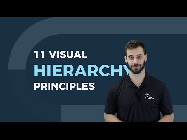


How to Add Text to a Photo on iPhone Using Markup & Visme

Written by:
Samantha Lile

Visual hierarchy is a method of organizing design elements in order of importance. In other words, it’s a set of principles that influence the order in which we notice what we see.
In this guide, we’re listing 12 principles of visual hierarchy that every beginner designer needs to know.
We’ve got a lot to cover so let’s get started.
Visual hierarchy is a design principle that refers to how elements are arranged in a design. Visual hierarchy helps designers and developers to lay out each element in a logical manner that helps the visual be digested properly.
In a design, this means the header will be at the top in the largest font, with each subsequent element sized based on importance. This helps the user better understand the flow so they know where to look first.
The reason visual hierarchy is such an important principle to understand is because it's on the designer to create the hierarchy in such a way that the viewer doesn't even have to think about where to look first. Their eye is automatically drawn to each element in the exact order they're meant to view it.
We've also created a video version of this blog post to help you further understand visual hierarchy. You can watch it below.

Bigger is better, right? While the classic adage is still up for debate, size is arguably the most effective way to emphasize visual elements. Simply put, larger elements draw greater attention than smaller elements.
It’s the precise reason why newspaper headlines appear in larger fonts, and major stories often have even larger headlines than articles on the rest of the page. In any design, larger elements—whether they be words or images—not only will be most noticeable, but they also will carry the strongest message.
Notice in the above example how the largest word is also the most striking and emotive. Readers are much more likely to quickly respond to the word, “cracking” than the second-largest word, the basic “performance.” The design wouldn’t be nearly as effective if the words were the same size or if another word on the page, such as “act” or “time” were even larger.
Another important principle related to this concept is scale, which is the size of an object in relation to another. A single object, no matter how large or small, has no scale until it is compared to another. It allows us to create balance in a design and focus on dominant elements. The greater the scale, the greater the emphasis.

By utilizing perspective, designers can create an illusion of depth ranging from a few inches to several miles. Because we see similar illusions in the real world, we generally perceive larger objects as being closer than similar smaller objects and, therefore, they usually command attention before any other object on a page.
For example, an illustration of a road will usually be wider at its lowest point and gradually grow narrower the higher it stretches across the canvas. Likewise, an object closest to the viewer will always appear larger than the same object farther away.
Proper perspective will employ both scale and proportion to accurately communicate appropriate distance. A drawing of a five-mile stretch of road will recede far more sharply than a half-mile stretch drawn on the same size canvas.

Just as larger elements are perceived as more important than smaller elements, bright colors usually draw greater attention than duller hues. For example, if a single sentence in a block of text is highlighted with a bright color, it immediately grabs readers’ attention.

Spotify's Found Them First
Consider the above design. Notice how it grabs far greater attention when the natural tones were highlighted to neon colors? The color scheme is known as a duotone, an increasingly-popular web-design trend. The effect, which layers a pair of contrasting colors over a photo, lends to striking designs that figuratively pop off the page or screen.
Dramatically contrasting colors can also emphasize specific elements than a spectrum on a more gentle scale. Placing a red object against a green or black background will draw more attention than the same red object on an orange or purple background.
The color combinations used in a design, and how they relate to one another, are known as its color scheme. A designer’s choice of color scheme can create unity, harmony, rhythm and balance within a creation, but it can also create contrast and emphasis.
A design that uses too many contrasting colors will often appear unorganized and incohesive. The same can sometimes be said of designs that use a color scheme that doesn’t adhere to color theory. But choosing the best palette involves so much more than randomly choosing a monochromatic, complementary or tetradic combination.
Similar colors can be used to group related elements in a design, and color choice can even suggest weight and distance. Warmer colors, such as red and yellow, advance into the foreground of a design with a dark background, while cool colors such as blue or green usually recede into the background. The opposite occurs with a design over a light background: Cool colors such as blue and green appear closer than warm colors. It’s just how the human eye perceives it.

Color depth chart
Therefore, color choice can truly affect viewers' ability to identify a figure from the background within a design. Mixing warm and cool colors can create depth, just like perspective.
Effective color combinations rely not only on each hue’s position on the color wheel, but also its warmth and contrast with surrounding colors. Check out Visme’s tutorial on choosing impactful color schemes.

Think about an outline, a traditional resume or a table of contents. Generally, each is comprised of several sizes of type, with major headings in a larger point size than subsections and smaller details. Using a variety of type sizes not only emphasizes what’s most important, but also organizes the overall design of the document.
Typeface hierarchies can be created with text of various sizes, weights and spacing—or a combination of each element. Even if a single font is used throughout a design, varying its size and weight not only draws attention to more important elements, but creates an overall composition that is easy to read and understand.
Just imagine a resume that uses larger, bolder type for references than for the applicant’s name. It might not only appear sloppy, but it would likely cause a good deal of confusion for those quickly scanning a mountain of applications.
Likewise, a design that features a series of type that is all the same size, font and weight won’t effectively draw focus to much of anything -- a challenge that has to be met quickly with so many audiences spending split-seconds gauging the quality of your design.
It’s for this reason why most web-design programs offer not only a manual selection of typeface attributes, but a preset hierarchy consisting of title, subtitle and graduated heading fonts, in addition to basic copy text.
Look at the above design? Does it appear more organized and easy-to-read when all words are the same size, or when hierarchy principles are applied?

One of the most basic tenets of visual composition deals with what you leave out of your design. According to the Rule of Space, an aesthetically-pleasing design requires its fair share of clutter-free negative space, often referred to as “white space,” regardless of the design’s actual background color.
When arranging the elements of a composition, designers can use the space around the content to draw attention to particular elements—think of a single element on a blank page—or to send an entirely separate visual message, such as the hidden “arrow” found within the famous FedEx logo.
Strategic spacing can even draw viewers’ eyes across the page in a targeted sequence, by contributing to page-scanning patterns.
Readers tend to scan pages based on particular patterns, observable through their eye movements. When designers want audiences to notice elements in a particular order, they often rely on the most common patterns.
Native English speakers, for example, read from left to right. Therefore, they typically present a similar scanning pattern when faced with a page of text. Arabic, on the other hand, is written from right to left. Those accustomed to reading that language are more likely to scan pages in this “opposite” direction. Designers should keep these differences in mind when creating content for global audiences.
The most common eye-movement pattern of English readers is the F pattern. Why? Because that’s precisely how we read a book, a letter or a web page. We scan the page from left to right along the top and again for each line of text until we reach the bottom of the page.
Because of this natural tendency, designers most often utilize the F pattern when composing websites and other illustrations that rely heavily on text. Because reading in some other direction is just uncomfortable when it’s not what we’re used to.
Designs that rely more on images are often composed in a Z pattern. Because the brain processes images faster than text, readers can scan the page quickly by glancing across the top from left to right, then down the page in a diagonal fashion before completing the scan by again crossing left to right (or right to left if the audience typically reads in that direction).
Designers can emphasize certain elements of a composition by placing them along this common “Z” eye-movement patterns. Think of a heading, an image and a subheading.

Proximity, or where elements appear in relation to one another, is one of the most basic elements of composition. Simply speaking, placing related elements close together suggests to readers that they are, in fact, related.
Think of a white screen with a group of five dots on one side and a single dot on the other side. Our first assumption is always going to be that the five are, indeed, a group.
Placing elements close together can send other messages, as well. For example, placing elements in certain locations on a map can provide audiences with an understanding of distance, whether near or far. Of course, this also depends on the size and scale of the map. An inch isn’t always a mile.
By placing elements within particular proximity of each other, added images and messages can be created. Think of how often you see three circles and a line positioned in a way to suggest the shape of a happy or sad face? The suggested image then often gains more attention than its individual elements. Do you see a happy face, or do you see three circles and a line?

Just as grouping items near each other suggests their relation, including white space around elements singles them out as separate groups of information. Negative, empty space not only makes information easier for readers to digest by grouping it into compartments, but it also creates focus as it helps eyes zero in on individual items.
Compositions lacking ample negative space can result in a jumbled, confusing and chaotic design. In other words, less is more. Savvy designers can even utilize the blank space to suggest an additional visual message. Just think of the “arrow” implied within the center of the famous FedEx logo, or the Coca-Cola design, above.

Alignment is part of the structure by which elements are placed in a design. It dictates that visual components, whether they be text or images, are not positioned arbitrarily throughout a composition. For example, a typical page of text is aligned to the left, so that objects share a left margin.
Many visual designs are centered or justified, which means they are spaced across a page so they share both left and right margins. If words were just scattered randomly across a page in every direction they would create quite the confusing scenario.
In F-pattern designs, objects are generally aligned to the left, while Z-patterns often employ a combination of left, center and right alignments, such as in the above advertisement.
Simple visual designs most frequently align in the center of the frame, a format that provides balance and harmony, and is also aesthetically-pleasing.
Most Western readers are accustomed to reading from the left to the right size of a page. Therefore, designs featuring text are often aligned to the left margin in the same fashion.
Right alignments are often employed to provide balance to an overall design that may be more visually heavy on the left side. Likewise, left alignments can offer the same effect in the reverse scenario.

The Rule of Odds allows designers to emphasize particular images by placing them in the center of a group. By placing an equal number of neighboring objects on either side of the main focal point—thus creating an odd-numbered group—the result clearly points to the most important visual element, located in the center.
For example, a group of one or three elements is more striking than a single pair. Likewise, groups consisting of an odd number of objects are almost always considered more interesting and aesthetically-pleasing than even-numbered groups. Why? People feel more comfortable with balance.

Just as contrast emphasizes and draws attention to design elements, repetition creates unity, which boosts understanding and recognition.
Think of most published texts. The page designs are organized in such a way that body text is all one font, chapter headings are another and footnotes are a third different font—all consistent throughout the entire publication. This style repetition creates a cohesive work, recognized as a whole.
For a unified design, repeat some element—whether it’s font, color, shape or size—throughout the entire composition. Consistent styles help clearly define the visual hierarchy of any design.
Take, for example, the infographic in the introduction featuring our 12 visual-hierarchy principles. Repeating the same fonts and styles throughout the document clearly unifies the list and tells readers that each entry is part of a whole.
Repetition can also give elements new meaning. How often do you see blue underlined text stand out on a page? Enough that you instantly recognize the font as a hyperlink, right? Repeating this style in a design tells your audience where to click for more info. What other popular styles can give your design additional meaning?

Movement is one of the most effective ways to attract viewers’ attention, especially when it’s implied within a still design. Lines are obviously efficient in pointing to items of emphasis—just think about an arrow—but they don’t have to physically appear on the page to do the trick.
Leading lines can be implied through the use of repeated elements—think of a row of dots—the proximity of objects or shapes, as well as the relationship of positive and negative space. For example, by slanting an object up or down, lines can be created that suggest flight or descent.

The most effective designs are composed through some type of grid. The most typical grid is the classic modular composition of crossing vertical and horizontal lines.
Artists, photographers and graphic designers have long employed the rule of thirds to improve the overall balance of their compositions. The rule involves mentally dividing a composition into a grid composed of two horizontal and two vertical lines—or nine separate sections.

Important visual elements are placed along the lines, emphasizing the four points where the lines meet. Off-center compositions are generally considered more aesthetically-pleasing when compared to designs in which the main focal point is placed in the center of the frame. The rule encourages the use of negative space, clever proximity of elements and effective alignment.
Not only is it most common, but the modular grid is generally the most legible design. Still, sometimes the best way to create emphasis is to break the rules.
Instead of the classic vertical-horizontal grid, designers might choose a diagonally-directed composition to ensure their creation stands apart on a page and draws viewers’ overall attention.
Some designers will choose to break the grid entirely, randomly placing visual elements across a page in order to best stand apart from surrounding gridlocked text. That surrounding text can be in the same design or on a surrounding page.
Don’t be fooled by the concept of randomness. Randomly scattering elements across a background according to no specific reason or strategy isn’t going to miraculously transform into a Jackson Pollock masterpiece. When breaking the grid, every choice still must be calculated and with purpose.
Visual-hierarchy principles are some of the most effective strategies for emphasizing elements of a design and clarifying a visual message. But as with much of life, you can have too much of a good thing.
Designers must wisely choose what principles to employ, or risk diluting any emphasis and breaking down the visual hierarchy. If everything stands out, then nothing stands out.
Unsure if your hierarchy is effective? Then test it. Simply stare at the space in front of your page or screen, allowing the actual design to fade into the background until it becomes a blur of shapes and colors. What stands out?
Or, to save yourself from going cross-eyed, you can use the blur test by taking a screenshot of your design, opening it in Photoshop and applying the Gaussian Blur filter.
If the main attraction is still the element(s) you planned to emphasize, your visual hierarchy is effective.
Get an at-a-glance understanding of what visual hierarchy means and how it can be implemented by scrolling through this infographic below.

Embed on your site:
<script src="//my.visme.co/visme.js"></script><div class="visme_d" data-url="ep88eydm-12-visual-hierarchy-principles-every-non-designer-needs-to-know" data-w="800" data-h="6404"></div><p style="font-family: Arial; font-size: 10px; color: #333333" >Created using <a href="http://www.visme.co/make-infographics" target="_blank" style="color: #30a0ea"><strong>Visme</strong></a>. An easy-to-use Infographic Maker.</p>
What visual hierarchy principle are you most comfortable employing in your designs? Which do you find the trickiest to master? Start implementing visual hierarchy in your own designs with Visme.
Design visual brand experiences for your business whether you are a seasoned designer or a total novice.
Try Visme for free

About the Author
Samantha Lile is a web content creator with a journalism and mass media degree from Missouri State University. She contributes news and feature articles to various web publications, such as the Huffington Post. Currently, she resides in the beautiful Ozarks with her husband, four dogs and two cats.