


[New Feature Roundup] Content Creation Has Never Been Easier


Written by:
Nayomi Chibana

Did you know that your DNA is 99.9% the same as the person sitting next to you?
Or that 22% of Americans want Bruce Springsteen to write a new national anthem?
It’s been said that statistics can be used to prove almost anything, but there’s no doubt they're still one of the most powerful tools for influencing the way people perceive the world.
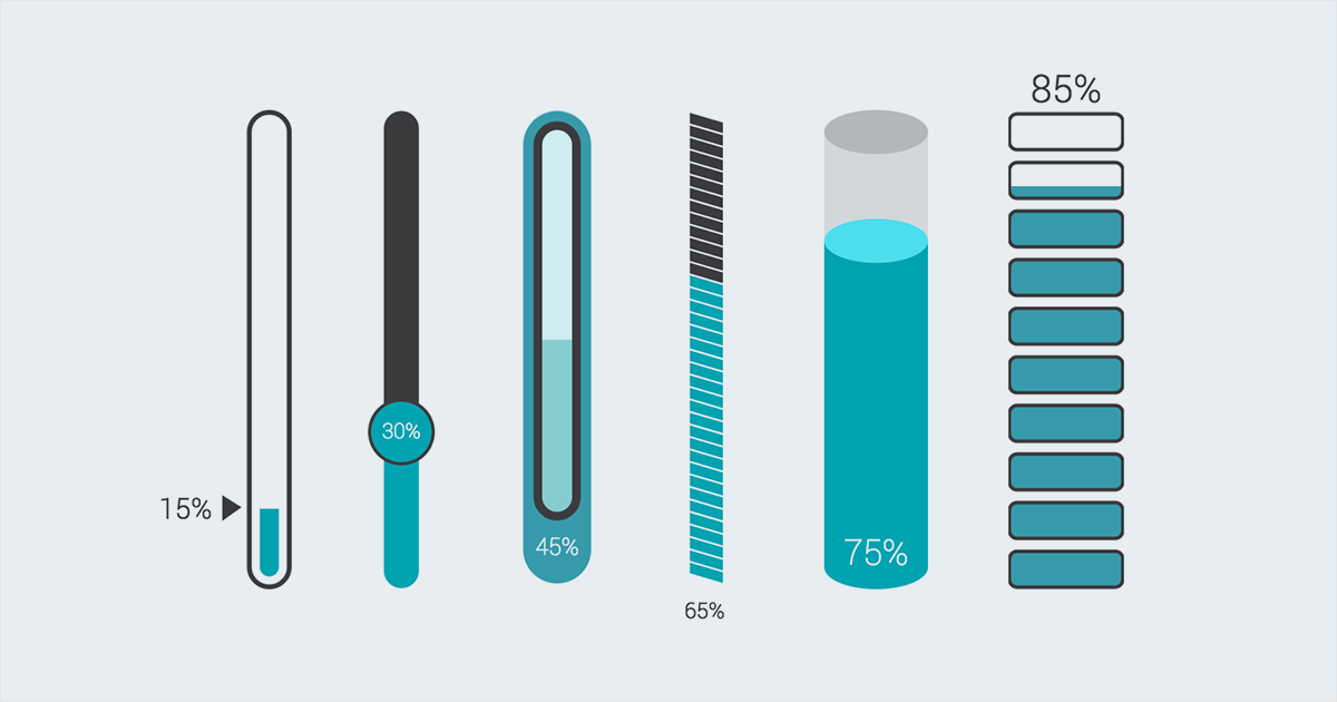
As part of its mission to empower visual communicators everywhere, Visme recently released a whole new set of widgets to help you quickly create visual statistics and display all types of data.
Here are just a few examples of how you can creatively display information, using progress bars, radial gauges, sand watches, thermometers, among other types.
RELATED: Visme Introduces New Infographic Widgets
Click on the image below to view an interactive slideshow created with Visme or scroll through the static images to view a series of interesting and little-known facts.
Source: Time Magazine

By 2040, 40% of Japan's population will be senior citizens.
Source: Newsweek
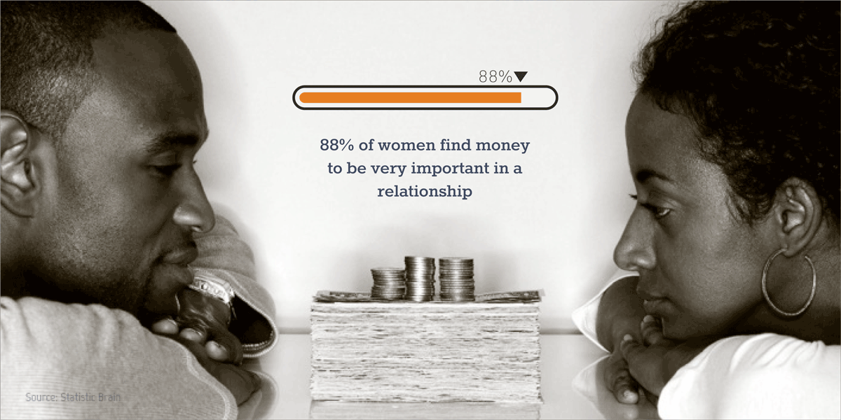
88% of women find money to be very important in a relationship.
Source: Statistic Brain
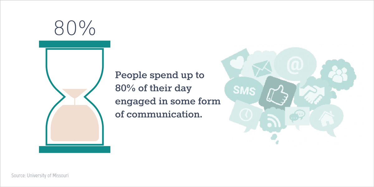
People spend between 70 and 80% of their day engaged in some form of communication.
Source: University of Missouri
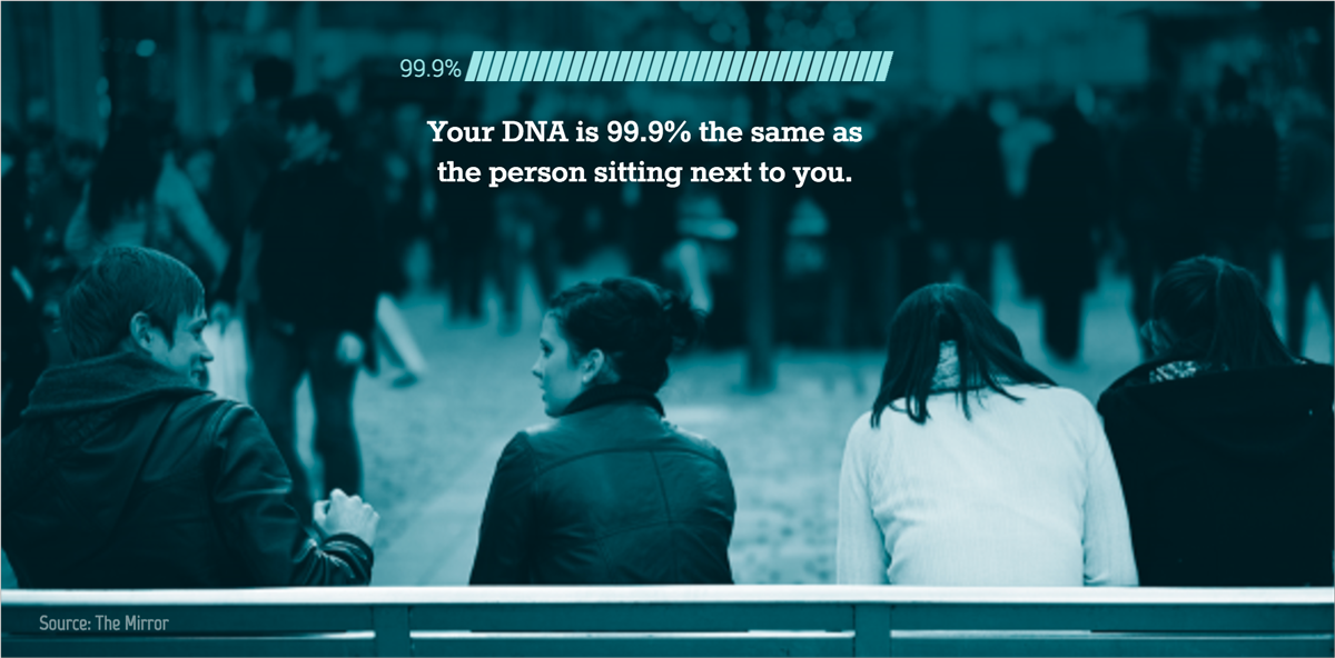
Your DNA is 99.9% the same as the person sitting next to you.
Source: Business Insider

46% of Millennials left their last job due to lack of career growth
Source: Inc.com
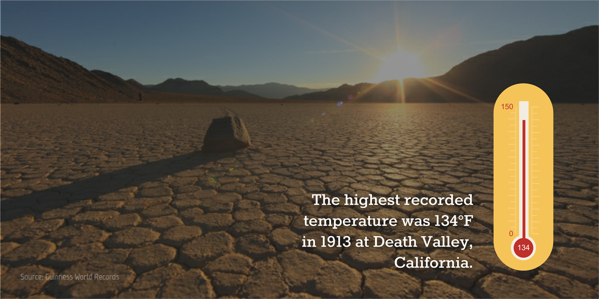
The highest recorded temperature was 134°F in 1913 at Death Valley, California.
Source: Guinness World Records

You are 1% shorter in the evening than in the morning.
Source: Business Insider
You can apply your own look and feel to any of these data widgets by double clicking on them and adjusting a few settings.
To start, watch the video version of this tutorial below or you can read through the step-by-step instructions that follow.
If you haven’t already signed up for a Visme account, you can do so with just your name and email at www.visme.co.
Once you’ve chosen a template (or decided to start a project from scratch), you can click on the Chart and Data Widgets tool found on the toolbar on the left side of the Visme editor.
Next, you’ll see 34 data widgets appear on the docked panel to the left side of your screen. You can choose from any of the newest data widgets by scrolling to the bottom of the panel and simply clicking on your desired visualization or dragging and dropping it onto your canvas area.
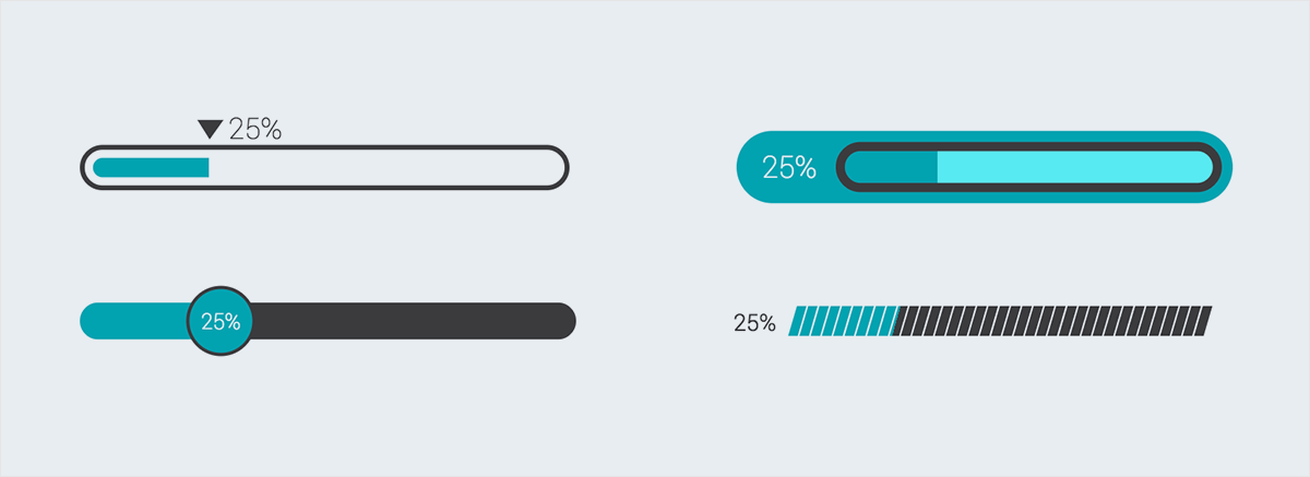
You can choose from vertical data widgets or horizontal ones, depending on how you want to lay out your information.
And you'll also find new radial dials, gauges and even hourglasses useful for visualizing all types of statistics and measurements of time, distance and space.

Once you've chosen your desired data widget, you can then adjust its size by clicking on any of the corner handles and dragging and dropping it until you reach the desired size.
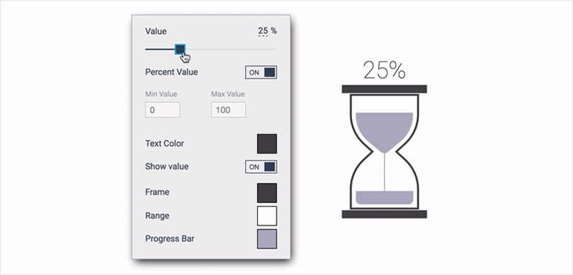
To create your own visual statistic, simply double click on the data widget and insert a value by typing it in manually or using the slider, as seen above.

If you want to visualize a number, rather than a percentage, you can turn the Percent Value option off as well.
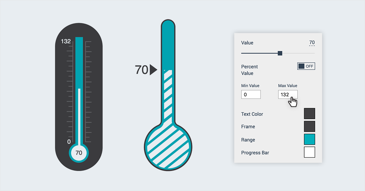
In the latter case, you can also create your own scale by inputting a minimum and maximum value, as seen above.
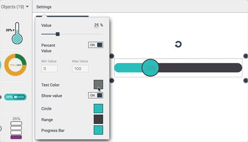
Then, you can also apply your own text color by clicking on the Text Color swatch found in your Settings menu to the top left of your screen.
Choose from 50 pre-defined color presets or choose a color from any of your previously used color schemes.
You can also create your own color palette by going to the Colors tab and then clicking on the plus sign to add new color. Finally, save your color palette for future use by clicking on the Save Palette at the bottom of the pop-up window and giving it a name.
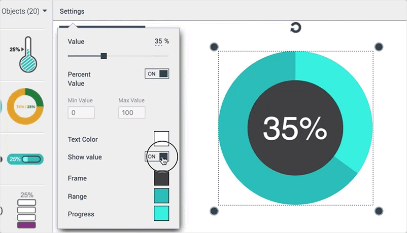
There may be times when you will want to hide your values and simply display the visual representation of a percentage or a value. In this case, you can turn the Show Value option off from the Settings menu.

You can modify any color in your data widget, from the color of the frame to the progress bar and range.
To do this, simply click on the corresponding swatch and choose any of the hues used in previous projects or apply a brand new color scheme.

Finally, you can share your visual statistics with the world by either publishing it online or downloading your project as a JPG, PNG or PDF file.
To conserve all interactivity and animation effects, click on the Publish button at the top of your screen to generate a URL which can be shared with anyone. If you'd rather have a static version of your project, click on the Download tab from the pop-up window and choose your desired file format.
Now it's your turn to create persuasive visual statistics by taking Visme's new data widgets for a test drive. You can create a free account here and let us know if you have any questions or requests in the comments section below!
Design visual brand experiences for your business whether you are a seasoned designer or a total novice.
Try Visme for free

About the Author
Nayomi Chibana is a journalist and writer for Visme’s Visual Learning Center. Besides researching trends in visual communication and next-generation storytelling, she’s passionate about data-driven content.