How to Make a Gantt Chart in Excel + Easier Alternatives

If you’re trying to visualize geographic data, look no further than Visme’s interactive map generator. With the ability to customize any region in the world and provide interactive data for your audience, Visme’s tool is an incredibly useful application.
Just a few ways you might be looking to showcase geographic information could be:
According to the Content Marketing Institute, 81% of marketers say that interactive content grabs their audience’s attention better than static content.
So, What is interactive content? It's content that requires your audience to click, scroll, drag, hover and more, leading them to engage more and stick around longer.
Take this interactive map below, for instance, showcasing data for the number of US coronavirus cases thus far.
Did you hover over each state to see the different numbers and statistics? Do you see how powerful that is? Users are much less likely to scroll past interactive content. They want to stick around and play with it for a bit first.
We’ve put together a quick step-by-step tutorial to show you how to make an interactive map with Visme like the one we created above.
If you're more of a visual learner, this video will show you how simple it is to make an interactive map in Visme.
An interactive map is a type of map that allows users to interact with the content. It includes features such as markers, pop-ups, and overlays to provide users with a rich and engaging experience.
Users typically have the ability to zoom in and out, pan across the map, and click on various locations to identify specific features and access additional information. Interactive maps can be used to display geographic data, provide directions, and create immersive experiences for website visitors.
In the next section, we’ll discuss how to make an interactive map. But before we dive in, watch this video to learn how to create interactive maps with Visme’s map creator.
Your first step in creating an interactive map is to sign up for Visme’s interactive map maker and generator.
The next step is choosing a template that looks closest to your vision.
You can easily browse through all of Visme’s map templates here, and explore other templates in our library as well.

If none of our current options suit your fancy, feel free to completely start from scratch on a black canvas as well. Simply log into Visme and create a new project to get started, then add a map from the Data sidebar of the editor.
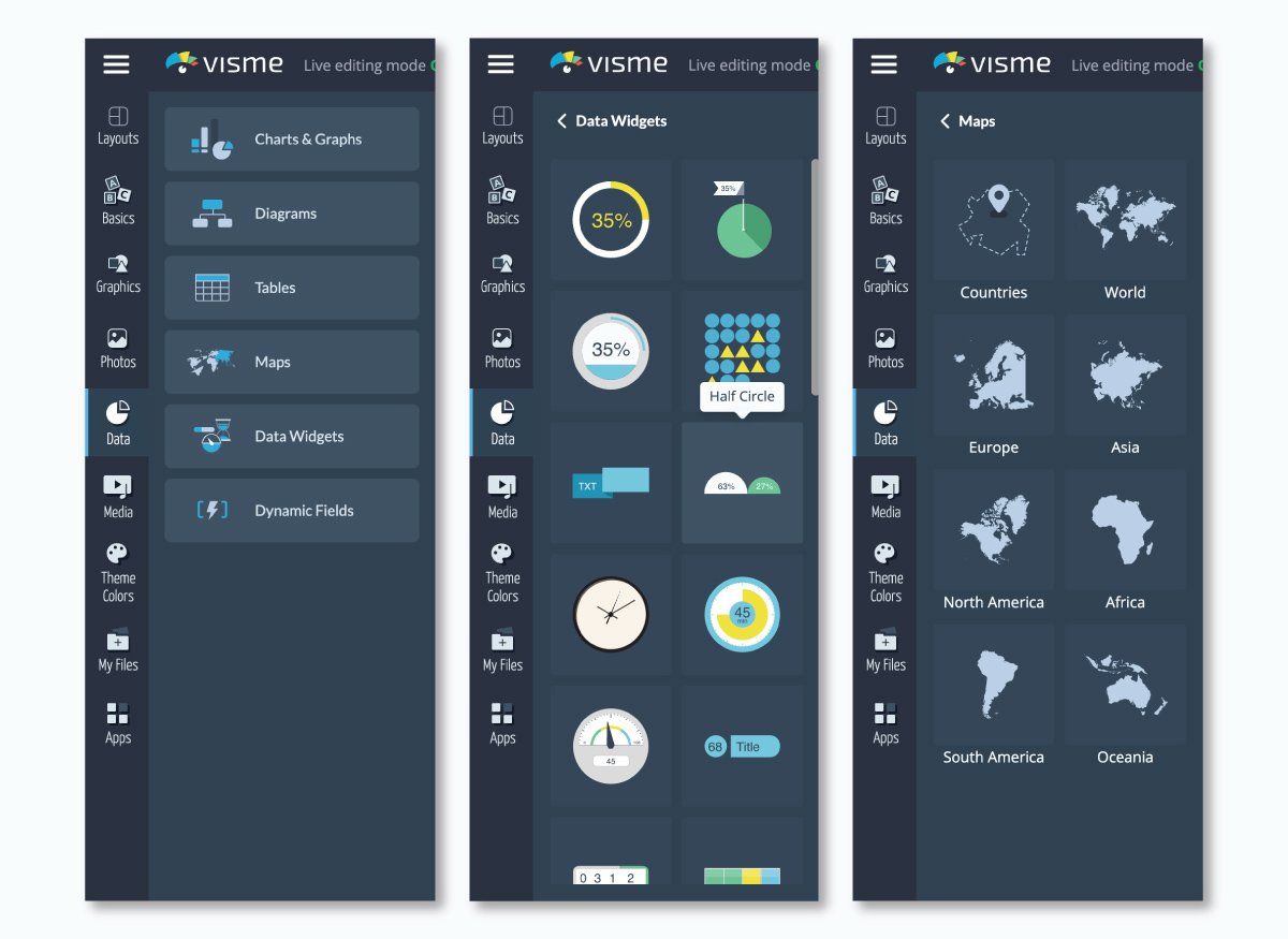
You can also choose to create a world map as well! Just click on your map then select settings to find the country or region you plan to focus on.

You can then search for any country by either typing its name in the search bar at the top right or scrolling through the list. Under the Regions tab, you can also visualize major world regions, such as Africa or Asia.
Once you've selected your country or region, you can then click on the Edit This Map option in the middle of your map preview to insert your data.
Your next step is to input your map data. Whether you’re including population, votes or cases of a disease, like in our earlier example, you can insert any data you’d like.
As you see below, the area of each state, country or province is the automatically populated data, but you can update this to whatever you plan to share.

Insert your own information by clicking on the Add More Data option and then pasting your data from Excel or Google Sheets.
You can add as many columns of information as needed; just make sure to rename your column with an appropriate title by clicking on the cell and typing in the name.

Now it’s time to color code. In the Map Data area, you can also select the colors of various areas in your map to change them based on your numbers and information.

You can click on any previously used hues under the Colors column or click the plus sign to find a new shade.
Go to the Presets tab to choose from any of Visme’s preset color combinations, or select More Palettes to find any color themes you’ve created from your brand colors.
Under the Map Settings tab, you'll find several options that will allow you to further customize the way you visualize your data.

For example, you can choose a Global Map Color (although the local colors you defined in the previous step will override this setting), or you can Show Borders between states or provinces and set a color for them.
You can also activate the Show Caption on Hover option so that when the cursor moves over any state, the data inserted in the previous step is displayed. In order to create contrast with your global map color, you can choose a light or dark-colored caption.
Next, you can display the data inserted under the Map Data tab by activating the Area Value Map setting.
Once you do this, other options will appear, such as a drop down menu with the names of all the columns of data you created in step three. Here, you can choose which column of data you'd like to visualize.
If you're dealing with numerical data, you can visualize the range of values in your data set through a corresponding range of colors.
To do this, simply choose a Start and End color under the Area Value Colors setting, and the Map Engine will automatically assign a hue within this color range to each of your data points.
Also, you can activate the Show Legend option to display the colors that correspond with each range of values. From the drop-down menu, you can choose whether to display it to the right, left, top or bottom of the map.
Depending on your background color, you can also choose to make the color of your Legend Text dark or light.
Finally, you're ready to publish and share your interactive map with the rest of the world. Click on the Share button at the top of your screen to access your options for sharing your interactive map online.

Under Publish for Web, you can generate an online link to share on social media or in emails. Or you can head over to the Embed tab to grab a responsive embed code to paste on any page of your website.
After sharing your Visme map online, you can track its progress using the analytics feature. This advanced tool enables you to monitor unique visits, total visitors, visitor IP, location and more.
Now that you know how to build an interactive map, here are some interactive map templates from Visme's library to help you create your own. Choose any templates below and customize them using the Visme map generator.
This easy-to-understand Choropleth map template highlights the differences in GDP per capita worldwide. It lets you effortlessly add data to show varying income levels in multiple regions.
With its eye-catching colors and design, anyone from economists and political scientists to students researching global income gaps can use this map.
Use it in your reports, academic projects or website to give your work a visually engaging and informative edge. And if you are an educator who uses learning management systems for content delivery, Visme allows SCORM and xAPI export options, making it easier to share your Visme content with your students.
Present the rankings among countries in a sleek and modern way using this yellow and green map template. It allows you to effortlessly visualize rankings among countries for various subjects, such as economic performance, environmental issues or sporting successes.
This modern template provides a visually appealing and informative way to share country rankings in different sectors. The template is ideal for statisticians, educators, analysts or professionals who need to present comparative data.
Dive into the brewing scene of Latin countries using this visually vibrant map template. Perfect for breweries, marketers, or beer enthusiasts wanting to highlight the origins and popularity of different breweries in Latin America.
This user-friendly template depicts brewing trends and top breweries and reveals the connections between various regions. Customize its dynamic visuals per your branding needs with Visme's brand design tool.
Just copy and paste your website URL and the tool will automatically extract your branding assets, such as brand colors, brand fonts and company logos. You can then apply these elements to any document in just one click.

Discover America's most popular attractions with this easy-to-understand and colorful map template. The map uses bright colors and engaging designs to highlight different places. It is designed to show the top attractions in each U.S. state.
Tailor-made for travel agencies, bloggers, or tourism boards, this map offers a vivid view of each state's appeal.
So, if you're looking to share information, attract visitors, or just spread your love for travel, this template is a fantastic visualization tool for showcasing America's favorite attractions.
If you are looking for unique visuals to support your map design, use Visme’s AI image generator. This advanced tool lets you generate images, icons, illustrations, paintings and more. Just give your prompt, choose your style and watch the magic happen in seconds.
Communicate the spread and popularity of smart devices throughout Europe with this meticulously crafted map template.
You can display penetration rates, growth trends, and various other data sets related to technology usage and adoption.
Vibrant yet informative, this template aids tech researchers, marketers, and smartphone manufacturers seeking to comprehend the technological adoption patterns within this continent.
Whether you're tracking the rapid adoption of smartphones or analyzing the newest trends in wearable tech, this template offers the ideal canvas for your statistic-rich insights.
This template is ideal for social media analysts, digital marketers or educators who want to identify which social networks dominate in different countries. With its neon and black color palette, the template instantly stands out for its visual appeal.
The template supports the visual representation of intricate demographic data, allowing audiences to trace the usage of different social networking platforms across regions.
Leverage Visme's design collaboration features to maximize your experience when customizing your templates. Invite your team members via email or a shareable link and work on your documents using features like live editing, commenting, annotating and version control.
Additionally, Visme's workflow management feature allows you to manage your tasks, roles, deadlines, corrections and more from one place.
Read this article about how to do collaborative design right with Visme or watch this video to learn more.
Interactive maps allow users to interact and access detailed information, providing dynamic and immersive experiences. Some features that make a map interactive are zoom and pan, hover effects and pop ups, markers and pins, interactive layers, search and filters, heatmaps, charts and graphs, customizable interfaces and more.
You can add an interactive map to a website using various tools and platforms.
If you want to create your own map with a data visualization software like Visme, simply choose an interactive map template, select the country or region, input your data, color code your map, customize the visual appearance, and add an interactive element. Once your interactive map is ready, you can generate an embeddable code and add it to your website.
If you want to embed Google Maps into your website, you just need to go to Google Maps, find the location you want to embed, click on the "Share" button, and select "Embed a map." Then, copy and paste the copied HTML code into your website’s HTML file where you want the map to appear.
Another alternative is to use Google Maps API or Mapbox. However, you’ll need to sign up for an API key and then use the provided code to embed the map into your website.
Yes, Visme is an interactive visual design and content creation tool that allows anyone to create a wide range of dynamic and interactive content without coding or professional design experience.
It comes loaded with dozens of interactive features, like 2D and 3D animated widgets, icons, graphics, illustrations, shapes, characters and special effects. You can add hover effects, popups, links hotspots and transitions to make your content super engaging. Embed interactive content like polls, maps, charts, graphs, quizzes and GIFs to boost audience engagement.
Experience a new dimension of interactive storytelling with Visme's animated 3D character creator. Select a 3D character and customize it to match your brand and story. Choose their entry, waiting, and exit animations and add them to your interactive content or website. You can find these sleek characters in Visme’s animated form builder, which has been proven to double conversions.
There are several tools that allow you to create interactive infographics, with Visme being the most popular and feature-rich option. Other tools include Canva, Piktochart, Infogram, Easel.ly, and Venngage. In this article, we’ve discussed the 17 best infographic tools for creating infographics that stand out in 2024
While both tools are user-friendly and offer a wide range of templates, Visme offers an extensive feature set for both individuals and businesses of all sizes. You can create videos, forms, presentations, ebooks, printables, data visualizations and other content types—all in one place.
Within the same platform, you also get access to animation and interactive features, including 2D and 3D widgets and characters that elevate your storytelling. The best part is that Visme provides a full suite of AI-powered features for generating images, writing high-quality text, editing photos and generating unique, customizable designs.
Ready to create an interactive map to engage your audience? Sign up or log into Visme to start taking advantage of our interactive map creator and share geographic data in a fun and engaging way.
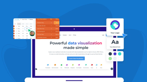
Design visual brand experiences for your business whether you are a seasoned designer or a total novice.
Try Visme for free