How to Add Text to a Photo on iPhone Using Markup & Visme

“Color is a power which directly influences the soul” is a famous saying by one of the artistic greats, Vassily Kandinsky.
And color does, in fact, directly influence the soul. Nobody knows that better than the Pantone Institute.
At the beginning of December, they announce a NEW Pantone Color of the Year every year.
A color they select by analyzing many levels of design and society in general. They then explain how the color relates to how people live their lives and how it can influence the soul well.
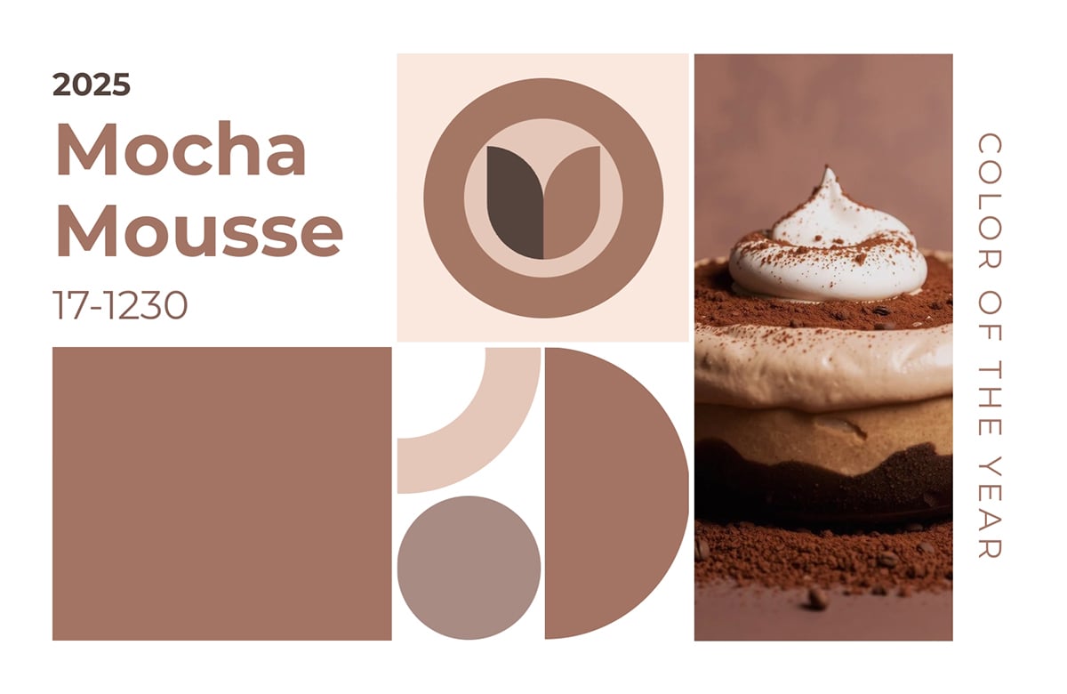
This year’s color is Mocha Mousse, which has a delectably earthy tone that reminds me of boba milk tea and cappuccino ice cream.
As a designer, I love this moment because of the expectation and excitement at seeing the new color and what the collaborating brands create as part of the celebration. My favorite is the one with Spoonflower, which offers a collection of delicious textiles that will make any room feel cozy.
Keep reading to learn more about Mocha Mousse and what experts in the industry have to say about it. Plus, we’ll look back at all the colors of the year before 2025.
On every launch, the Pantone Institute publishes a landing page with all the possible information you’ll need to know about the new Pantone Color of the Year. Part of the content is always a quote by Leatrice Eisenman, Executive Director of the Pantone Color Institute™, that explains the underlying vision behind each year’s color. This is what she has to say about Mocha Mousse:
Executive Director of the Pantone Color Institute™
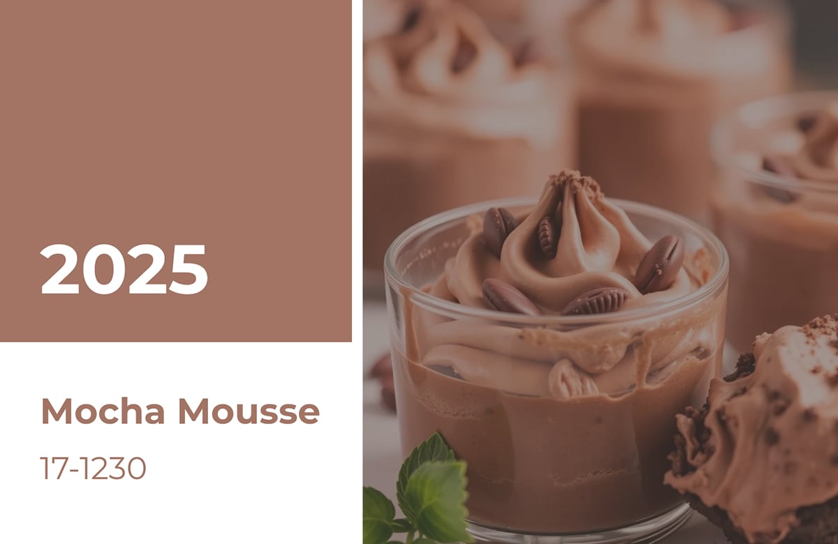
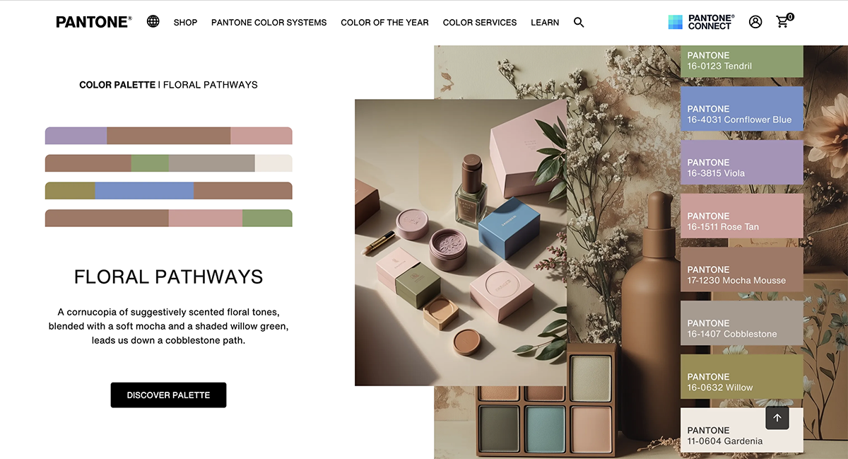
This year, the proposed color is a great foundational shade for several palettes, ranging from soft, earthly or flowery tones to deep, rich hues in blues, violets and oranges. One palette suggested by Pantone is floral pathways. It combines Mocha Mousse with soft flower shades in neutral tones.
The overall reception of Mocha Mousse has been positive, even if there has been some talk about the unfortunate perception of the color association with 💩.
Our friend and branding expert, Jacob Cass, had this to say on social media, “#PANTONE has just announced its Color of the Year for 2025. At first glance, I thought it had to be a joke… especially when paired with that poopesque mousse image. It reminded me of the infamous “ugliest color in the world,” Pantone 448C. Curious, I looked it up again to compare, and luckily, the new shade is quite a few tones off. Color has power. Even if it's ugly. Let's see what Mocha Mousse can do!”
That aside, plenty of color professionals have embraced the new color. For example, Lauren Battistini, a color expert from the US, shared her thoughts about Mocha Mousse with Brittany Wong at HuffPost:
“It’s a clear indicator that the fashion, home, interiors and other industries are shifting to something with more comfort, warmth and earthy appeal,” she said. “The color pendulum shifts about every 3-4 years, and we have been witnessing a shift for some time over to a warmer, earthy color palette.
A neutral such as Mocha Mousse doesn’t necessarily hold much presence on its own, but when you pair it with the right colors, it serves as a visual comfort within the overall color palette.
I see it as a perfect anchoring neutral to combine with colors such as cream, aqua, ochre, warm red, aubergine, blush, cinnamon and warm greens.”
The Pantone Color System is the most detailed color-matching system in the world. The system originated in 1963 to solve the printing industry’s problem of colors being difficult to reproduce or match from a sample.
They ensured that every color, tone, and tint was assigned a number to classify it. Pantone now offers the most extensive library of color codes to classify, communicate and match colors for the design industry, as well as for paint, textile and plastic manufacturers.
The Pantone Color Institute offers designers, marketers, creators, artists and brands a chance to collaborate and build a strong color presence. As the representatives of Pantone’s leading color-matching system, their knowledge of color is unparalleled. They are the experts in how color affects design and consumerism.
They are also the ones who decide the color of the year.
In 2000, the Pantone Color Institute had an idea to share their vision on what they named the color of the year. Seeing its positive reception, they continued doing it yearly until it grew to what it is today.
The introduction of the Pantone Color of the Year confirmed the Pantone Color Institute as the leader in all things color-related.
Visme's Head of Designer Alex, explains it perfectly, “A group of color experts spend the year studying trends in areas like fashion, marketing, social media, and even politics to choose this color. It’s not just a random pick, it’s a powerful way to reflect the current global culture and shift how people think about color. Something as simple as a color can make a big difference in a company’s success. The Pantone Color of the Year is more than just a shade; it’s a strategic tool you can use in your marketing to shape your brand’s image, boost engagement, and even drive sales when used thoughtfully.”

Pantone usually announces The Color of the Year in early December or just before Christmas of the year before. Since Mocha Mousse was announced on December 2024, it’s safe to say that The Color of the Year 2026 will probably be announced around the same time.
Some creatives and designers start to speculate what colors are runner-up around November, watching for any major color trends or announcements that hint towards the selection. But we won’t know until Pantone shares it in December.

The Pantone Color Institute studies color trends throughout the year to decide on the next Pantone Color of the Year. They consider all aspects of society, including fashion, marketing, social media and even politics. The hue chosen as Color of the Year has become increasingly influential in design and brand marketing.
The first Color of the Year was selected in 2000, but it wasn’t until 2007 that the color trend forecasting took on a life of its own. Nowadays, when a new color is announced, Pantone offers color lovers an array of inspirational products and color combination palettes designed especially with the corresponding color in mind.
Hundreds of brands design products using the Color of the Year, reinforcing the importance of the Pantone color trend forecast.
The announcement of the new Color of the Year has received plenty of media coverage in the last few years. Bloggers have written articles about how to use the color; homemade producers have created products to sell; graphic designers have created social media templates, which just skims the surface.
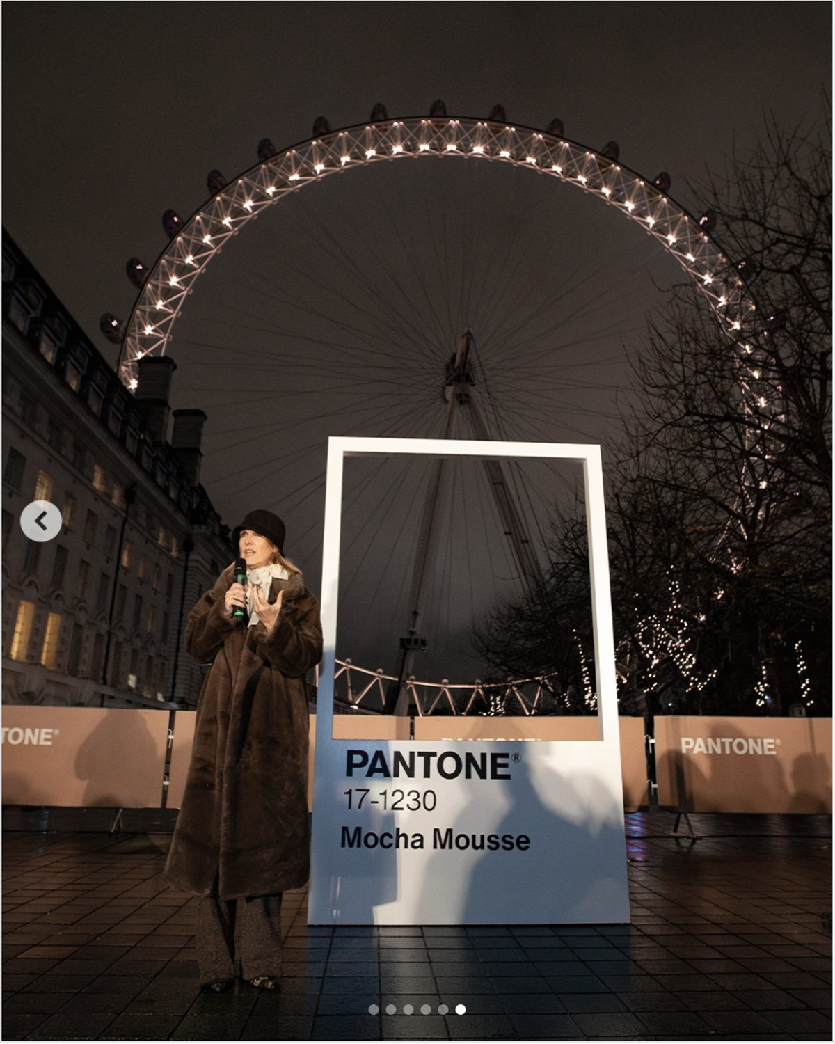
This year, Pantone announced Mocha Mousse simultaneously with events in London and New York. The London Eye was one of those locations, and the team illuminated the large circular structure with Mocha Mousse-colored lights.
The extensive color trending research done by the Pantone Color Institute saves you countless hours of marketing research for your own business. When the new color is announced in December, you or your designers should look into how it can be incorporated into your business.
The Pantone Color of the Year is a color trend forecast for the consumer, which means that it’s intended to be used for consumer products and designs created for clients. Some creative brands renew their look every year according to the new color, but most businesses cannot handle that much change.
The Color of the Year is meant to be used for marketing and product creation, not necessarily a rebranding. This means that you can create ads with the new color, just don’t change your logo or brand colors.
When posting your Mocha Mousse inspired visual marketing designs on social media, don’t forget to use the dedicated hashtag #COY2025 and get extra (and unexpected) exposure.
I asked Visme's social media manager, Chelse Hensley, for some tips on using Pantone in social media and marketing strategies. This is what she had to say:
“The Pantone Color of the Year has become culturally iconic in predicting trends and setting the mood for what to expect in design for the next year.
A way Social Media Managers can capitalize on the COTY is to create a content series, graphics, and mood boards featuring the color.
For example, at Visme, we would create a Color of the Year LinkedIn carousel featuring our design templates that matched the color and mood. Or even a Pinterest board filled with inspiring color palettes of foods, libations, decor, fashion, and design, all reflecting the specific color profile.”
One of our Head Graphic Designers at Visme, Daniela, also has some tips for how to use Mocha Mousse in your designs:
“You can incorporate the Pantone Color of the Year into your designs as an effective marketing strategy. For 2025, using Mocha Mousse can help you connect with audiences who value modern culture and design trends.
If you offer products, consider integrating Mocha Mousse into your packaging or launch campaigns (Especially if you want to evoke comfort or sophistication) to gain relevance and recognition in your industry.
However, remember that 2025’s Pantone color is not a replacement for your brand colors. Use it thoughtfully in ways that align with or reinforce your core values, messaging, and tone for a cohesive and authentic brand presence.”
Since 2013, Pantone has offered color and design tools matching the announcement of the Color of the Year.
Graphic designers, fashion designers, makeup designers, interior decorators and product manufacturers have access to various Pantone Color System tools available for creating new and trending products and graphics with the Color of the Year.
Any kind of product can be manufactured with the Color of the Year. For example, Pantone has a line of products that renews every year with the new color: mugs, keychains, and specialized color chips. Pantone also has a special plastic color matching system for manufacturing plastic products.
Graphic designers can incorporate the hue into color schemes for branding, publications or packaging. Fashion designers can create clothing and accessories that either showcase the color or use it as an accent. Fabric designers can incorporate the color into textured fabrics or patterns for curtains, pillows and throw blankets. The possibilities are truly endless when it comes to using the Color of the Year in consumer products.
Check out the amazing array of products available this year with Mocha Mousse. Pantone and their collaborators also sell products with the Color of the Year. Look below for the Pantone Partners and their campaigns.
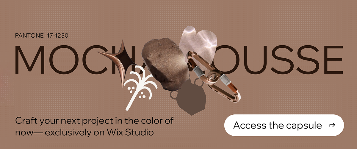
Pantone partnered with Wix Studio this year to create the first-ever Pantone-inspired web design system. The limited edition capsule includes single assets, pre-designed sections and modules, and full templates that you can customize to suit your style while staying on trend with the Color of The Year.
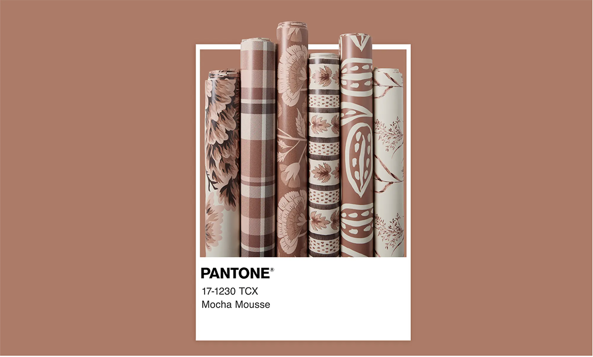
Spoonflower created a capsule collection with the Pantone Color of the Year with contributions from four independent artists. Some of the available products include wallpaper, fabric and home decor.
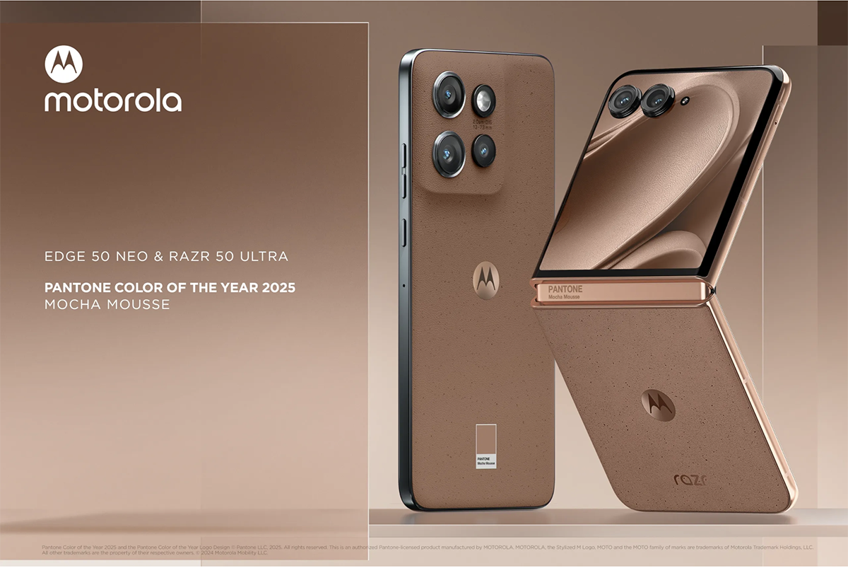
Motorola partnered with Pantone again to launch the new Edge 50 Neo and Razr 50 Ultra, now in Mocha Mousse. To add to the festivities, Motorola launched its new phone around the same time that The Color of the Year was announced. The phone was inspired by the colors' meaning and is meant to complement your lifestyle and showcase who you are.
The Pantone Matching System (PMS) has always been a system for printed materials. Compared to the same color on a screen, the Pantone color on print will never be precisely the same, but it will be very close. This is why Pantone offers a few different systems for using Pantone colors online.
This way, a brand can maintain its color schemes from print to the web. These systems were also created because Pantone knows that some designs, such as websites and social media, stay on the computer and never make it to print.
Pantone also makes it easy for web designers and marketers to use the Pantone Color of the Year.
The Pantone Color System offers a collection of tools for designers and marketers, making it easy to transfer color inspirations from swatches to computers and onto print. Pantone also offers fashion and product design systems.
For a faster solution, you can also easily use the Pantone Color Finder.
Insert any PMS number in the search box, and it will show you the corresponding RGB and HEX codes for use on the web. A visual content editor like Visme will accept the HEX number, and advanced editors like Photoshop will take any of the values.
These are the color codes for this year’s color, Mocha Mousse:
We've created an extensive list of all the Pantone Color of the Year from 2000 to 2004, plus we have some tips or expert points of view to give you a better understand of their use case, selection and vibrant appeal.
Made with Visme Presentation Maker
Below is a list of the Pantone color of the tear along with their code:
Unfortunately, Pantone didn't issue any official press releases for the Colors of the Year from before 2007. Thanks to the magic of the internet, we know a little bit about how and why each color was chosen. Let’s take a look at the first Colors of the Year and the color collections that were inspired by them. Here's a quick list of them below, we also have them listed in the presentation in the previous section as well! The Pantone colors before 2007 includes:
Pantone is famous for creating a standardized color-matching system that has become the global standard for color communication in design, fashion, printing, and manufacturing. Founded in 1962, the company revolutionized color reproduction by developing the Pantone Matching System (PMS), which provides a universal language of color. Designers, artists, and industries worldwide rely on Pantone's precise color specifications to ensure consistent color reproduction across different materials, mediums, and locations.
To find a Pantone color code, you can:
Yes, it is legal to use Pantone colors, but with some important considerations:
Pantone is a powerful color-matching system that helps with cross-material color stability, but it also has some disadvantages:
There are several Pantone licenses, and their cost depends on their use. Pantone Connect is the most common app extension for using Pantone in Adobe Creative Cloud software. It’s $14.99 a month.
Pantone Business Licensing has options for color display manufacturers, color printer manufacturers, colored materials, consumer products and software + web. The cost for all these is at the request of Pantone sales representatives.
Design visual brand experiences for your business whether you are a seasoned designer or a total novice.
Try Visme for free