


How to Add Text to a Photo on iPhone Using Markup & Visme


Written by:
Nayomi Chibana

Color is such a fundamental part of the way we perceive the world that we often take it for granted. Think about it: From the youthful and vivid orange on someone's attire to the gray and gloomy sky above us, colors have the power to mold our perceptions of others and even the circumstances we find ourselves in.
This is why one of the most powerful tools in a designer's arsenal is color. It can either make or break a design; it can be the determining factor in engaging viewers or sending them promptly on their way.
Unless you're a seasoned designer, it takes time and effort to find a color combination that works within your website's design principles, which is why the design team at Visme decided to provide our users with a handy list of beautiful color schemes from websites that have been recognized by Awwwards, the most prestigious award for Web designers and developers.

After receiving plenty of positive feedback on our first color combination guide, we knew that our audience would appreciate another round of gorgeous palettes to choose from. For those looking to enhance their design skills even further, consider using color grading software to fine-tune the hues and tones of your images and videos.
You can easily apply these to any of your Visme projects by using the hex codes provided to the right of each image, as seen in the GIF above.
This website color palette is full of metallic touches over a blue-toned gradient creating a chic 3D setup for Shopify’s product updates. These colors evoke a calm setting that inspires curiosity in the viewer.
The vintage color palette on the Prometheus website includes an earthy terracotta with a deep blue gradient and the sleek black of the car. The metallic touches add an air of futurism to the scene.
Deep teals and bright metallics create an innovative color palette that transitions from dark to light in an animated video. This screengrab captures the website’s color palette in all its glory. Visit the site for the full experience.
Earthy sandy tones add a sense of stability and warmth to this site’s color scheme. The slate gray for the text creates contrast with the clay background and the touches of sky blue and fern green give pops of color.
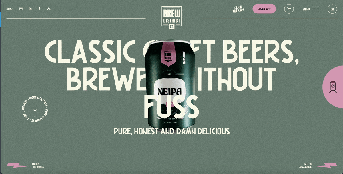
This website doesn’t have just one color scheme; it has four, and the visitor can pick between them with a button. Each color scheme showcases a type of beer and consists of a textured muted background and a bright color accent: raspberry and green, teal and pink, blue-gray and orange, and olive green and light orange.
The almost black text over a light gray background gives this site a mellow tone that contrasts with the bright blue accents in the intro video and squiggles as you scroll. The shapes floating in the header are the same color as the text and background, creating visual balance.
The first scene of this website’s video-based hero section starts with a powerful red and black figure over a bright red background. Over her eyes are pixels in tones between black and red, plus a few blue lights that give contrast. The text has a blue tone that matches the flickering blue lights at the top. Click on the site’s link to watch the full video effect.
This website’s color scheme is based on a series of gradient circles interlaced with each other. The overlay creates many colors, but the main hues are sky blue, salmon-pink and bright orange. There are two accent colors, black and neon green, that draw attention to important information like dates and calls to action.
The chosen color scheme makes a lot of sense for a website about a sculpture of moon phases. The combination of gray-washed white, space blue, slate gray and soft gradients in the text creates a true cosmic mood.
In this website, we see the brave choice of making all text muted red. Usually, red isn’t a very easy-to-read color, but in this case, it’s well-balanced with a creamy-gray background. The pink object in the center adds another layer of depth to the color palette
This beautiful combination of candy pink, green-yellow, lavender gray and pastel brown is ideal for designs looking to project a vibrant and inviting image.
It's hard to look away when faced with a minimalist yet striking design such as this. The dark smoky black background coupled with a striking electric blue make this a winning color scheme, useful for a variety of projects.
Using the red Polish flag as a basis for its color scheme, this attractive website combines a dark scarlet red with dark pink over a light gray background. Its lively and creative and, at the same time, refined in its use of a minimalist color scheme with different shades of the same hue.
This colorful combination of goldenrod, vermillion, dark blue and Dutch white brings to life this artsy and creative design for an online archive of musical works.
This unique blend of skin tones and more elegant colors such as dark imperial blue and ruby makes this the ideal color scheme for designs with nuanced messages. Reserved yet approachable; sophisticated yet fun: These are the kinds of gray-area messages that are effectively sent with this eye-pleasing combination.
This eye-catching blend of blue sapphire, gunmetal gray and platinum on the one hand and peach-orange and tan on the other make for a modern and sleek color scheme. Used here to project a futuristic image, the cool, metallic colors are effectively tempered by more human, earthy tones.
This in-your-face combination of Portland Orange, vivid yellow and jade on a dark gray, almost black background screams for your attention. Daring and full of energy, this color combination is perfect if you're going for a contemporary and audacious look.
Dark sienna, charcoal and a burst of pale red violet make this color scheme a must-have for those looking for an elegant, futuristic yet dynamic look and feel. This color combination is versatile enough it can be used in projects ranging from modern-looking corporate reports to magazines and editorial content in general.
Eggshell white, dark vanilla and taupe gray with jelly bean red highlights come together in this minimalist yet warm and inviting site. The burst of energetic color throughout the design makes this site elegant and inviting at the same time.
Dark cerise, royal purple and dark slate blue are blended in this beautiful and engaging site. The deep cerise acts as an accent color over the dark purple background, leading the viewers' eyes to the navigation menu as soon as they arrive on the site.
The shades of blue and violet in this site are especially pleasing to the eye and evoke both energy and peace at the same time. Blueberry and sky blue are artfully combined with amethyst to give life to a refreshing and eye-pleasing color combination suitable for any design which aims to incite positive emotions.
If you're looking for a more muted and corporate look, this color scheme brings together shades of green, blue and brown that convey both professionalism and reliability. Phthalo Green, dark slate gray and pewter blue are just some of the colors used here.
A range of blues, from a bright lapis lazuli blue to aqua blue, make this a reserved yet beautiful color scheme. It can be used in a variety of different visuals, from muted corporate projects to design-related ones, as in this case.
A beautiful myrtle green and keppel come together here with azureish white and plain white in a simple but effective combination.
This bright and elegant color scheme brings together a very saturated light cold blue with other shades, such as dark slate blue and pale cornflower blue. This combination is elegantly complemented by a bright and vivid shade of pink.
This playful and colorful scheme combines several vibrant hues: bright turquoise, tangerine yellow and dark orchid.
This sleek and ultra-modern site boasts an elegant and eye-catching combination with effective contrast. The bright yellow-green combines well with the black and gray in the background.
This is another example of a site that effectively uses a bright accent color to delineate a path for the viewers' eyes. In this case, the bright yellow draws the eye first to the title, then the path up the mountain and finally to the call-to-action buttons at the bottom of the page.
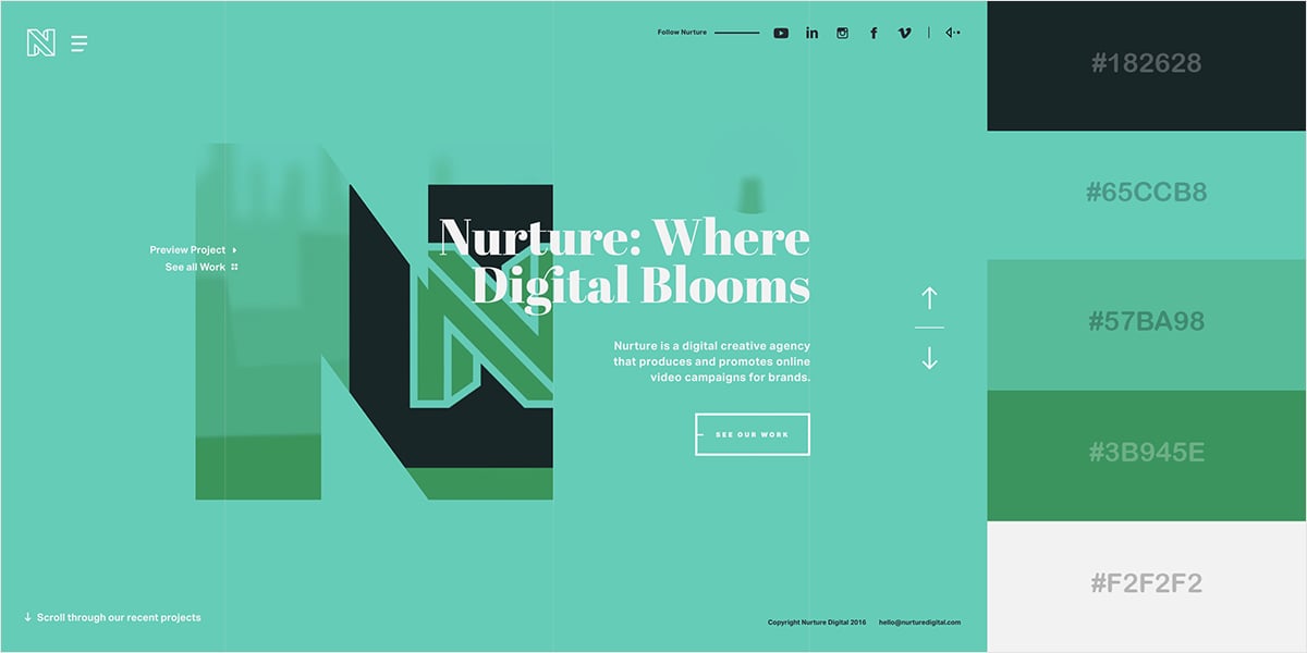
This combination of ocean green, aquamarine and sea green perfectly communicates the concept of modernity and at the same time, life and fertility, which is totally in sync with some of the words in the site's central message: digital, nurture and bloom.
This earthy combination of green with a range of blues, from pale cerulean to teal blue, is perfect for conservative designs intended to project an image of stability, reliability and abundance.

This lively site brings together a bright raspberry pink with softer colors such as pastel blue and light pastel purple. The result is a wonderfully fresh and lighthearted color scheme.
This unlikely blend of a range of dark pinks with a blues makes this a unique and engaging combination that can be used for a range of projects in different fields.
This fresh and citrusy blend of light greenish-yellows, lime green and black is a favorite among brands related to high-adrenaline sports and energy drinks.
The bright turquoise background and orange call-to-action button on this site may be a bit loud for some visitors, but the combination definitely conveys high-energy emotions, which go along with the image in the background.
This range of pinks and reds with a bright blue call-to-action button creates plenty of visual interest and draws attention to itself immediately.
This bold and unique combination of royal blue and gold, with vivid cyan highlights, captures the eye. Its unexpected and somewhat out-of-the-box thinking help make this website a winner.
The cyan, blues and oranges on this page make this a particularly inviting and energetic design that can be applied to projects with an optimistic and uplifting message.
This wintery red and blue combination evokes both coolness and warmth at the same time, similar to images related to the winter holidays.
This bright and rich color combination brings together a vivid yellow, blue and pink in this beautiful minimalist design, which can be used in lively yet professional projects.
This site pulls off an attractive design with just a few elements and a well-chosen color scheme. Turkish rose, middle green and yellow geometric shapes over a black and gray background are enough to catch the viewer's eye.
This effective color combination uses shades of blue and red to create a sense of boldness and ardent professionalism, ideal for designs looking to convey power and competence.
Even if you're not familiar with the term flat design, you've probably seen it before: Websites with no drop shadows, no gradients, no bevels; in short, no three-dimensional elements.
While the site above adds a bit of a shadow effect to the boy on the right, it would technically qualify as flat design 2.0, which is nothing more than the addition of a few very subtle three-dimensional effects.
As seen here, flat design colors tend to be very bright and super saturated.
This unique combination of a coffee tone with sky blue and different shades of brown makes this a soothing and comforting color scheme: Something reminiscent of your favorite coffee house or lounge.
This combination of cameo pink, UCLA blue and and granite gray brings to mind the kind of attire used by well-to-do, preppy college students. Although this makes sense considering the site's target audience, this scheme can also be used in any design looking for both seriousness and a bit of liveliness.
This Spotify site makes perfect use of a grape-colored accent against a very dark desaturated violet. This color scheme can be used for any design where you have a few elements or a central message you really want to pop.
Oxford blue with a few bright blue and red highlights make this a very traditional and corporate site. Blue and green, which convey professionalism and stability, are commonly used colors for corporate reports.
This blend of gold, purple and black bring to mind words such as wealth and extravagance. Accordingly, this combination can be applied to designs related to fashion, luxury and high-end products.
This beautiful combination of viridian green and telemagenta over a dark background creates heightened visual interest and draws the viewer in at first glance. Bold yet professional, this color combination, when used correctly, can even be applied to corporate designs.
Whereas the previous color scheme was eye-catching--but not too bright--this combination is purposely loud, to the point that it might repel some viewers. When looking to make a bold statement, though, this combination may work well when done right, as in this case.
This relaxing yet cheerful combination of lemon, yellow, mint and dark cyan make this an ideal color scheme for any message looking to convey energy, optimism and, at the same time, harmony and growth.
Do you still have questions about website color schemes? These FAQs will help clear any doubts.
The color scheme you choose for a website depends on various factors like brand identity, target audience and the emotions you want to evoke. However, a popular choice is to use a combination of three colors; two complementary and one accent.
The chosen colors must reflect brand personality while ensuring readability and visual appeal. It helps to start with a primary color from the brand palette and then select complementary or analogous colors to create a cohesive palette.
Get inspiration from guides like this one to choose your ideal website color combination.
The three-color rule for website design states that the best color combination for websites consists of one main color, one complementary color and one accent color.
Typically, the primary color is a strong hue used in titles, big text and visual elements, the complementary color is the background, supporting visual elements or subtitles. Finally, the accent color stands out from the other two and is used for elements like buttons, links and captions.
The best color combinations for websites in the technology industry include a mix of modern, sleek tones like blue, white, gray, black and silver. These colors convey professionalism, innovation and sense of trustworthiness. Additionally, incorporating pops of vibrant colors like red and orange sparingly can add visual interest and highlight key elements.
There’s no strict rule on the number of colors a website should have, but generally, it’s recommended to use a cohesive color palette consisting of around 3 to 5 colors.
A color palette with few tonalities ensures visual harmony and consistency throughout the website while allowing for variation and emphasis when needed.
The best color combinations for websites that are calming include soft blues, greens and neutrals like light grays and beige.
These colors evoke feelings of tranquility, relaxation and balance, making them ideal for creating a calming browsing experience.
The best background color for websites that seek a calming effect are soft creamy grays and eggshell whites.
A trustworthy color palette often includes shades of blue, as it’s commonly associated with stability, reliability and professionalism.
Pairing blue with neutral tones like white, gray and beige can further enhance the sense of trustworthiness.
Additionally, incorporating accents of green or teal can evoke feelings of growth and harmony, reinforcing trust in the website and brand.
The most legible color on a website is black text on a white background. This high contrast combination ensures good readability for most people.
However, other combinations of dark text on a light background can also work well as long as there is sufficient contrast between the text and the background.
Websites are the welcome mat to a brand’s existence on the web; they represent the brand identity and transmit its values and goals. But how can color be so important in that pursuit? It’s all about perception and color psychology. Colors transmit feelings, ideas and moods.
That said, the art and effort involved in choosing website color schemes isn’t lost on us; we know it’s tough. Hopefully, this collection of 50 website color palettes has inspired you to create a unique and perfect combination for your website and brand.
Once your website (and its color palette) is ready, use the Visme Brand Wizard to extract the colors, fonts and logos and get a full-set of beautifully branded templates. In less than a minute, you’ll have a complete collection of ready-to-use designs for both internal and external communications.
Get started with Visme today and take full advantage of how color can help grow your business through emotion and visual storytelling.
Design visual brand experiences for your business whether you are a seasoned designer or a total novice.
Try Visme for free

About the Author
Nayomi Chibana is a journalist and writer for Visme’s Visual Learning Center. Besides researching trends in visual communication and next-generation storytelling, she’s passionate about data-driven content.